IIRC, they will set up the voting in this thread. You’ll see a separate post announcing it’s time to vote, with each of the entries listed with the creators names. Then you choose which one you want, and it will then show how many votes there are (as a percentage of how many votes have been cast).
We @BlenderCollab have a few days to vote. You can vote fast but also think slowly about design, colors, technique, difficulty, subject, realism, etc. Choose consciously and not on your own entry.
And the new subject week 26 “Carnival” has already started. The winner of this week’s “Album cover” challenge may select a subject for week 27.
0 voters
Hi, there are instructions (somewhere in 2017). At the time, the process that made it to the winner was the next challenge and voting in the forum. But continuity was problematic. So I and NP5 decided to give it more structure. Better promotion on the forums. We even have our own “Blender Collab” channel.
Every week a winner provides a new challenge, I discuss the new topic with the winner if the topic is similar to previous challenges or is too difficult for a beginning student. I create the vote and new challenge threads.
If you want to create your own poll, open a new thread and select the gear icon.
But do that in one of the other channels (show, ask, talk).
Pete
Wow, tehre are quite some awesome works here! I am really sorry now that I missed on participating on this one, but it is nice to see such cool works from all of you guys using different approaches and styles 
Wow! This is so hard. I don’t think there’s a single entry that doesn’t deserve a win. I’m going to have to do some serious thinking.
I agree! Definitely not going to be an easy choice this week.
These are awesome everyone! 
Such a cool subject and I especially like all the entries with fur, such a difficult thing for most computers.
I’ve been kind of taking the summer off and so haven’t been working on my art 
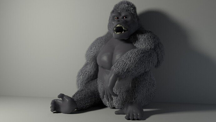
But just for fun here’s a piece I made some years ago:
As mentioned. The vote is added in the thread.
There is one vote per person usually, (just remotely it is possible to set three per voter, but rarely ever used).
Vote has an end time, to create a result, so you can’t vote on old ones.
There is a ‘leap frog’ system to keep thing flowing easily, winner chooses the subject in two weeks time. That way the next one can start the moment the old one closes and is being voted on.
Thanks go to FedPete for all the admin of it.
I like!
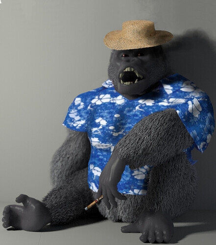
If only he had a cigar in his hand, a straw hat, and a Hawaiian shirt!
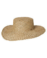
I used a free photo editor and swiped these pictures…

Oh man 
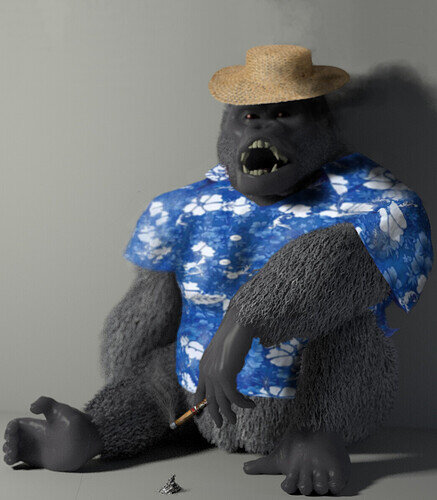
I didn’t realize he’s in just exactly the right spot for those too. A little smoke, ashes falling…
It was one of those pictures that I was maniacally giggling to myself the entire time because I thought I was so very clever…
Actually, I had to look to find pictures that were roughly the right angles to your picture. So rather he was the reference for them- they managed to be the right angles for him.
I thought of that…
This is an undoubtedly better image than my original 
You even added shadow where it should be on the shirt and matched the DOF closely.
Bravo, sir. 
My one critique is the shadow of the head on the wall, doesn’t match the hat’s shape.
It is true, it is a bit round rather than a bit flat…
But did you at least notice the shadow coming off from the ashes?
Such attention to detail!
It’s the little things 
Makes me want to submit other old artworks just to see what you’d do to them 
Funny you say that, I was thinking of it- I think the next Blender topic should be to steal your pictures and edit them! 
Haha, well I certainly have no shortage. But it seems like that’s more of a photoshop/gimp/krita challenge.
I know… 
Besides, these things usually come out of the blue- I your saw gorilla, then I instantaneously thought “Hawaiian” 
I have actually done this for my room. My computer can get pretty warm with the more intensive renders. It works!
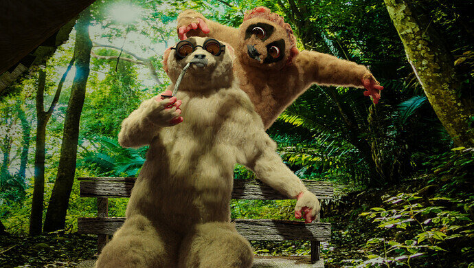
@Zangk , congratulations on your winning animal’s entry. I love your little story and how it’s presented. The lighting and shadows are beautiful. Although the sun in the forest background image is a bit odd. But this doesn’t matter because the scene is in a good balance, forest vibe. Good contrast and focus.
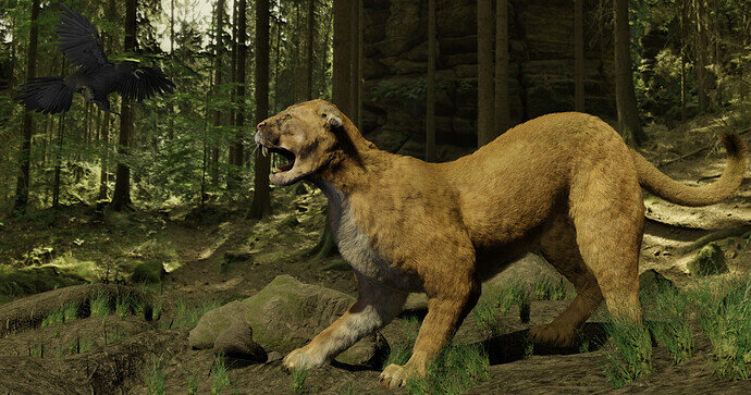
- Cathy_N, your scenery is also very good. And the cat action posture is well chosen. You can tell it is afraid, ready for action. But what I miss in this scene, to make the story complete, is why it is so?
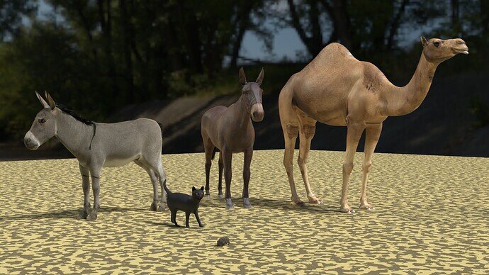
- NP5, you have a really nice set of domestic animals. The textures are excellent.
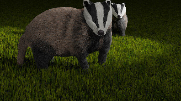
- GameProgrammer2K, really nice badgers, but your scene cut could be improved. Put the animals more in the middle of the image. Now they stand in the upper half.
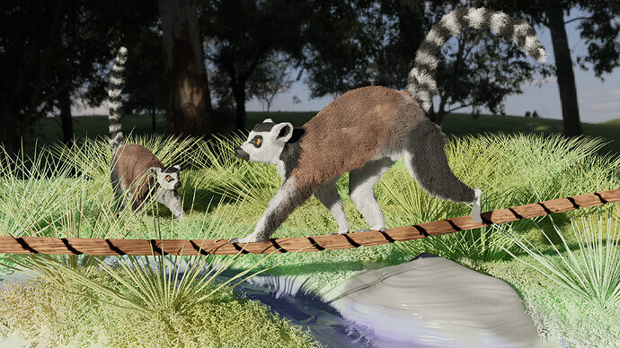
- Rulo_martinez, your lemur is well designed and has excellent fur. the composition is good. You could try to improve the surroundings and lighting. So the dark shadow background matches the bright sunny front.
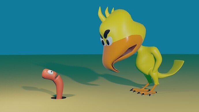
- DANB1, you showed us a funny story. It could use more environment
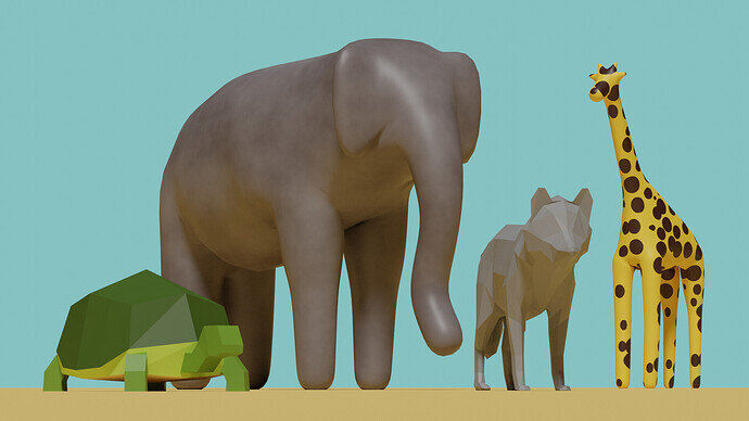
- Tyger2, what I like is the wide range of techniques you’ve used to design your animals. I like the camera position, but there is some mismatch in the scale of those animals? Maybe adding a little of DOF.
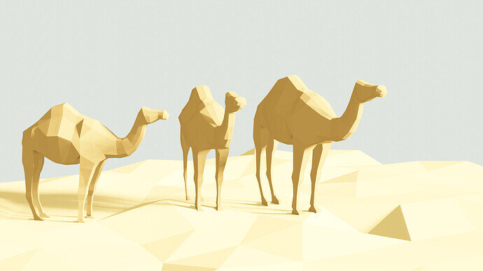
- FedPete, low poly but with the current level of those other entries. You didn’t make any chance.


