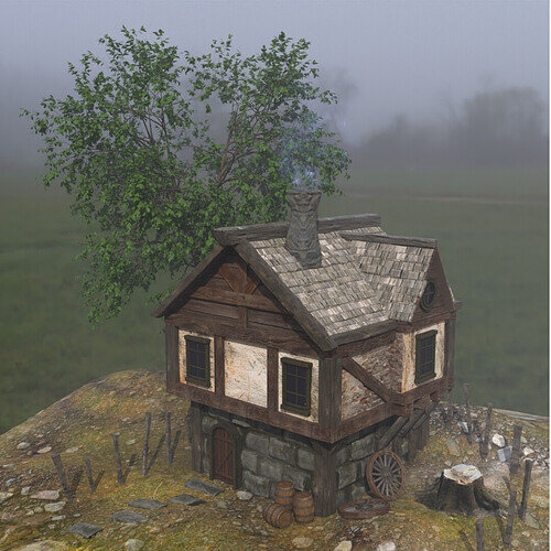
Does the ground material have displacement? If it does, I think it will only show up in the experimental render. I had this issue with an earlier piece for a collab. Idk just a guess.
Very nice building, looks like it’s a medieval English house.
Aah, thank you! Actually I combined two textures for the ground but only 1 of them has any displacement, albeit very very low. But the rest of the house, the stone walls, brick/plaster, chimney etc have displacement enabled. And its a bit weird because displacement does show up in ‘Supported - GPU’ viewport but it doesn’t render. I’m just glad I was done with the render today, will look into this problem some other day 
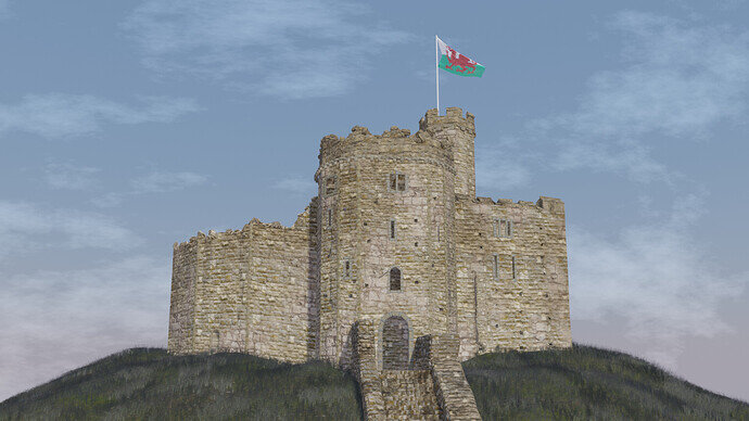
Here’s my VERY rushed entry: Castell Caerdydd. This castle is built on roman walls that are still partly visible. It’s the heart of my city, and I have always been fascinated by it.
I had too much work this week and didn’t think I would be able to participate in the collab. I ended up making a very quick model so my advice - don’t look too closely! 
This was my reference:
It’s too oversaturated for my liking so my colours are quite different. I spent around 20 minutes trying to find a good sky background until I gave up and took a look at the world shading in Blender. Turns out you can make a lovely sky in just under 1 minute. Live and learn lol
Nice one!
It reminds me of a castle in Unreal Engine.
You pulled it too well, somewhat close to the Unreal one.
Impressive!
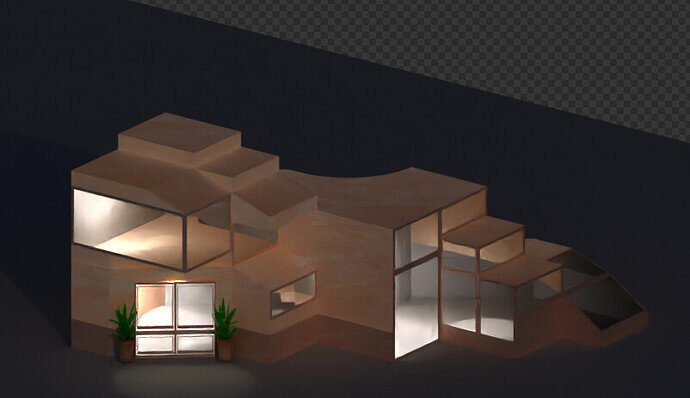
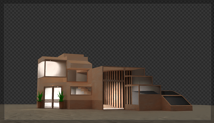
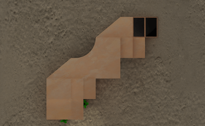
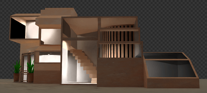
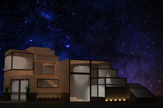
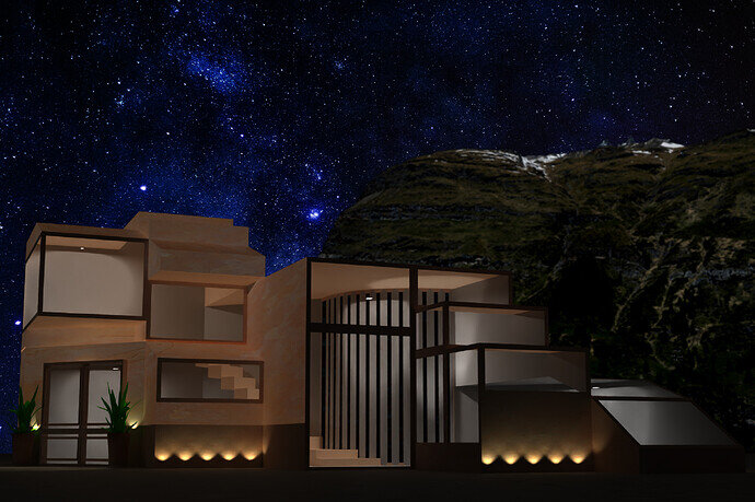
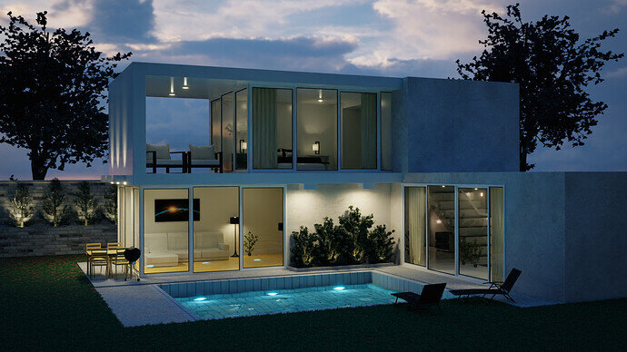
Scrapped my first idea and made a concept for a house i´d like to live in. Just based on fantasy. Finished the building part but now time runs away and i´m having ahard time setting up the rest of the scene and finding the right settings and background. Guess i´ll first look at better lighting.
Thoughts for concept
- • needs to look modern and simplistic, can be „boxy, but not like a stack of identical boxes. Needs at least one element, that breaks the rule!
- • needs to be open enough to be flooded by daylight during the whole day
- • needs to be protection from harsh weather like thunderstorms and rain. But not like a concrete bunker. I want to feel like I’m a part of every weather that may be from the inside. So I need at least one inclined glass ceiling over a comfortable spot to lay down and just do that as a meditative activity
- • needs to have floors and ceilings on different height-levels since I truly enjoy the change of perspective and the lightplay
- • needs to not have closed rooms or walls dividing the inside space
- • needs to be relatively easy to be cleaned - so no stucco and dust-catchers
- • needs to have a flat roof to sunbathe and gaze at wandering clouds and gleaming nightskies
- • needs to be located at a nice place surrounded by nature, so I don’t have to worry about gardening at all. My garden shall be every place outside the walls
- • needs an ocean nearby or at least a small river.
- • needs to have mountains in view-distance
- • needs to be off-grid from any kind of neighborhood, so I don’t have to worry about putting on trousers whenever I just don’t feel like it
- • needs to be as self-sufficient as can be (regarding electricity)
- • needs to be located on a hill with a view to the mountainside and valley
- • inside walls need to be made out of the kind of „breathing“ concrete, that grants a warm auditive atmosphere and a good auditive experience when people talk or play/listen music
- • outside walls should be made out of the kind of concrete, that deflects water and look pleasing
- • overall the color-scheme should have a light but „earthy“ vibe, in the direction of terracotta or something like that
Question: At which time is the final deadline and which timezone are we talking about?
Good luck everybody and great work so far!
@Kasimir Forget about the timeline and start posting WIP. What if final is not there before time, let us relish your WIP. Final would come!
Submission
Yes, i need to learn to tweak things better, couldn´t figure out how today and i´m simply out of energy. But i got better at some basic funcions with the compositor. Never really used it before, so it took an awful lot of time just scale/fit/position the elements. Getting some sleep now 
Thank you!
I’m still pretty new at the compositor, but when you have the time I highly recommend checking out Blender’s cryptomatte feature: Using Cryptomattes in Blender 2.8 - Compositing Tutorial - YouTube 
It allows you to easily separate elements of your scene and preform comps on them. So for example you could blur only the rocks in the background of your house, change HSV and so on.
But it’s always good to call a project quits, take what you learned and apply it to the next thing! 
This looks good but maybe increase the alpha values a little bit higher.
There’s no reflections or refractions. Also try some shaders like translucent/glossy etc, making glass is easier than it seems. Good luck!
Before going to compositor you may would like to play with some render settings. Like in Cycles > Color Management. Here you could try playing with Look and Gamma.
In compositor you would like to play around with Color Balance, Gamma, Brightness - Contrast, Hue - Saturation.
There is a lot you can do with these tools.
The GameDev forum site will show the time in your local settings.
basically, it ends Saturday at 23:55 timezone=“Europe/Amsterdam”.
But the real deadline will be much later and starts when I set up the vote.
Basically the things you would do in Photoshop, Krita, GIMP. I use it is lot, but it’s also a lot of work. Because it’s an additional step, allowing you to fiddle the end results. Which consumes collab time.
We @BlenderCollab have a few days to vote. You can vote fast but also think slowly about design, colors, technique, difficulty, subject, realism, etc. Choose consciously and not on your own entry.
And the new subject week 16 " 1,000 Tris ” has already started. The winner of this week’s “Architecture” challenge may select a subject for week 17.
0 voters
I´ll definetely check that out! Until this project i always worked my way “around” using the compositor because it was just so cryptic to me. Works so different than other graphics-software, where you just drag the elements with your mouse and have a layer-tree etc. Layers in Blender still confuse me a lot. But now i understand the basics of how the nodes work and am eager to get to now them better. Always wondered, how people get out such clean and colourful renders like yours - i guess using the power of composition and a cleaner workflow is my way to go.  Thanks!
Thanks for your advice! I already use those settings but i think my error is, that i don´t really understand the look-settings and don´t do that in a specific step in the workflow - where i don´t really have specific steps but jump back and forth and back again - and also apply changes and ticking boxes without really noticing some side-effects i create by doing so. So much fiddlefiddlefiddle consumed so much of the time i had for the projects …
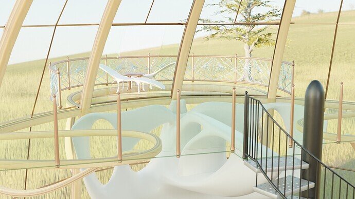
Love your scene, it looks warm and comfy inside and pretty realistic altogether! Cheers!
Thanks a lot for your appreciation.
This may would be of some help
https://docs.blender.org/manual/en/latest/render/color_management.html

