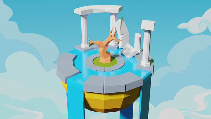
If the water is falling off the island where does it come from!? 
No wonder the tree died! (no leaves) 
Maybe the water isn’t falling, maybe it’s going up xD
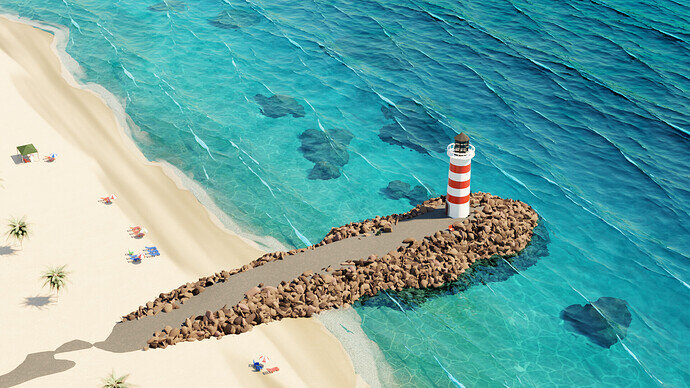
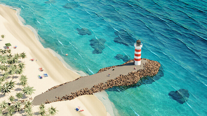
Hmmm. where is the whale? 
I wanted to add a small boat, whales and birds
Also, add more ppl
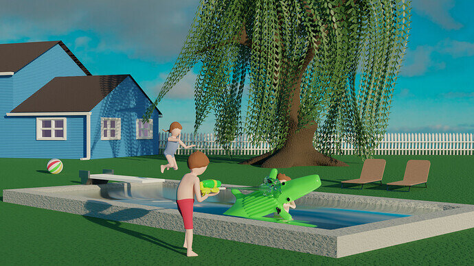
I couldnt figure out how to paint my crocodile toy. I UV unwrapped it and seemed to do everything I had done in the past but it would only let me paint the eyes and handles. So picture him with a big toothy grin
This happened for me in this project, I had to paint directly on the image instead of the model.
yeah, I think that I have to mess around with Krita or Gimp and brush up on that medium
Water
We @BlenderCollab have a few days to vote. You can vote fast but also think slowly about design, colors, technique, difficulty, subject, realism, etc. Choose consciously and not on your own entry.
And the new subject week 12 " Euphemisms ” has already started. The winner of this week’s “Antique” challenge may select a subject for week 13.
very difficult to vote this time.
I see a lot of work and progress on all entries.
really good contributions. 
Well this is not fair. I clicked on @umishrak clip to see video and it automatically voted… Not saying that I wouldn’t as I havent seen it yet.
How do I get to see it? since I voted for it 
Hey. I found that when I don’t think about it too much and just do whatever my mind tells me on the first hint it just look pleasing. Still, have to sift trough skills what I can or can’t do. But its strangely satisfying.
Don’t know where you are pulling this artistic references “from the sleeve” all the time but its kind of impressing Sir.
Click on “show vote” and change it if you want to
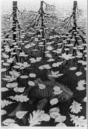
Ahhh, M.C. Escher is one of my favorite artists. 
Is that Gildergreen tree from Whiterun? I have to vote for this one now, for the Nords of Skyrim.
That’s the exact spot that inspired me.
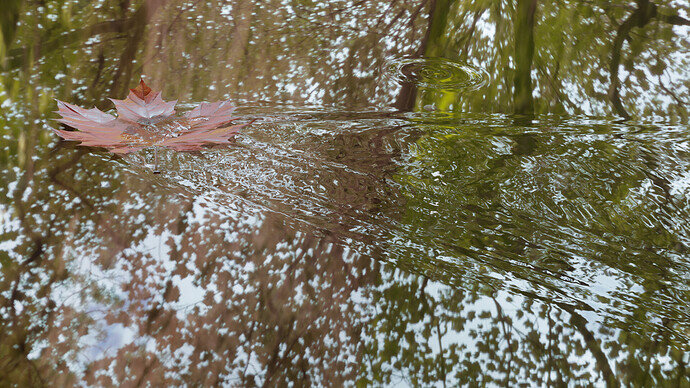
@Mateusz , congratulations on winning the vote on the water collab challenge. It is a simple but well-thought-out aspect of water. Tranquility, nature (trees), physics (reflections), and even life and death all come together in a single illustration.
- igorfv - nicely bright-colored, well-composed, and very, very beautiful waterfront. Can’t say what’s wrong. Maybe missing some details in the ‘grey-road’ towards the tower …
- Yee - I like the composition and the simplicity, nice reflections in the water. But it could use more attention to detail. Even if it is low poly, you still can add details.
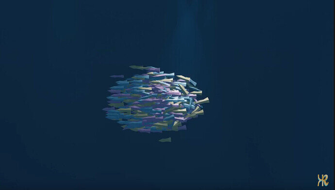
- Umishrak - A well-performed tutorial. Add more details to the fish and even animate the fish (tails …). And adding another element to the scene. whale, shark, diver … gives more diversity to the scene. Or changing lighting conditions …
- sezpul - fun scene with a lot of water fun details. I do think the sun is too low, with long shadows, late in the daytime. For me, personally, it doesn’t look that hot wheater (grey clouds). As in time to swim and splatter. Maybe brighter sun colors (white clouds) … ?
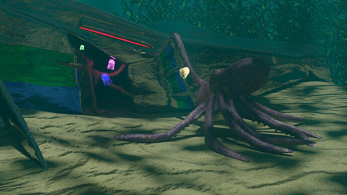
- Kax - I like your underwater scene. It really feels like underwater. But the jellyfish are too bright, too colorful. I would expect more translucency for the jellyfish. I understand if you make them translucent, they are less visible. But then you can use one bigger and more in the front. to compensate for that. Or use more …
A wide diversity of collab entries. Did you learn something new with this challenge?


