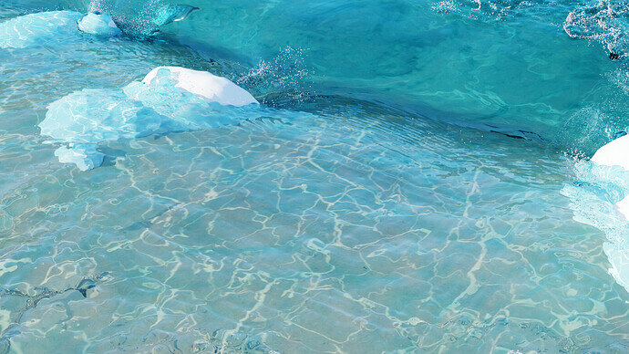
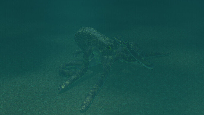
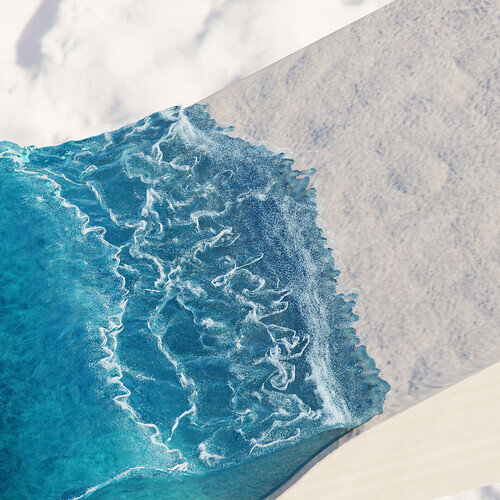
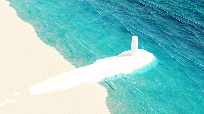
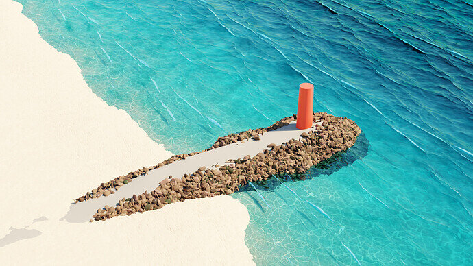
I’m loving this spray and foam =)
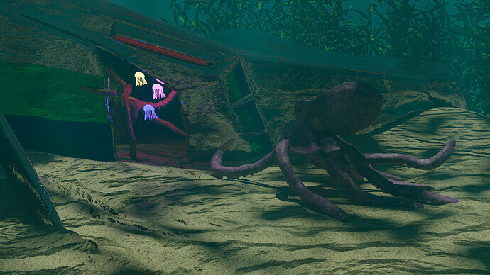
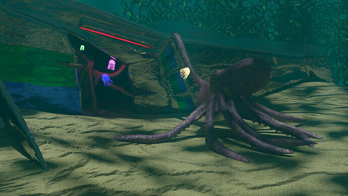
Approaching a semi-final scene, I’m thinking. Looking at it as I say this, I already know I need to go back in and mess a bit more with the sand, and perhaps thicken the kelp forest in the background. Any specific critiques or suggestions to improve on it are welcome. This week again I’m treating the challenge as an exercise in creating textures and lighting.
I think somehow you need to add more light to the Big octopus. it should be the centre of attention imo not the neon jellyfish.
caustics. exagiraed. redo
I just used some material node based on vonoroi. To mimic water reflections, using Eevee but later switched to Cycles.
This is exactly what I did =)
I’ll keep playing with the lighting, yeah. I already did tone down the Jellyfish lights - (and tone up the ship’s red light) a little. Maybe I move one of them closer to the big fellow… Not sure I want to introduce a fourth type of light source in the scene.
I’ll think on it.
As an unrelated aside, ditto on voronoi shenanigans for water-surface shadows.
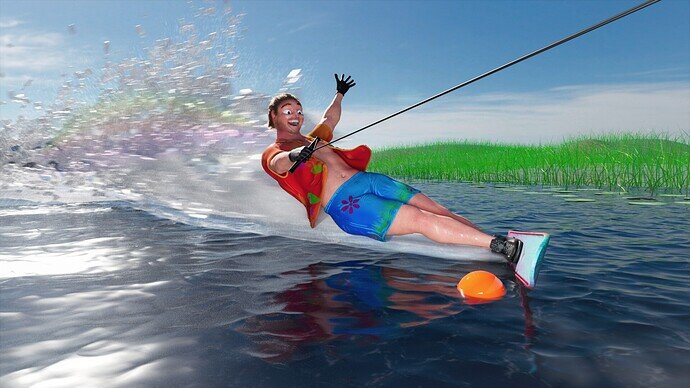
This is NOT a submission, but just for fun I thought I’d share the full version of my profile thumbnail since it was my first water related piece (made in Maya):
The splash was such a pain to simulate 
Alrighty. Lots of miscellaneous modifications and tweaks, edited emission values, and fixed the sand. Unless I say otherwise, this is probably my final version.
Edit: Swapped it out with an extremely light change for better definition on the yellow jellyfish.
Edit 2: Swapped out again for an improved render.
I like so much about this, but damn if that face isn’t terrifying. 
The version you’re looking for that has caustics is here: Blender Builds - blender.org
You’ll want to click the link that says “All Archived Builds” and find D13533. That’s the patch build that has caustics available. There may be a more recent build, but I haven’t had time to read through them and see.
So, if anyone wants to eye-roll at the newb, I’ve been using CPU instead of GPU for rendering this whole time. Turns out that’s actually quite impactful. 
Oh really? 
He was supposed to look like he was having fun haha
To be honest, it’s partly because the rest of the body looks so relatively plausible/almost realistic. And then you get to the face and its proportions are whacky. They’re fun kind of whacky, mind, and he definitely looks like he’s having fun, but there is a touch of uncanny valley lol.
Ah that makes sense, I appreciate the feedback! 
Never got any on that project so I was stuck with my own POV
- Water simulation is hard
- It’s looking bad
- It’s too heavy even on my high-end computer (probably because I’m doing something wrong)
So I’m giving up, I’ll work on another project
- This is true
- It’s not that bad
- You’re probably not doing anything wrong
- Don’t give up!


