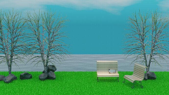
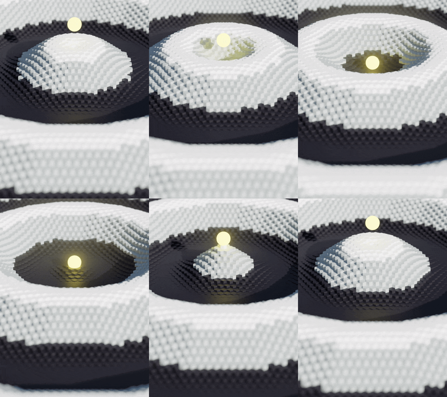
I don’t know how to make the grass look real. so I used a simple cone as a hair object. will surely try to learn how to make it better. their particle system and volumetric are making me crazy to play with
Oh, I can imagine. I still have yet to get around to messing with particles much.
By the Gods, Igor - I am glad when I manage to combine 4 or 5 nodes 
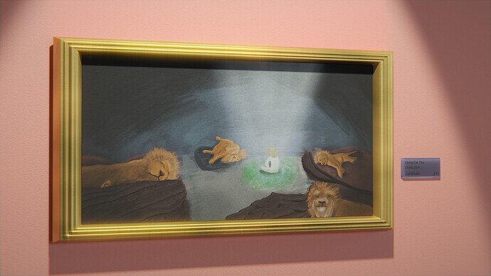
I wasn’t happy with my painting, so what better way to improve it than by framing it! 
Summary
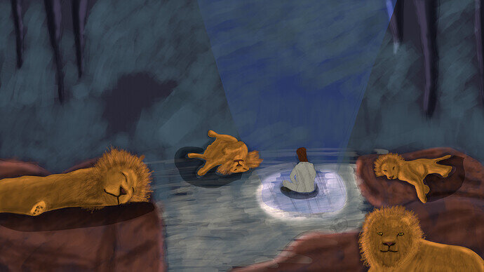
After messing about with grease pencil for a while, I grew too dissatisfied:
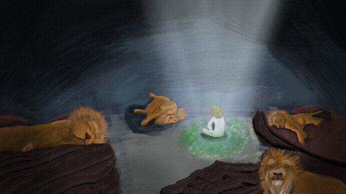
While it is possible to achieve amazing results using only grease pencil to mimic paintings, I lack the skill and patience to try and learn Blender’s unusual workflow. Sophie Jantak - YouTube is someone on Youtube that has actually done this. So I sort of cheated and took it into Krita, making it a LITTLE better at least:
Then today I thought it might work more as a photo of a painting to disguise the mistakes 
I love how every single entry is abstract and different from each other. The concept of peace means completely different things for each one of us.
My submission for this week.
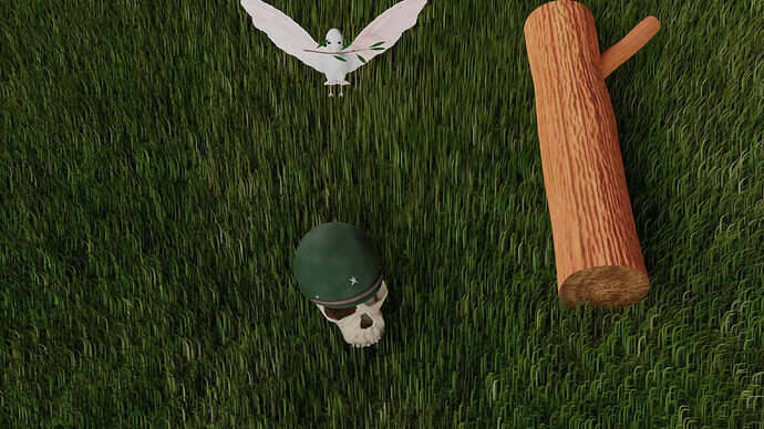
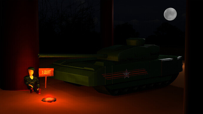
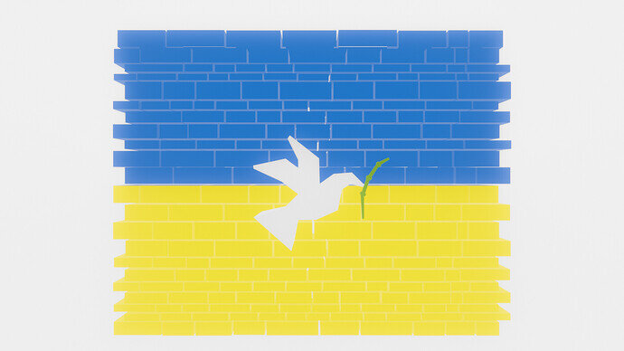
Just an idea i tried to convey into a simple scene. I´d title it “an unlikely moment of peace”
It´s not meant as some kind of political message against anyone.
I like the colors, so pretty! Did you use any volumetrics?
Thanks a lot. I think I ended up using volume scatter because I couldnt get volume absorption to have a haze that was white, only black but I ended up liking this more. I adjusted the antrioscopic (or whatever it was) to almost 1.0 (like 0.95) for the sun washing out the scene to the top right effect. I’m not sure if thats what you mean by volumetrics or not but it adds a lot to the atmosphere
Always vote for Peace
We @BlenderCollab have a few days to vote. You can vote fast but also think slowly about design, colors, technique, difficulty, subject, realism, etc. Choose consciously and not on your own entry.
And the new subject week 11 " Water ” has already started. The winner of this week’s “Antique” challenge may select a subject for week 12.
@sezpul Congratulations on your winning “Peace” entry. I see tranquility in your beautifully colored composition. And in contrast to the figure, which gets the viewer’s focus of attention. Giving a warm, peaceful feeling. Well done!
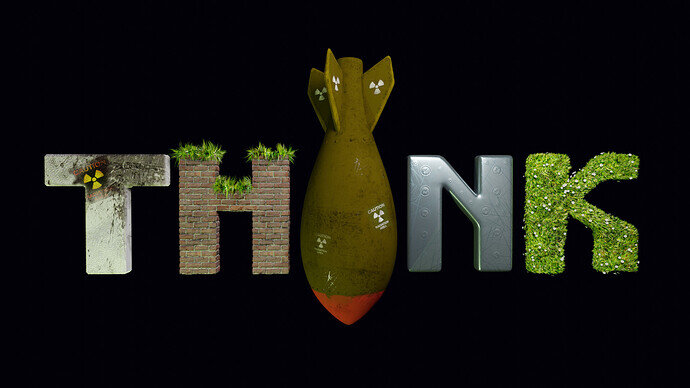
FedPete - It’s more a statement than a peaceful illustration. I think the lighting is a bit off. And the ‘N’ doesn’t look hard surface. Maybe less different material use to get more unity.
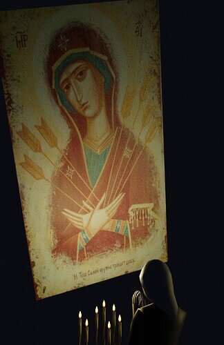
Blest - Great idea. I think the lighting of the candles and a praying person is very nicely done. But the Saint icon panel doesn’t have this nice candle lighting effect. If a smaller panel, then more room for details on the candle and figure. And panel lighting effects.
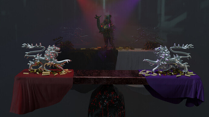
Kax - Seeing your Work-In-Progress (WIP) I got the impression, that you’ve added too many details, because of the time you had. Because I really liked your first glass model. Simple, nice glass reflections, a strong evenly lit image. But by adding more and more, you were creating two sides. That’s the reason I think you’ve added something in the middle to combine them again. Adding more details.
Zachdude - It’s a great painting, would like to see more paint texture (bumps, thick paint, paint strokes). And as in real life, the frame can make or break the presentation.
Sagar27 - A nice peaceful scene, but it feels somewhat tiny. A miniature scene … And while the trees are leafless, the grass is very green (fresh).
ADITYA_SAHU - I think you struggled with your composition on your first idea. Which I like very much. But because of the enormous blur of the camera, it feels like small stones on top of each other. In your last entry I miss composition.
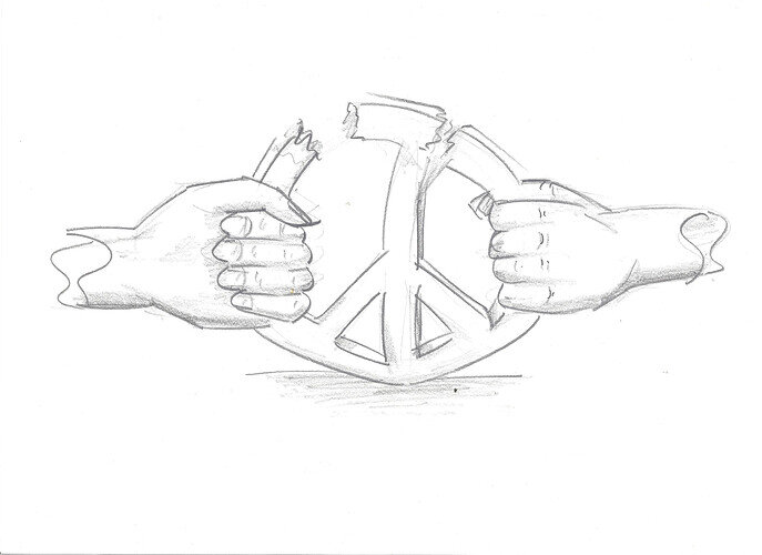
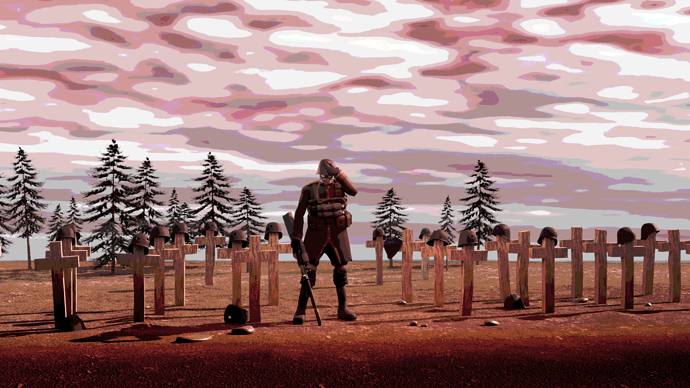
Jack_Mak_Morn - You have made a statement! Great color scheme. Good composition. You tell a story, but maybe not everyone’s taste.
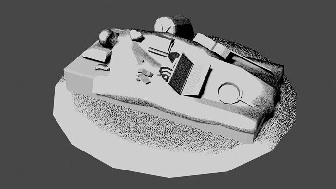
Kasmir - Also a nice little story. But it’s too dark on my monitor. And I think the tank got too much. It’s about the person. Part of the tank (gun barrel) was sufficient.
NP5 - Peace in space, make it rockier…
Willrun - Good use of symbols. But I miss the composition, integration of all the elements.
Yee - Early stage of modeling?
igorfy - Tranquility, mesmerizing …
Yes, it was an opportunity to make a barren landscape, at least better than my quick offering. Only where there is no life is there peace.


