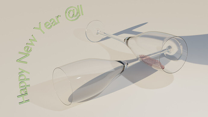
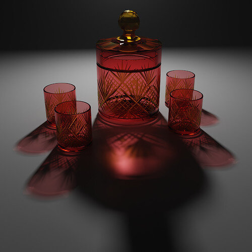
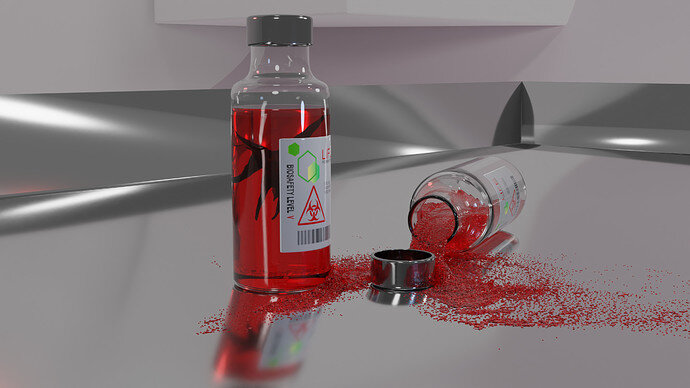
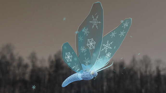
A lot better, looks great. Competition is stiff for this one going to be hard to decide who to vote for 
Yes, so many great entries! And thank you 
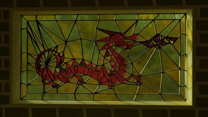
That is much better! How did you achieve the shattered effect? There must have been some procedural work but it’s obviously not random 
Good window, much better in second render, it is still made of glass so is perfectly fine as glassware.
Ah, this involves more manual work than I wanted to  Initially I followed a tutorial in which you outline the edges in vector graphics software and then import in Blender as strokes and easily get a mesh, then apply a Boolean modifier to a scaled cube - glass. Oh well, I only managed to import svg with bezier curves (that is used a reference image and added ‘lines’ where glass edges meet on top of it) and beveled them. Didn’t succeed to apply boolean modifier on a cube as it got messed up, so I cut a plane with a knife where the frame should be
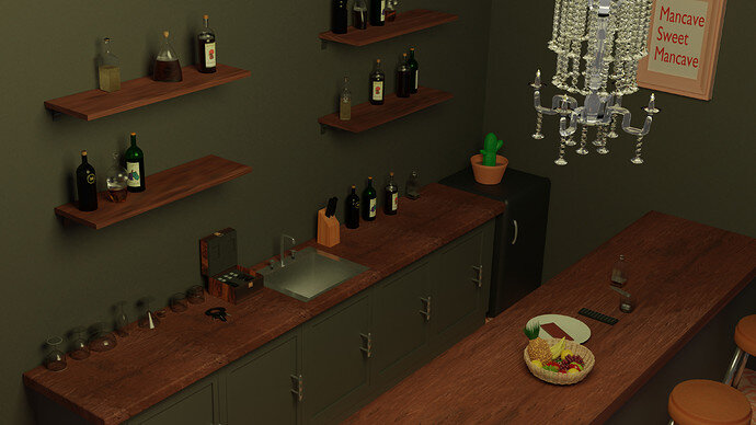
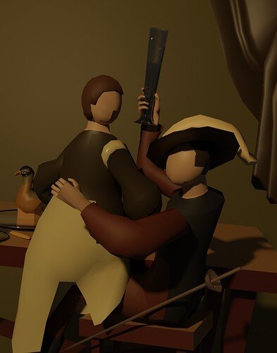
The mancave
There is even a little bit of chocolate for @Miss_B and @Digitz and more sensible choices for everybody else I think they call it fruit 

~grabs a piece of the chocolate~ Why thank you sir, and I’m loving the scene. It turned out great. 
I am a huge fan of stained glass, as I’ve done some in real life, though it’s been many years since.
Looks good especially the unmentioned chandelier! Every classy mancave needs one. 
Me too! I took a couple of private lessons a few years back just to try it  so cutting the plane with a knife a little bit reminded me of that experience and I enjoyed every moment of it
  so I don’t regret that Boolean modifier didn’t work out this time
Added few snacks. Per request 
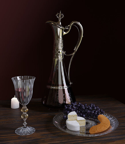
Crackers are rubbish.
Plater has a displacement map made by @Digitz. Working very well. Thanks 
And I just noticed the table has cut short on the right


Oh interesting, any chance you can link the tutorial if its Youtube or something?
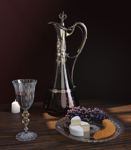
The way you implemented that displacement looks great on that plate. The whole scene looks good. Maybe add a very slight volumetric atmosphere to finish the realism. So slight that the eyes might not really see it, but the brain registers the fog.
I love this idea a lot
How is that?
I added volumetric and some window like light. Looks deeper
 But has dark area on the right
That’s really well done and the crackers are fine.
https://youtu.be/fxODjPnJbs4 here it is 
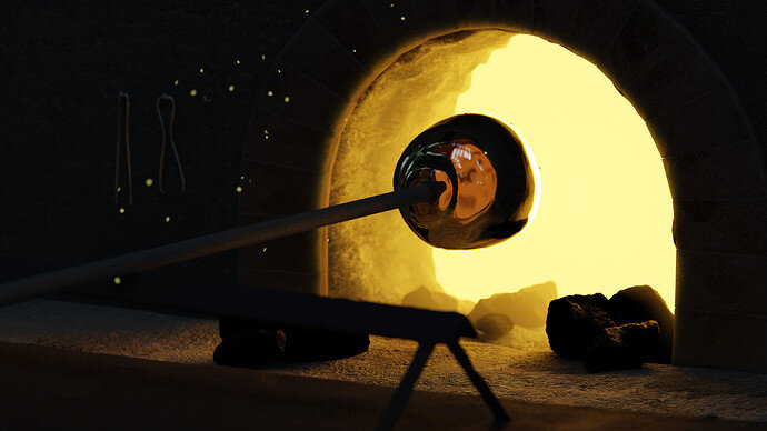
Your best “Glassware”
We @BlenderCollab have a few days to vote. You can vote fast but also think slowly about design, colors, technique, difficulty, subject, realism, etc. Choose consciously and not on your own entry.
And the new subject week 2 " Desert ” has already started. The winner of this week’s “Glassware” challenge may select a subject for week 3, 2022.
Just a rough great, Blest 
