hi,@Digitz
You can render it on (cycles) to get better results
cycles can be used for realism
nice work BTW
@Yash2009 thank you, although I’m not too sure what made you think I didn’t render with Cycles. Denoising maybe or that it didn’t come out looking as realistic as I was trying for I suppose.
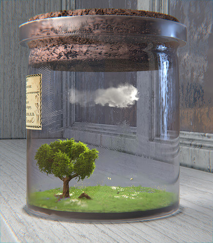
@FedPete I appreciate your feedback as always. I tried setting up a more desert type look outside the window. I thinned out the glass mesh on the vial, and added some more defined details like grunge and fingerprints to the window and vial glass too.
Lastly I thickened up the little cloud and adjusted the lighting, the colors were looking a bit too saturated.
Now this looks great 
It improved very much!
Lights, composition, colors, textures, such difficult parts of 3D design.
Now inside and outside world is more each counterpart. I like the improvements
Try to add more grass color variation. Maybe add flowers …
I wish I could but I have exams coming so this is all I can do 
Study goes first! No problem!
Success!
Thanks!
Nice improvements.
Might the cork look better if the glass had a tapered top hole it goes into? Currently the cork appears to be able to shape itself to the outside profile. I am guessing the glass is solidify modified so the internal shape is a repeat of the outside?
Perhaps the window background could be darker less lit. It might accentuate the jar with its internal sunshine.
@NP5 it’s not a Solidify modifier, it is a mesh inside and out, but easy enough to edit. Flattened out the section between the top ridge and the main “body” of the vial/jar and the same with the cork, I flattened it out and tapered it slightly. Originally I was going for the idea that the cork had expanded some over time and took on the curved shape on that part of the vial, but you are right and most bottles/containers are flat in those areas, probably to create a better seal when they are closed with a cork.
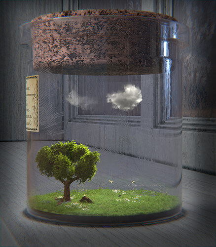
I thinned the cloud back out a little more, I felt it was too thick in the last render. I also reduced the amount of dirt/roughness around the bottom of the vial since it was taking away from and blurring a lot of the grassy area. I darkened up some of the surrounding lighting. In the compositor, I used Lens Distortion for some chromatic aberration and a Box Mask to further darken the edges so the vial “pops” a bit more.
I’ll gladly take any more feedback, but I won’t apply it to this project. Thank you for all the feedback so far too, it really helps with learning and growing as an artist.
Final edits, render and submission:
Thar certainly makes the cork feel right to me, not a distraction to the eye.
Great work.
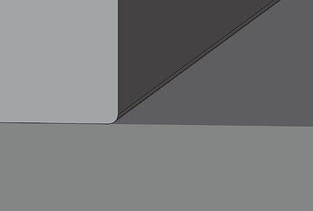
Minor thing just noticed. The corner of the windowsill and the upright really should not look like there is a crack, separate planks. Although they would be separate they would be tightly joined, possibly painted over etc. If the window is sealed, not an opening window pane, the same applies to that join. You may have meant it as dirt in the corners. In which case the dirt should be on the windowsill joining edge too. I just get the feeling it is made or folded cardboard. Not sure I am able to get across what I mean here. lol.
Ok this is what it ‘feels like’ the join is doing.
It’s from Ambient Occlusion. I’m not sure why it didn’t apply to the window sill itself.
On our Blender journey, we go from meadow to High Altitude. But don’t forget, you have still one day to cut some wood and create a real meadow!
Next week 27 challenge
Subject “ High Altitude”.
Note: If one of you in the list below, don’t want to receive a signal for the announcement of a new Blender collab subject. Give me a private message. And also send me a message if you want to be added. @FedPete
Signal: @Alex_Rusu @Ananda_Namaste @anfloy @Blest @billmih @Caleb_Kofoed @Cyndi @Digitz @Ethan_Martinez @elibyy @iamindieps @Jaco_Pretorius @JaneDoe @Josa_Booba @Kartik_Nair @Leon_V2 @Marijus @Martiine @Mateusz @Munsa @Navarshi_Mahanta @niladri_ghosh @NP5 @Orion_Dauter @Rao @Reginaldo_Junior @Seblecaribou @Sblendid @ShyDragon @Simone_Rossaini @Tanunen @Tetiana_Stasiv @TripleJ @WillyEckerslike @xMezzy @Yee @yo_johann
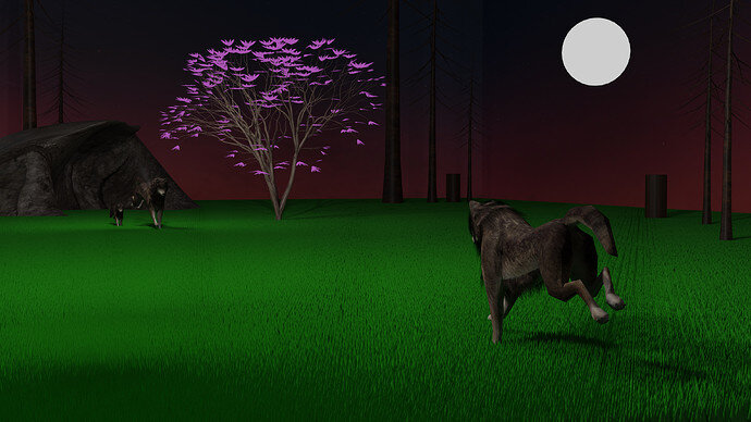
this may not look like the meadow u guys know since i used the deep african meadows as a reference…deep african meadows are inhabited by wolves,hyenas and dears
Voting entries week 26 “Meadow” theme
We have a few days to vote. You can vote fast but also think slowly about design, colors, technique, difficulty, subject, realism, etc. Choose consciously and not on your own entry.
And the next subject, week 27 “ High Altitude ” has already started. The winner of this week’s “Meadow” challenge may select a subject for week 28.
0 voters
Thank you. It’s a lot of fun to learn and practice 3D art. It’s always incredible to see others perspectives on these things too.
@Digitz , congratulations on having the winning entry for this week’s Blender collab. Beautiful performed illustration of “Meadow”.
- FedPete - Needs better (time) management.
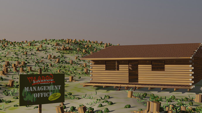
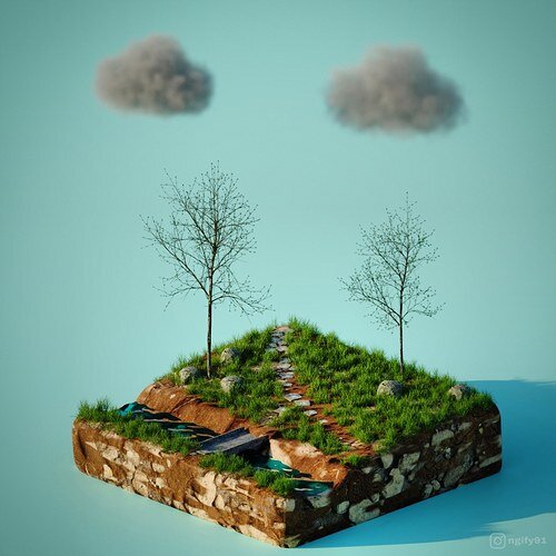
- niladri_ghosh - Lovely fine details, but green grass and (too) tiny tree leaves?
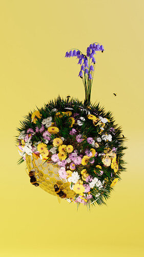
- Mateusz - For me personally, it’s more a flower bouquet. But I like this sphere idea. Make 12 for every month … or four seasons.
- Yash2009 - Details, like gravel, variation in grass colors and type. Meadow means also ‘open’, to see the sky.
- Aditya_Anumod, love this idea, great composition. But also here, it sits in the details. Grass repetitive, moon disk. Left animal contrast against the dark rock is difficult.
Just my thoughts, have fun.
Hahaha  flower bouquet.
Lol.


