Nice simulation. I too tried to simulate the smoke/fire but couldn’t get the expected result. though my expectation was lower than what you have created. 
Voting entries week 22 “Dangerous” theme
We have a few days to vote. You can vote fast but also think slowly about design, colors, technique, difficulty, subject, realism, etc. Choose consciously and not on your own entry.
And the next subject, week 23 “ Piece of modern tech ” has already started. The winner of this week’s “Dangerous” challenge may select a subject for week 24.
Some thoughts I had …
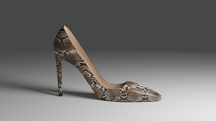
- Blest - A funny approach. By itself not dangerous, just a shoe. But the subject “Dangerous” makes it dangerous. And that’s what I like for this entry.
- Mateusz - Yes, smoke is hard to do, but it can be a beautiful technique. But becoming familiar with it, takes a lot of time and trail and error. For me this scene is more about danger than dangerous.
- FedPete - The idea is good. But spend more time on the environment (where does the story takes pace). And rule of thirds. More fog, play with camera.
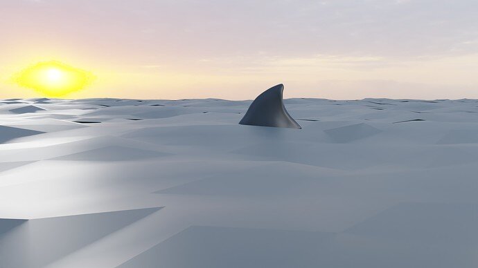
- NP5 - Swimming with a shark would be dangerous, but now you are in danger. Making the shark body a bit visible (underwater) would enhance the illustration.
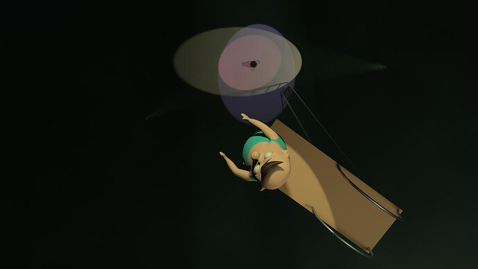
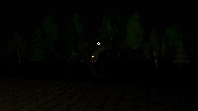
- Rao - Snakes can be dangerous, but on my monitor it’s too dark to see. Try to work with individual lights, to emphasize the main object(s). But I must admit I had the same idea. Sitting at a campfire (gives light in a dark environment), in the back bushes, trees with a lot of angry eyes. I abandon it, because of the work involved.
Good entries!
Did you learn something?
Thanks for the feedback. 
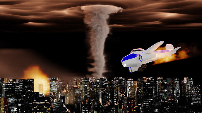
I lacked the steam in this week. Maybe my interpretation wasnt as true to the subject. But, tornado is dangerous in my understanding. Although is not in center of the scene. I gues scene in all lacks of focus point. I hoped for wildly differend outcome. I like your feedback dhough. Its good to have one with so little experience as I do.
Hey everyone! So sorry, I forgot to post my near-final project before going out of town and away from my computer for the weekend.
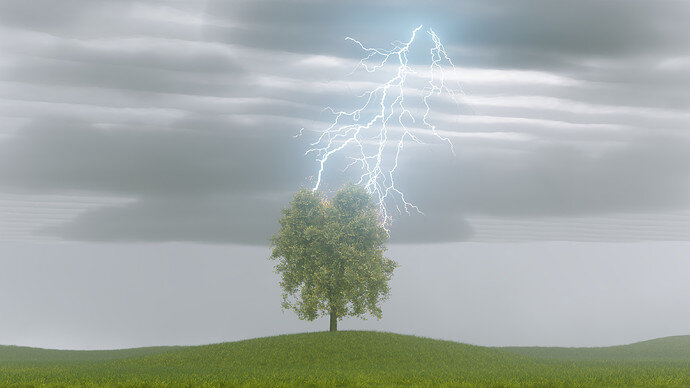
This was my first time trying a lightning effect and some of the new volumetric systems in Blender 2.9x. I wanted to keep playing with the clouds a bit more. Hopefully I will get my entry in by the deadline next time!
Nice lightning effect. I just think it needs to be darker for a thunderstorm. Life is irritating when it gets in the way of blendering!
Good point. I was having trouble finding a balance in the thickness of the cloud cover to let light through, and I ended up boosting the brightness of the environment. It would be really cool to have the lightning provide most of the lighting and achieve a really high contrast scene.
It is tricky in that for the micro second of the lightning it is probably well illuminated like with a flash of a camera, but it is too fast for us to perceive as a lit sight, we ‘see’ the flash lightning in the dark.
@Blest congratulations, walking on one shoe is dangerous …
@yo_johann nice idea and performance. It has potential.


