Changed the name. (Lost in Translation)
Added!
Such an improvement  Eazy peasy!
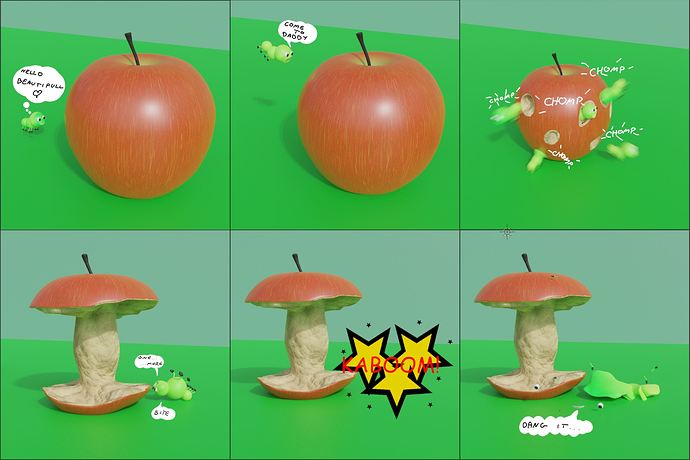
Here is my greedy worm.
Haven’t had much time this week so I made this procedural apple with procedural texture. Slapped few spheres together for the worm and arranged it in to a comic strip. Hope you like it.


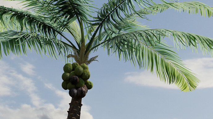
Hello! I have been reading a book about an ill fated turn of the century attempt to start a colony of “cocovores,” people who only subsist on coconuts. I looked it up, and coconuts are indeed fruits.
This palm will be a great addition to my recently compiled nature library for an environments course I am taking. I loved getting to practice these nature skills in a challenge.
Of course, there is never enough time to make it perfect. I would have loved to play around more with the lighting, as well as frame it in a way that showed off the palm leaves while keeping focus on the coconuts as a subject.
I hope everyone had a good week working on this!
That looks so real, it scares me a little!
Thanks! It’s the magic of image texturing. I had to work with the images a bit since I only had basic albedos, but I thought the displacement turned out surprisingly well on the coconuts. As far as the palm fronds it’s just a matter of putting the time into modeling each leaf and then dragging them around to look convincing.
Hey all!
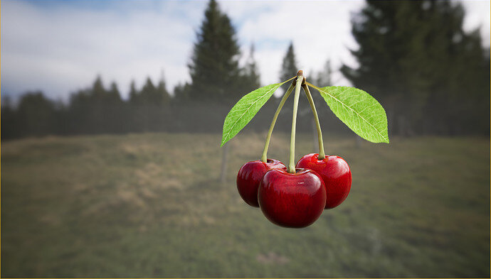
It’s been a while since I’ve been active here, but thought I’d check out the forums yesterday. Saw the topic and decided to use this as a learning exercise of my favourite fruit - cherries!
Everything painted by hand in Substance Painter, rendered in Unreal Engine.
Just noticed I had read the deadline wrong, so it’s ok, if I’m not part of the challenge this week. Thought it was today at noon 
You’ve made it. 
The collab ends here at midnight. But then, for me, it’s bedtime.
The next day I start to compose the vote. So there is a lot of time after closing and generating the vote.
Voting entries week 19 “Fruit” theme
We have a few days to vote. You can vote fast but also think slowly about design, colors, technique, difficulty, subject, realism, etc. Choose consciously and not on your own entry.
And the next subject, week 20 “ Fish tank ” has already started. The winner of this week’s “Fruit” challenge may select a subject for week 21.
It was a fruitful week. Yes, it is hard work. Having an idea to work on for a couple of days. But when to stop or when to add more. Tweak the lighting or changing the composition. So many different type of fruit this week. And so many visions. All excellent work on different levels of 3D art. Well done!
Great organic look.
But I miss a good sun burn, like Blest did. I know it is a cloudy day. But it could be brighter.
I understood your time problems.
But, from a composition point-of-view I would left out the background. Because I miss the reference between cherries and forest. If you had given it a context, like cherries op top of ice cream, then wow!
You can use HDRI for rendering, but still left it out in the total composition render. Blender is capable of doing that.
That’s a very good point - it would definitely benefit from being more grounded.
At first I thought of having a cherry fruit bowl with maybe a kitchen or garden HDRI, but time flew and decided to focus on studying the fruit itself more. Might still take it further and add a few more fruits to it in a different scene 
Trying to figure out what’s causing the UV seams on the sides though. Exported the models with UVs out from Blender to Painter, as I find it easier to paint there. In Painter the seams are not visible, but when using the textures in Blender or Unreal, the seams appear. Thinking it might be a triangulation or tangents issue when importing/exporting, but haven’t been able to pin-point it so far. Probably something tiny that I’m missing. Any thoughts?
Unfortunately, my knowledge about substance painter and export is very theoretical.
Blender can do the same things as Painter. But Painter is so easy in use. It manages all layer merging into material nodes in a cleaver way. So easy to get fine results. But at a cost, you don’t learn the concepts (theory) of merging/managing bitmaps to build normals, bumpmaps, diffuse, cavity …
Which is part of painter, but because of the intuitive UI, you don’t need to know at first.
It’s just Photoshop with very cleaver automated tasks. Building these task in Painter, that is the hard stuff.
Very, very difficult choice! Good work everyone!
No worries. And there’s definitely lots of ways to go about texturing! I’ve tried GIMP, Photoshop, Painter and Blender itself so far, but Painter is definitely my favorite 
I really like that there are various options out there and that technology is constantly improving - Blender itself has made great leaps in the last couple of years.
The tricky thing is also mixing and matching different softwares and learning which settings to use to display the desired results. In this case I figured out I had to disable “Mark sharp” on the UV seams in Blender and rebake the maps in Painter without averaging the normals. Must be a differing method behind the scenes of how shading is calculated and displayed.
Thanks. I agree, the lighting is definitely the weak point of my scene. I would have loved to play around the the compositor a bit, at least bringing up the warmth value a bit and maybe adding sun beams or a lens flare… something to signify a warm sunny environment. Unfortunately I rendered this out with about 10 minutes to spare from the initial deadline, so that will have to be a task for another challenge.


But, as I explained earlier in this thread, closing date time is a gray area.
It’s ended on the moment I’ve posted the vote list.
Excellent work this week. Lots of really strong entries and I had a difficult time choosing.
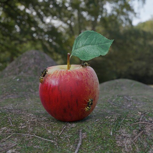
@NP5 I have to give it to you for the wasps. They are really excellent models, and would have been a strong contender for last week’s contest if they were close to in shape. Their texturing and the texturing on the apple is great as well. It’s been said above, but what breaks this composition and could definitely be improved is the ground. Rather than displacement, you could add ground debris, moss, twigs, or baby grass and just have the flat ground peeking out underneath.
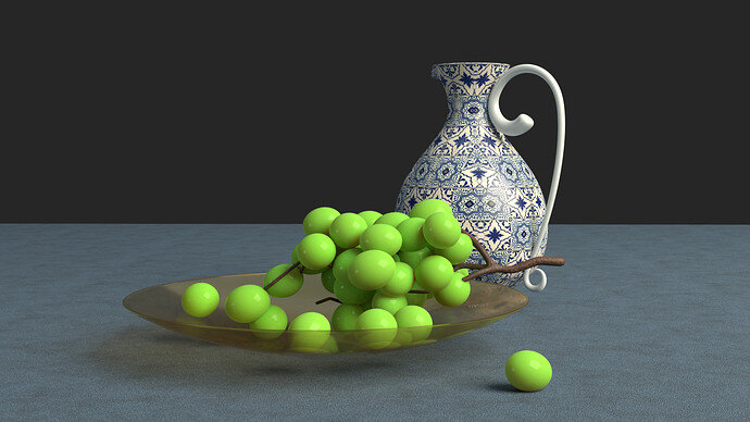
@Josa_Booba Your light values and composition are really excellent. Nice job. I think your twig and leaf could use more geometry, especially when featured so prominently. For the twig it is probably a matter of subdivisions, for the leaf you would want to use proportional editing to make it look more natural and less planar.


