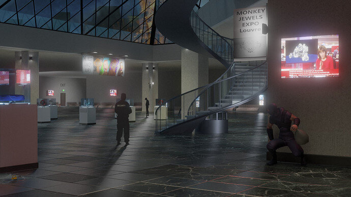
Great improvement, the story unfolds itself. It’s brighter, with more details. Love the reflections which also emphasize jewelry.
Hi. My 2c.
First: great work.
Few ideas: You recreate 2D to 3D - you did a good job.
-
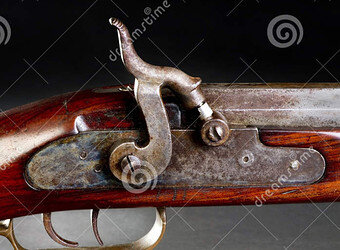
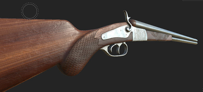
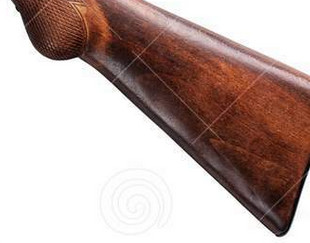
For realism, I would use more than one image to recreate some details that are invisible in your reference photo. Hammer lacks essential details. If you look at other photos of similar rifles - hammer always has something metal to hit. That area needs more mesh added.
-
If it’s in a museum - add some scratches to show it’s old an valuable. In Substance painter that is rather easy. Small imperfections gives the idea of the age of the item and the fact it was used. Also add some bumps to change light flow.(Modifier->Displace->new Cloud texture-> Make effect 0.01 or some small value that fits. Mesh -> Smooth smooth->Normals-> Auto Smooth). You might need to add Subdivider and extra loops to sharpen edges. This adds realism as nothing in real life is perfect.
-
Make wood grain more pronounced/more wood grain rahter than making it deeper. Add separate wood grain layer in Substance painter that affects only Normals.
Hi Blest.
I love your previous work. Mainly combination of unique artwork with real to life environment.
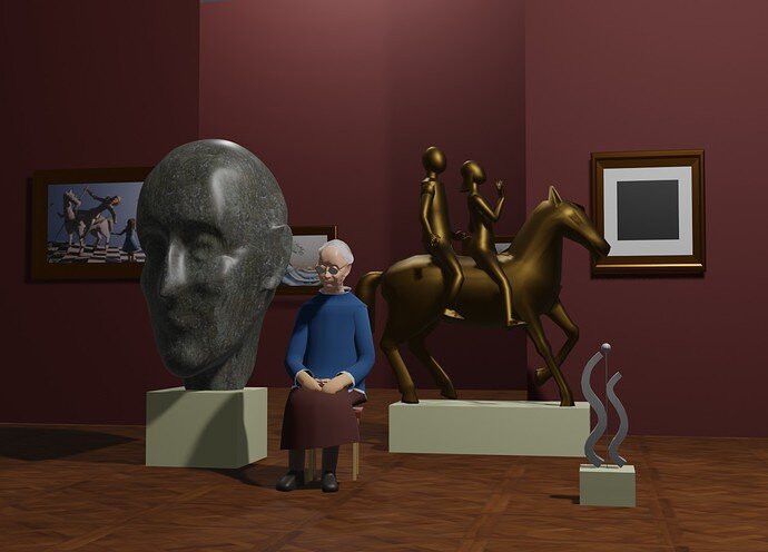
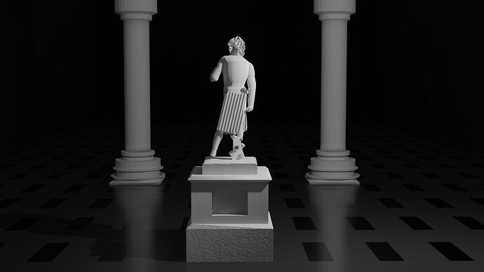
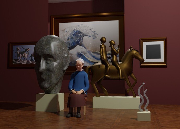
Sadly this image has the most flat illumination I’ve seen from you. No ambient Occlusion on the ground or stands. More Blender Internal style rather than Cycles.
Horse looks awsome. Black square is a nice touch. Maybe add one more as a black ISO cube in white square? Blender theme. Default Blender render but with transparancy in a white square.
I would also add some more items partially clipped by the frame to indicate that there is more in that environment that could fit in a frame.
BTW. If you create plane with a cut out - you can add extra shaddows as if cast by items that are not even there, but encrouch on the frame. You can use import images as planes and import shape of the statue that would cast a shadow?
I notice that most keepers are rather bored (museums I’ve visited) and if you put a book in grandma’s hands would create a story of what she does when there is no one arround.
Haha, I wondered if anyone would discover that mistake with the hammer. I actually have more than one reference, but only discovered this mistake after some way in the process ^^ After some quick consideration and because this work is mostly just personal practice, I decided not to worry about it and leave it as it is.  Cudos for recognizing that detail! Somebody knows their rifle anatomy!
I actually went back to Substance Painter and added some scratches and surface irregularities to the wood. Everytime I look at it now, I wonder how I didn’t see the unrealistic perfection before! I guess I was just too excited that I finally figured out (kinda) how Substance Painter works and how to add the details I wanted (soo much trial and error), that I was simply glad to finally finish 
I guess I am too impatient after the model has reached a certain level of quality… Good to know (and pay attention to) if I want to make the next step and push myself even further! 
Might I ask, what exactly you mean about the bump? I don’t think I have enough geometry on my model, to make a displacement (it’s all normals at the moment). You mean I should add that? Or do you just mean, that the surface needs some “big area” surface irregularities in addition to the small one as scratches etc.?
Maybe I’ll try out how the wood looks with more grain too, but to be honest, my thoughts are already on the next project I want to make 
 Plus, my laptop is already struggling to handle the amount of information in substance painter! My husband built me a PC set up for Christmas, but we are still waiting for the RTX 3080 to be available again…
Anyways, thanks for your great constructive feedback @Marijus
Btw, here's my little comment to your very awesome and now even better scene - if you are interested. I know, at some point one has to just call a project finished and move on!
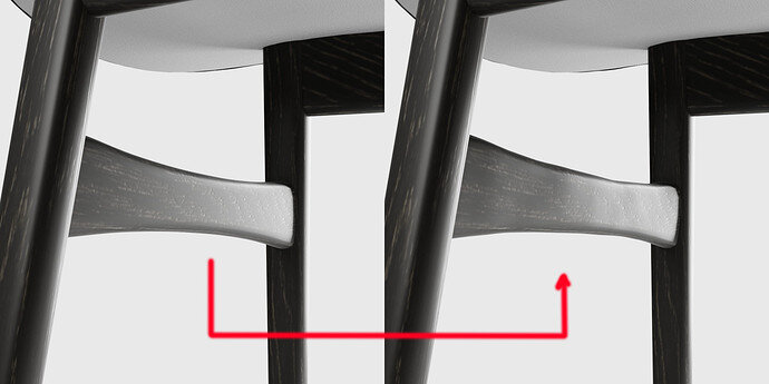
I love that “security” in your new version. The only thing I prefered from before, was that both TV and Monkey Jewels EXPO shield were better readable. Now I think Bloom and Brightness make it less “sharp”, if that makes sense.
@Blest Hi there, always great to see your submissions 
You are right on the spot. Just a bit of bump to break clean lines.
If your gun was in a display cabinet on the wall - there is no need for this, but your animation zooms in really close to it.
I see, thanks for the explanation! 
Still some hours left “At the museum”. People can start prepare the next exhibition “Retro game”:
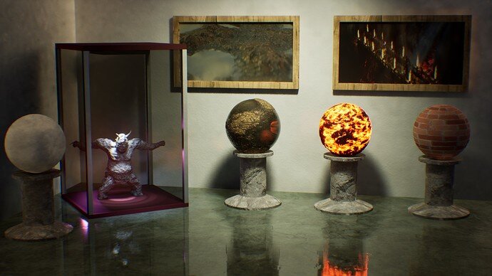
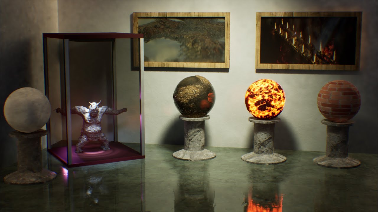
“Modern Art of Materials Museum”
Probably final submission. Too tired to improve it more…
Edit: but made a short video:
While I’m prepping for the vote I see now that the end closing date was wrong (24 instead of 27). Nobody noticed it? My apologies for this. But maybe every participant did already know the end date is on Saturday night.
So, I’m going to collect the entries.
ah, this time I didn’t notice the date as well. I’m so used to weekly cadence  . There are less submissions this week compared to the last, so maybe someone did notice
Voting entries week 08 “At the museum”
We have a few days to vote. You can go for design, colors, technique, difficulty, subject, realism, etc. Choose consciously and not on your own entry.
And the next subject, week 09 “Retro game” is already started. The winner of this week’s “At the museum” challenge may select a subject for week 10.
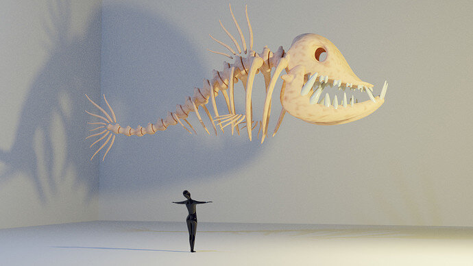
Thank you for a detailed analysis of my work. Sorry if you were disappointed with it. I made it in a hurry, fighting with drowsiness. Used previously made objects. I am not quite happy with it myself, but just didn’t have time to make essential improvements… Just wanted to make something for the theme…
it ‘eats’ to much attention …
The attention goes to the lady …
Yes, but brings dynamics to the scene… I want to think about something new. What is the next theme?
Congratulation to @Marijus for his winning entry of week 08 “At the museum” Blender collab.
Still two days to go for the “retro Game” collab. Have fun, stay healthy.
I really love this scene. It gave me the best interpretation of being “At the museum”.
And the essence of a museum. My wife has this kind of a job.
After a hard week of retro gaming, we’re getting some fresh “In the air” energetic vibes.


