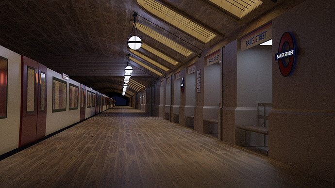
My submission…
HI, This is my first post (ever in this community). I hope you will consider my submission.
Not sure if it follows all the guidelines, so let me know. Blender 2.91.2/Cycles.
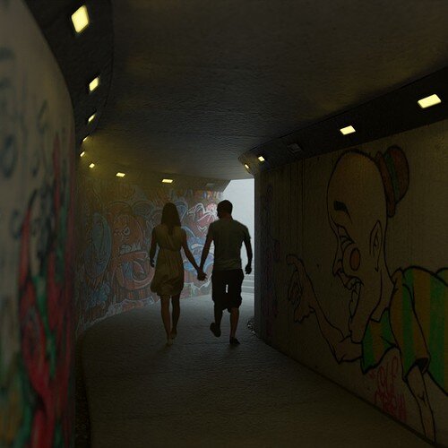
What is the idea behind the low camera point of view.?
 Voting twice
  I’m just kidding.
I must say I find the way in which you can log into GameDev very unusual.
When I started I used the authentication server of GitHub, because of work related Udemy courses. Then I did Blender 3D, still using GitHub to login on GameDev. But the new 2D Drawing course lead me to different login procedure.
Can we vote more than one? It is really difficult to select only one submission! Can it be 2 votes per person?
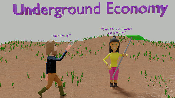
Reminds me of the Ninja Turtles, so the cartoon-ish style fits.
Hi, welcome. A very nice entry which reflects the “Underground” theme very welll.
We don’t have very strict rules! Only a week to work on a subject, the last image you added to the thread will be used for the vote. You can reuse from other projects but try to make it a learning process (new things).
We always appreciate it to see a project log in a different thread. Just to watch and learn, giving feedback in an earlier state. But that isn’t necessary. Just a reply like you did, is enough.
Have fun and a warm welcome.
That’s a good question because I thought about that a lot. I’ve been studying arch-viz and apparently a rule is to have the camera at head height or realistic helicopter height.
In the end it was the path dimensions and an aesthetic choice, it keeps a bit of symmetry and focuses on the dropped flowers. I tried head height and it lost a lot of appeal, it would have needed figures and shoppers to become a working image again.
(I’ve logged out of my old account on all devices so using this one fully now)
When I won the last challenge I thought it’s bad timing with having two accounts just at that moment, because it could look like that.
I voted for @NP5 with this account and didn’t vote with the old one. I thought about voting for my second favorite, which would have been @Blest, but didn’t and Blest was one vote in second place. 
 Karma …
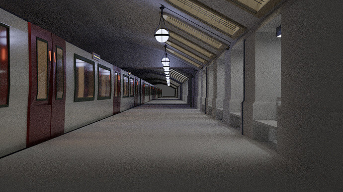
Made some station interiors and aligned the scene, also facing problem in panning around with the camera as the scene is of small scale. Next step is to add in some textures and tweaking up the lights. Maybe remodeling the train as I can the low poly triangles here n there. Hope I could submit on time. 
Great work so far getting the whole platform and walls done. Nice lights. Reflecting well in the train windows.
If I might add 2 cents - You have angle windows with no lights - put through some cool white arealight to simulate sunlight.
Add volumetric fog with in the area to get some god rays. Keep in-house lights warm white - it will add two contrastic colours and should make your image pop a bit more.
Guess who was there  I start to late so i never have time on lighting and camera settings, I have to find some good tutorials about that.
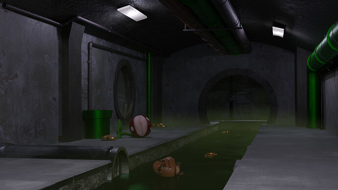
@Orion_Dauter Like it a lot, but i think fog is too dense and I can’t see the details or it’s just my monitor settings
@Exitus19 ninja turtles are close to my heart, I like this style.
Edit: i forgot to add image 
@Marijus I’d love to get some cool ray effects but still don’t know how to get there, already went through so many tutorials. Like I wasn’t even knowing about the spin tool, wiremesh modifiers n so many other stuffs. But I’ll surely try some fog if it’s not too time consuming. Thanks for the tip. 
You only have a few hours left to finish work on “Underground”. And what you find in the underground, you can display it “At the museum”.
The new subject for week 08. Have fun, keep it safe.
There are few changes you can make with a few clicks.
- Shade Smooth the roof. To preselve sharp corners, Object data Properties > Normals > Auto Smooth.
- Where you can, add edge bevel. Edit Mode, Select edge (ctrl+e) > Bevel, mouse wheel add few subdivisions. Repeat above on the same object to have smooth corners, while retaining perfect flats.
- Delete one of the doors, mirror then array. At the moment they are a bit diffferent.
- Make back wall black/dark gray to imitate dark tunnel with no light pass the station.
Overall - great work. I just wanted to share few tips that I have missed in my early days. Keep up the good work.
Denoise option
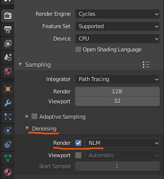
More samples is still better for low-light and interiors.
The viewport one is also useful.
Thanks all for sharing such important tips, I tried to tidy up the scene, but I know it could have been better. And unfortunately I couldn’t complete the texture part: my mouse’s done, just managed to add in a simple texture, with keypads. Mouse is really a big deal  .
.
Anyways this will be my final submission.
And it was fun to be a part here, also learnt new things. 
Because of the new texture, I find the lighting much improved.
but maybe, it is a more personal taste.
Great entry.

