2021 Collab: Week 06 “Fast” - CLOSED

I’m not English native speaking.
With “view look motion” I try to express the following.
Viewers look at an illustration and their eye (interest) zig zag over this image. From interest point to interest point. If you do this correct, you tell a little story inside this illustration. You try to guide the viewer in where he/she needs to look. That’s why the rule of thirds comes in place.

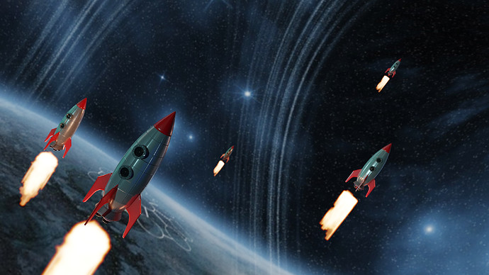
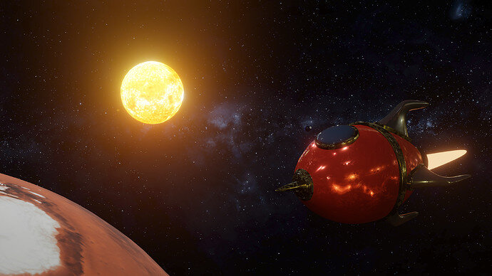
Your rocket flies in a positive direction (left to right for our western world) It’s flying to a star (direction),
the curve starting from this star then goes downwards and intersect with the planet. Which has a visual line and connection with the rocket. This is really good!! You guide the viewer.

But the crossing of planet and ring? is nearly falling outside the illustration (No rule of third).

This theoretical stuff is very difficult! If you are good in this, you are a real artist. Do not worry too much!!!

2 Likes

Okay, I still have time to geht something done and give some thoughts into it!
No english here, top :slight_smile: I’m from (german) Switzerland.

2 Likes

@Exitus19 Switzerland? No way, me too. ^^

@FedPete Thanks for the tip. Maybe I can shift some lights around if I get to it :wink:

3 Likes

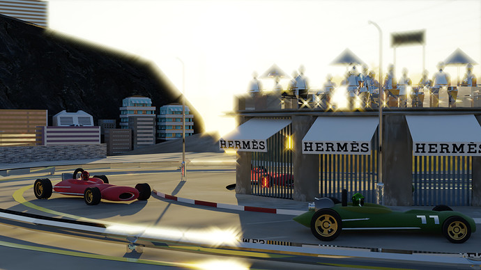
Thank you. It was hard to get the balance right because the more I turned it up the people looked like realistic silhouettes and it had a great effect but the other reflections were too bright so had to even it out.

2 Likes

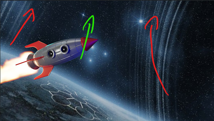
To make it more confusing to you (sorry!) I must say that I like the current composition of the image. The only change I would suggest to make is to align the rocket direction with the direction of the planetary discs.

I’m also not native English speaker so let me show it on picture:

image

red arrows show “movement” of planetary discs (or whatever that is :sweat_smile:), the alignment of rocket movement with them (green arrow) would make stronger effect of movement in my opinion. This doesn’t necessary mean that simply rotating the rocket will make this difference, maybe rotating the discs will be better, maybe camera position needs to be changed as well.
3 Likes

Yes I understand!
Pro’s do not render a still image in one go. They divide everything in 'part’s, so that they can tweak each part in the compositor. While we just render a bitmap, they create not only a bitmap in part but also all kind of other render information. Like Z-depth, AO, etc. In composition tab they use these extra bitmap info to change all sorts of things.
Like your brightness in front (has a Z-dept), can be lowered.

I have no experience in this, but I see a lot of tutotials.

3 Likes

Thank you, that’s interesting and good to know. Something for the future.

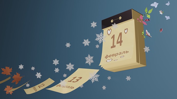
So recognizable. My wife has a lot of the these calendars with horoscopes at the back.

3 Likes

Arriving at Mars! not to scale.

14 Likes

Can’t see?

Just add a new version to the forum, don’t update an existing one (you can, but that all comments doesn’t logically works). When creating the vote, the last image entered will be used.

2 Likes

We got some great ones this week!

1 Like

Still some hours to burn before we go “Underground”. A new challenge created by JaneDoe, the weekly winner of subject “Love”.

Be Fast to send in your last render in 24hours or so. We are closing this challenge as fast as we can.

3 Likes

Voting entries week 06 “Fast” theme

We have a few days to vote. You can vote fast but also think slowly about design, colours, technique, difficulty, subject, realism, etc. Choose consciously and not on your own entry.
And the next subject, week 07 “Underground” is already started. The winner of this week “Fast” challenge may select a subject for week 08.

0 voters

5 Likes

Great entries everyone!

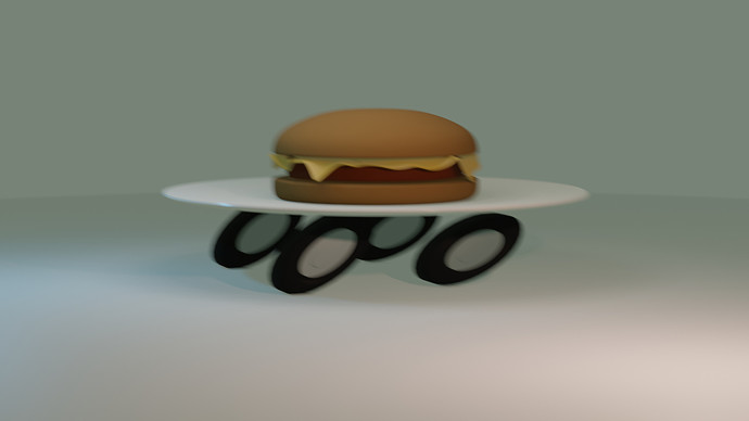
Was experimenting with motion blur but could not save the composition… :cry:

Good luck!

15 Likes

That’s a very good one! Sadly you couldn’t make it in time! Could have been my vote!

2 Likes

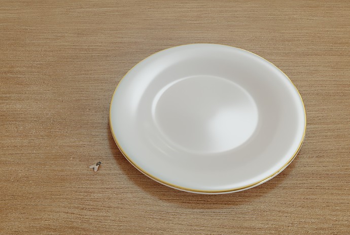
For any that do no get my entry. It is fast in the meaning of choosing not to eat.

8 Likes

That’s exactly what I thought it meant. :wink:

1 Like

Great I just wondered if is was a bit cryptic for non native English speakers. :smile:

2 Likes

My first thought was that whatever was on the plate - you ate it fast, as you wouldn’t be setting a plate out not to eat.

3 Likes

I think Sblendid nailed the theme perfectly, the crystal is amazing.

FedPete, I love the humor, as always.

Had to give it to Blest, the story telling is simply superb, it made me feel nostalgic, sad, happy and so many other emotions, it’s an outstanding entry, simple, yet extremely powerful.

1 Like

Privacy & Terms