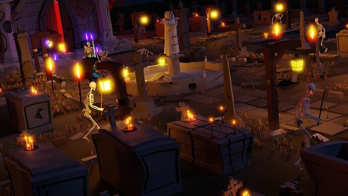
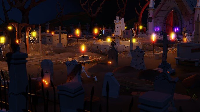
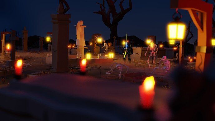
Good lay out, of a graveyard. It may look better from a human eye height?
Definitely! There is so much detail that it would go to waste only showed from bird’s eye view. I will do multiple shots
And after putting so much effort to individual elements there I think I even my try to record some simple video out of it…
I was thinking you are making assets to develop a game related to dead men.
But to be honest - after making all those models (there are 282 right now, not including some helper things like curbs, grass patches)… I was thinking about mabye making a small game with them (action rpg?) or maybe even polish them and release them on some asset stores…
Good idea…
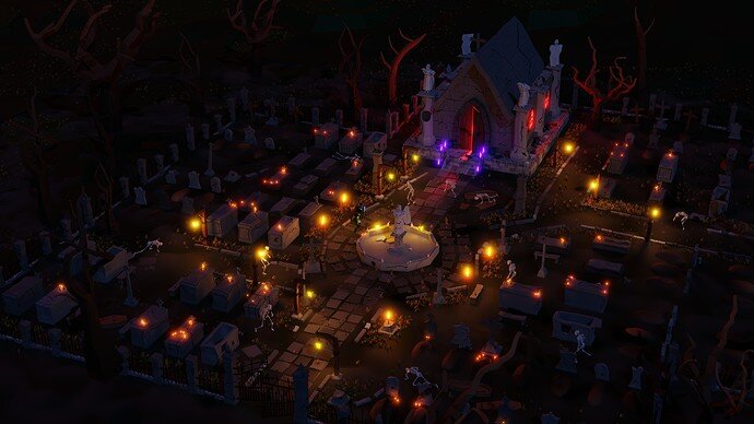
Day 25: Haunted Graveyard.
Time: 6h (but feels like 12 )
A few shots:
Making the scene was really tedious in Blender. There are loads of items so no other way around it, but my experience with level design tools in unreal and unity suggests to me that I would do it faster in game engine. Placing stuff like candles was really tiring…
Edit: just counted… it took 14 days to make it (including skeleton and knight characters)
Edit2: Oh, skeleton eyes are not glowing! Made a mistake during importing the skeleton from different blend file… Re-render time…
Edit3: Re-render done. Subtle change, but I like it. And uploaded jpg instead of png. Can’t see the difference in image quality, but the file size is much smaller.
I respect that you stuck with your own challenge! Great work. All the models are really nice as well, but your self-motivation is impressive.
Really great result makes a big difference the night lighting and all the glowing!
This. Thing. Looks. Awesome! Could definitely see it as a game map. Lots of great assets, and nice detail with the cracks and things.
Day 27: Catapult.
Time: 4.5h
And a short clip from all angles:
And viewport view:
The Catapult mech was my favourite design when I was younger and playing Mechwarrior 2 game . It’s awesome to be able to model it… though I struggled a lot to model it.
There are multiple variants of Catapult in the lore + multiple interpretation of those variants. Here’s one reference I used:
Day 28: Shield
Time: 1.5h
And viewport view:
This one was actually hard to do. I tried to keep nice topology, so that when I subdivide and use smooth shading it it would still be nice as a base for high poly model. I failed with the ornamented one… I would have to introduce huge amount of additional geometry… or maybe separate the ornaments from the base and use separate geometry… That might be my future learning goal on how to do such precise hard surface stuff in high poly.
I’ll probably keep it simple as today till the end of the month. Keeping the daily regime and focusing only on low poly things is tiresome…
The border ‘gold’ thickness varies round the edge of the shield.
Yeah, that’s true - good eye. I messed up the workflow for that one. I should have though about adding the border before adding loop cuts and bending the shield and applying the modifiers.
I could probably spent an hour or two trying to fix it, or redo the shield with the “ornament” entirely. The left shield has all the modifiers in place, so redoing is probably the way to go…
Thank you for the feedback!
Oh, nice one care to show wireframe?
(such a simple object on first glance, but isn’t that straightforward, isn’t it?)
Deleting out verts for low poly was most of the bother. I have assumed there was one central bend, but beveled main edges.
Thanks!
Now I see even clearer why I struggled:
The vertical loops are just making a mess out of things…
I had begun to see those in the render. If you wanted them for extra bend they could be useful. But I set out assuming the quarters were flat. Made half and mirrored.
For realistic/high poly mesh they would be useful. For low poly not so much… Sometimes I tend to loose the “low poly” focus out of my mind…