Hi Franklin,
Welcome to our community! 
During the past few years, Unity made a few changes to their Terrain tools. For this reason, it is unlikely that you’ll always get exactly the same result as Rick.
The goal in this section is to make a decent looking terrain, not to copy Rick’s terrain 1:1. Creating your own terrain following your own preferences is encouraged. The terrain consists of the mesh (shape), the textures and materials/shaders. The lighting also affects how the terrain looks.
In past versions of Unity, the lighting sometimes did not work immediately. That’s why Rick’s meshes sometimes look greyish/ ochre-coloured. To fix this, he should have gone to Window > Rendering > Lighting Settings. At the bottom of the Inspector, he should have clicked on “Generate Lighting”. Disabling “auto-generate lighting” also fixes certain issues with the lighting.
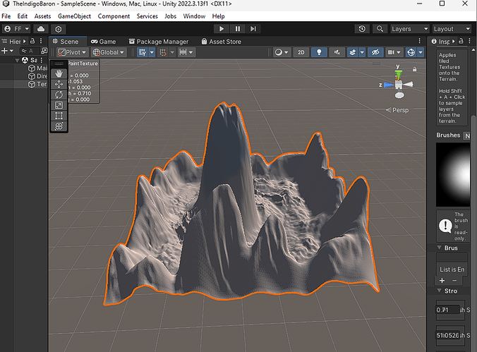
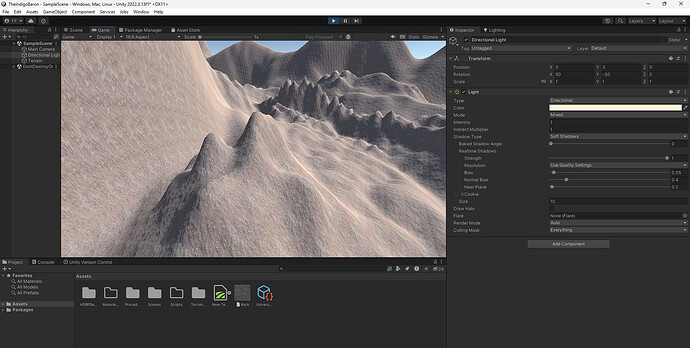
To be honest, I don’t see any issue in your screenshots. Your terrain looks fine to me, especially in your game window. What would you like to change and/or improve?


