Always interested in reading your thoughts.
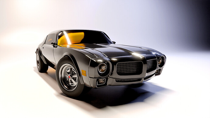
I choose no 1 cause its brand new 
I choose the first one, it looks brand new and sleek. Also, I like black cars. 
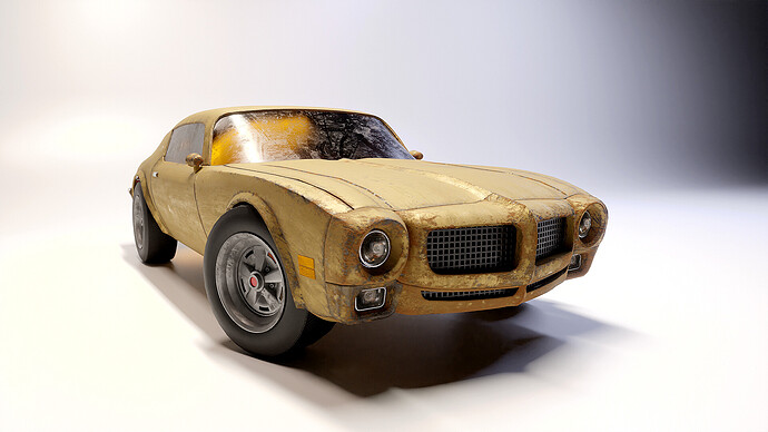
The yellow car has been improved after your first presentation, well done. Much better wear and tear. But the presentation is missing the same “dirty” environment. Like presenting this car in a cleanroom …
I like both versions. But the yellow one involves more 3D techniques. So it’s my favorite.
For the first car, I would go for a bit of HDRI imagery or Nitisha Sky texture.
great project!
Thanks, I appreciate the feedback. The yellow is my favorite as well, it looks like it has more of story to tell (unintentional rhyme right there). I will update each of the images with your recommendations in mind. 
 . I appreciate the feedback
 Thanks for the feedback
People who can appreciate the techniques that went into the second one would like the second one more. It’s certainly more technical. But in the eyes of the general public and a beginner like me who is just learning about UV Maps in the spitfire course right now, can’t imagine what has gone into achieving the worn-out effect. I think If I had more context on why it’s worn-out, I could appreciate it more. Without it, it feels out of place. In a world where we are used to AI photo filters, no one can truly appreciate the work that goes into some stuff until they do it themselves.
As a graphic designer who works with vectors, I have often felt proud of some of my more intricate stuff, only for the client to completely gloss over it because they changed their mind as they only see the artwork and do not understand what goes into it.
Appreciating the second for me doesn’t have to do with its complexity. In fact, I started Blender wanting to understand how to do these worn out effects for old machinery. I hope I didn’t offend you in any way.
I would also like to see your vector art. I’ve been trying to find free programs using vectors to incorporate illustrations with my renders. Some of the letters I had in my other images look jagged. Which program is best for vectors?
Not at all. I think I didn’t communicate well. English is not my first language. What I was saying was for a subjective interpretation, the context matters. The first one makes sense if you were using this as a prop in a modern city. However, if you wanted to create abandoned ruins or some sort of dirt chase, etc the second one made sense. So, I was just doing a deep dive because you were looking for “why?” as in the title. In the absence of the context of the scene, people will choose what subjectively looks good to them. The context can be an appreciation of the techniques used or even the context of the scene, like what caused it to get worn out, etc.
Which program is best for vectors?
I use adobe illustrator.
Looks really good, big improvement lighting-wise when it comes to the presentation over the previous post. It’s also good to see that some of the holes got patched up.
Definitely prefer the first render it’s simpler but also a lot more realistic.
The worn-down one is ok but to me it’s just not quite there yet. It needs a fair bit more work to hit that realism threshold.
The body is scratched up and rusted but it’s too random and clean, the tires are also in pristine condition among other things.
Scratches and rusting don’t happen “just because”, of course, you do get some happening in random or odd places but a lot of the time there is a “pattern” to it.
Think about what caused the scratches and rust. Did the scratches come from impacts, wild animals or weather? Same for rust, where did the oxidization come from? Rain, mud, air moisture, chemicals, water buildup etc.
What’s the story behind the wear and tear? Where was the car stored away or left to the elements?
I also think some dirt and dust would go a long way to enhance the effect, maybe even moss or grass which can sometimes grow on top of vehicles.
The model itself could use a subdiv modifier, if only for the render, to smooth out some of the visible polygons. You’d probably have to crease some edges but assuming your topology is good it shouldn’t be too much work.
Also, this is a nitpick, but the indicators on the side should be flush with the body or even slightly in it, not protruding.
Overall it’s a solid model though. Great work.
I appreciate the detailed description of each image. Placing a subdivision modifier is definitely do able. I’ll work on the dust / moss. Thanks again. 
small input for car no 2. Grille and lamp looks out of place from the condition of the car. It needs to show signs of deterioration as well. It would be great if you can add glass crack or maybe bullet hole depending on the story you’re trying to tell. The tire still looks in good condition despite the wear and tear of the car body. Maybe deflate the tire to match with its condition. Hub caps can also be more loosened. Is car no 1 and 2 the same car in you’re story?
I haven’t really thought about a story for each of the versions or considered them being the same car. However, I like the input of them possibly being the same car. I may change the yellow color to black for the second version to infer that they are indeed the same car ( as well as the cracked glass and tire details). I also thought about having the lower portion of the bumper detaching somewhat. Thanks for the feedback. 


