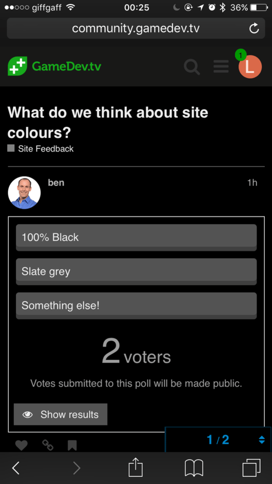
- 100% Black
- Slate grey
- Something else!
0 voters

0 voters
What about making the colour scheme (except for your black bar and green logo) - something like the colour from a popular game, where the contrast is already nicely done, sonic, mario that type of thing… it would be in keeping with the theme of gaming too 
Its perfect as it is, I hate white ANYWHERE simply because i have a stigma in my right eye so it refracts light differently, White = migrane.
Also black/white or grey/white as is now works fine for colour blindness as well i believe. Although i dont know of any myself i am sure at some point someone will appear and need the forums set up so they can read it.
This is an interesting point, thank you @Marc_Carlyon, often you do see some websites have the option for increasing font sizes at the click of a button, or changing the colour scheme to something which I think is typically more high contrast. If the colour scheme here were to change (some people may find the greys a little less happy) it might well be worth considering, not sure if Discourse already contains functionality for that, but seeing how it’s pretty capable of so much already I would be surprised if not.
One further step from that I suppose would be to offer a small select of different themes which the individual user could choose to please themselves, or in the case of visual impairments, help with readability (and the avoidance of the migraines etc).
I think it’s fine how it is. I prefer the darker backgrounds to the lighter one, especially when looking at a screen for hours on end (which I do on a daily basis).
If I was to be picky, I’d say go slightly darker if you can, but definitely not straight up black. Dark charcoal looks a lot more professional in my opinion.
@Lizzie I’m on a pc, but want to switch to linux when I can do everything I need to on that set up.
How are you liking the new logos, and background images for the course categories?
I think they look good. Maybe a little large for my liking personally, but having images represent the categories is a definite plus. You can see at a glance exactly what what you’re looking for. 
dark theme seem to be good for better vision and focusing, just like steam website. so far so good 
Visual Studio 2015 dark theme! As a coder, I can’t watch black font on white background for too long
Colours and logos are all looking nice
I’ll consider this “good enough for now” and mark this as solved.
Thanks everyone, no more forum changes for a while I promise!
I find the darkness a little oppressive. Not sure if it’s just from a phone that it feels that way.
I think you may be in the minority… I’ll poll it.
0 voters
Bright theme isn’t work well for me. It gives me a headache after awhile.
Anyhow, some other forum gives their users option to change their theme/skin. It might be a good consideration?