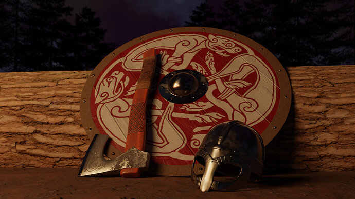
Viking Gear for this week's collab challenge (PPE)

This is a progress thread for my entry in this week’s challenge. Come check it out! Anybody can join and have fun while we practice our skills together!

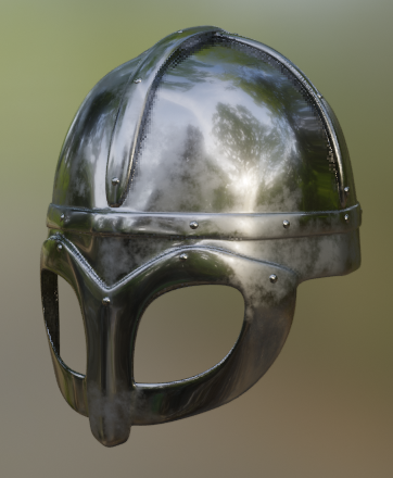
I’m making a viking’s personal protective equipment: helmet, shield, and axe.

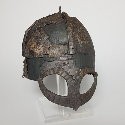
Modeling the helmet after the Gjermundbu Helmet:

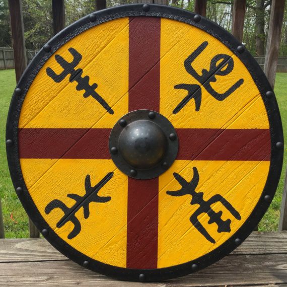
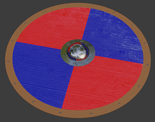
The shield will be something like this, though probably painted differently:

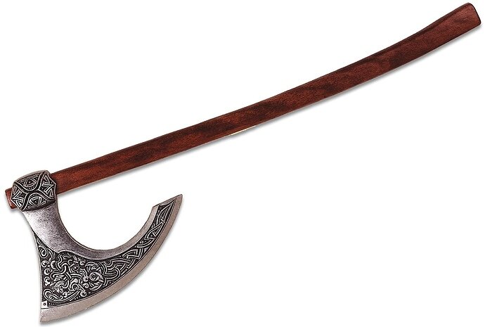
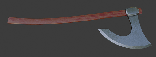
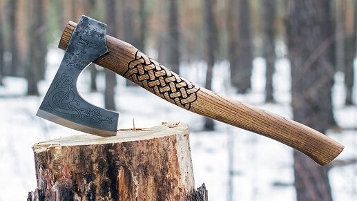
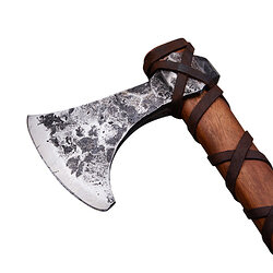
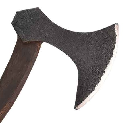
And this is the axe:


I’ll be hapy if I can replicate that engraving. Might be tricky.

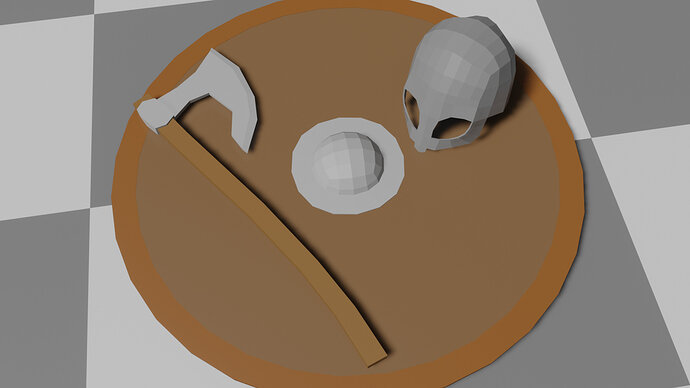
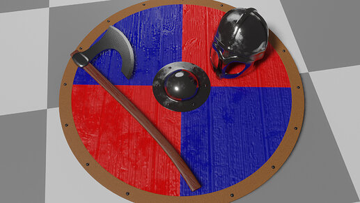
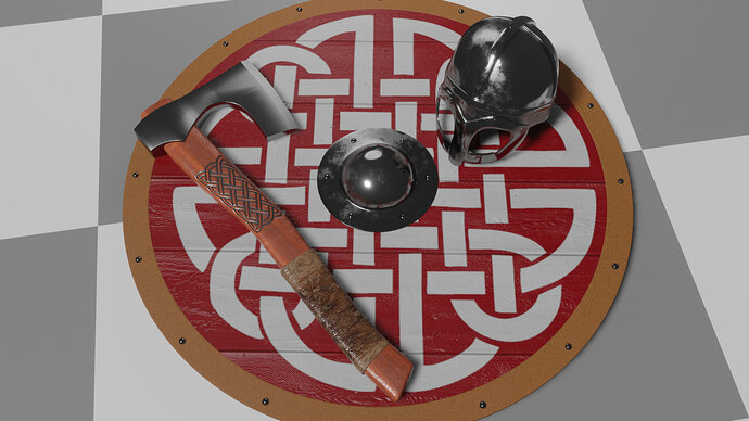
Here’s a basic block-out of the scene:

Now to do some detailing! I’m guessing most of my time will be spent on textures, trying to get the metal, wood, and engravings to look right.

I also found a page of viking quotes so I’m going to try to post one with each update. Here’s one that seemed fitting:

A man should have his plans worked out before he enters into great undertakings or incites others to them.

~The Saga of Ref the Sly, c.8

5 Likes

I expect a full chainmaille hauberk too!

4 Likes

Ooh that would be very cool, but tricky. I currently don’t know how to do chain mail, but I would like to know. I think I’ll finish these three first and then see how much time I have left. Thanks for the idea!

Added a level of detail and some basic textures.
2020-06-29 12_21_57-Window


I think the modeling is mostly done. Now the majority of the work will be on the textures.

There is more honor in accumulating little by little than in reaching for the sky and ending up flat on your face.

~Vatnsdæla Saga, c.7

6 Likes

Looking really good man!
These could be game assets already, though your goal is to get a high quality render I’m guessing?

1 Like

Thanks!

Yeah, I’m going to try to get a detailed render for my official submission. However, I’m trying to get in the habit of making duplicates of my models as I go along, at each detail level . That way I still have the asset at multiple LOD so that I can put the lower poly/detail ones into a game later if I want to.

I realized the axe I was referencing was actually a two-handed axe, which was not what I wanted, so I decided to change the design to this one:

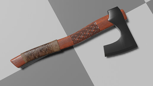
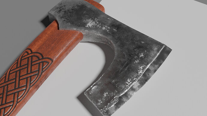
Here’s my new version:

Luckily I hadn’t spent too much time detailing the other one. I spent a few hours detailing this one, so I’m more invested in it now. Haven’t done the textures for the head yet.

Here’s how the scene’s looking:


Got some new shield textures too, but not sure if I’ll keep them. I may end up doing a more dynamic arrangement of the items before I’m done, as well.

Many breakers of battle-axes are more brag than brains.

~Grettir’s Saga, c.4

6 Likes

Axe handle is very nice if a bit shiny. How did you do the knot pattern, is it modeled or just texture?
All coming along well though.

1 Like

Thanks!

It’s a texture. I used this method we talked about a few months ago. Basically, I used a second UV map to place a black/transparent & white image, then used that image to modify the color, roughness, and bump. If anybody’s interested I can make a more detailed post.

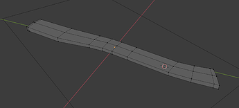
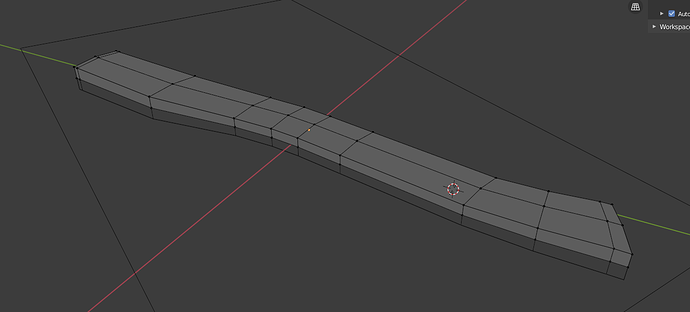
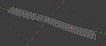
The geometry of the haft is very simple.

raw:

plus mirror modifier:

plus subdivision surface modifier:

2 Likes

Spent too much time on this today.

It’s getting better, but I’m not totally happy with it. I tried to add an engraving but I might get rid of it.

My favorite part is up by where the head meets the haft, so I may go for a more corroded look all the way to the blade like either of these references:

MY100826_2

When men meet foes in fight, better is stout heart than sharp sword.

~Volsunga, c.19

edit: Went with a rougher look for most of the head. I like it better. I think it’s another “simpler is better” situation.

7 Likes

I like the snake engraving on the original reference, but the one you did looked a bit confusing, so I can see why you removed it. if you can do the snake, like the original reference, it might look cool. also, if the blade is that worn, then why isn’t the handle more worn? I’m being nit-picky, it’s really awesome work, Tyger!

2 Likes

Thanks man! Those are good points, and I appreciate the feedback. Ideally I’d like the handle to be all nicked up and looking battle-worn, but it may be easier to make the whole axe cleaner.

About the engraving, I used that other one because I couldn’t find a picture of the one on the blade. And you’re right, it’s kind of a mess. I should probably just try to extract the original straight from the reference.

I might have to leave it for now though, since there’s only about a day left in the challenge, and I want to work on the scene.

Loved your entry by the way :joy:

2 Likes

Made a lot of progress today.

  • rearranged the scene
  • added a log
  • added trees to the background (made using sapling tree gen. addon)
  • did a little texture work on the helmet
  • added a sky
  • added a dirt ground
  • added a fire as a light source (just a picture of a fire, actually, set to emission)

If anyone is interested in the details on any of those things I can add more info after I’ve had a sleep. One more day to make changes, and I will probably still try to put some finishing touches, but it’s at a point where I’d be OK submitting it.

Often times it is not numbers that wins the victory, but those who fare forward with the most vigor.

~The Saga of Thrond of Gate, c.19

6 Likes

Amazing work! Just a bit, tho, your axe is intersecting with the shield, tip of the blade, see it?

3 Likes

Good catch! I didn’t even notice that until I read your comment.

1 Like

Oops! Thank you! Going to do some more work on it now. Will definitely fix that.

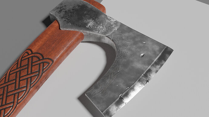
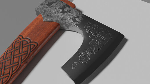
Brought back the smoother sides so I could try the engraving again. This time I just traced over the original image on a transparent layer in GIMP. Then used that image as a texture for a bump node.

Definitely my favorite incarnation of the axe head, so I’m going to stick with it. Thanks for the recommendation, @Bradley_Bowers!

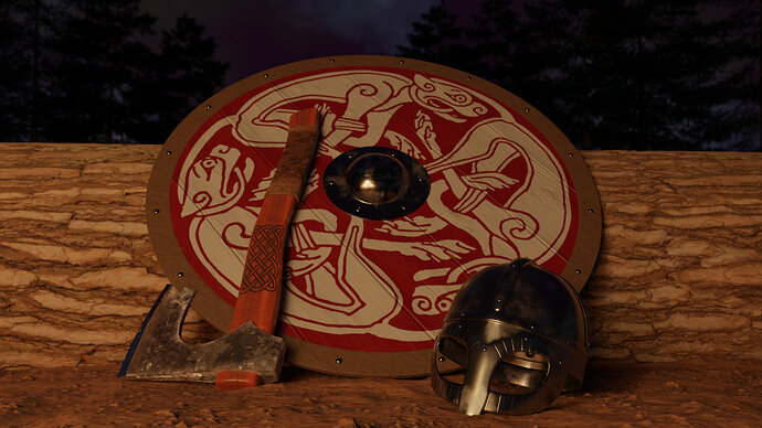
And here’s the finished scene:

This is how I will submit it for the weekly challenge (Check it out if you haven’t already!), but I may keep working on it later. Pretty happy with how it came out, but there are still some things I would improve. Namely:

  • Battle Damage - How much cooler would it be with dents & dings on the metal, chips and splinters in the wood, maybe even some blood splatter!
  • Chain mail - maybe a hauberk (as @NP5 suggested) hung over the top of the shield, or across the log. At least some hanging down from the bottom of the helmet for neck protection as I saw in some reference photos
  • Maybe do a real fire simulation for better fire light/reflections?

Many are wise after the event.

~Fljotsdale Saga, c.19

What do you guys think? How could I make it better?

4 Likes

Looking great.

The damage, ageing, thing is tricky. So many portray old eras with aged ‘antique’ looks. Yet the scenes are supposedly of the time when the items were new. It is like doing a modern street scene with all old rusted cars. Unless soon after a fight, battle, such items were prized valuable possessions and would be cleaned, maintained, well looked after.

2 Likes

Privacy & Terms