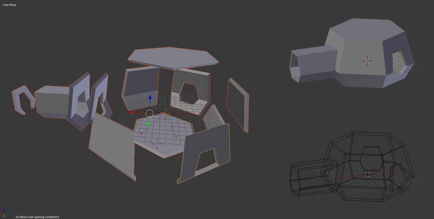
I tried to follow Michaels grid of basic elements. But at the start of this Section 07, I decided not to make a church, but follow a hexagon structure, making a space something … see my previous sketch.
But without the rectangles, it was a struggle for me to keep things in line with the floor grid.
I decided to keep the strategy of low poly design, with interchangeable components. But to build first my basic structures, space dome and a corridor in low poly. Then to extract parts of the structure, getting components which I can change to higher detail levels, or styles when needed.
As Michael mentioned, keeping a simple but effective naming strategy is really required. Because the parts are exploding in number and detail. But I like it, I learned a lot.
My corridor deconstructed, new detail element of a window added.
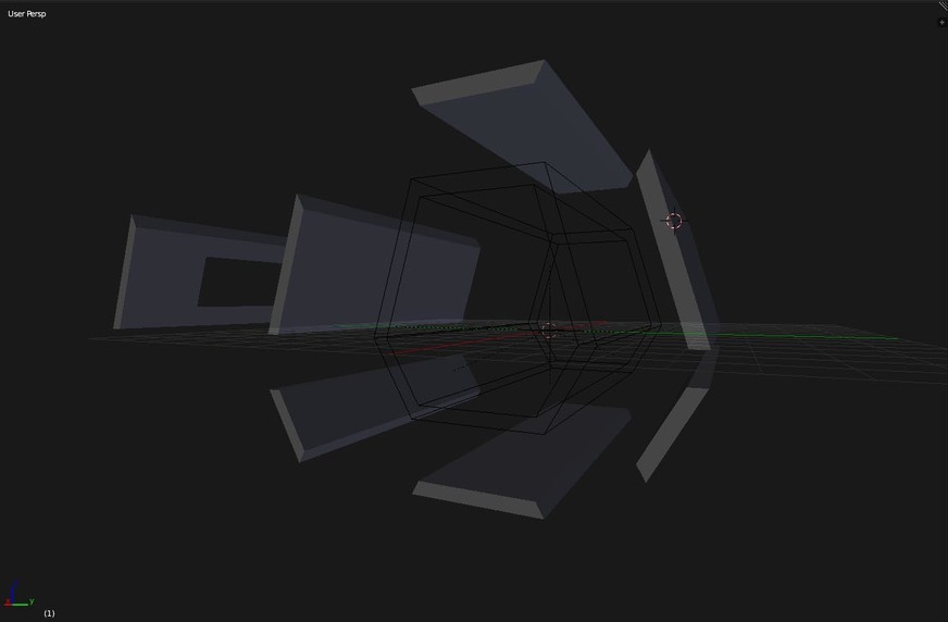
My original concept was, on paper, a hallway - a corridor. I got carried away with the modular concepts and the grid.
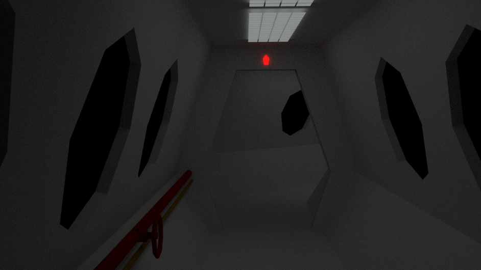
I decided to stick to the original plan. Here’s my test run, lights only. There should be a sun some where … I think I need to tweak the glass. I keep the hexagon theme. But drop the hatch (there isn’t much room for it). I think about something else.
Yes, I like the designs. I noticed the technique of designing walls with angles at the edges. I used this in Radiant Editor for Call Of Duty Series. Could be a Space Station. Well done.
Hi @Velcronator. To be honest, I abandoned this project. Michael uses a church for the lessons and I thought to combine that with my space thing. But then the lessons became difficult to combine with my project. So I decided to build the church, to follow the lessons instead.
But I will work on this and already did. I came to the conclusion, the scenery composition is not very interesting. My goal is to make it more a mystery.
I agree. I’ve been following the coarse as well. It’s interesting to see how others think. It’s easier and more usefully to follow the coarse but it’s also fun doing your own thing. Looking forward to the next bit.
!! WIP !!
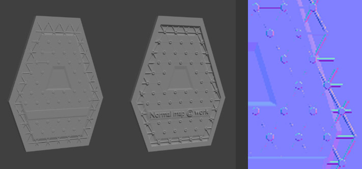
I do not like the textures! I will drop them. I like the more dark, tight atmosphere in the draft scene. Problem is, less lighting, lot of fire-flies… And space look requires hard light, sharp shadows (outside scenery).
Position of the astronauts leg, isn’t … dramatic enough. Looking for some imaginary scene. Why a only a leg? I don’t have the time to do a full astronaut.