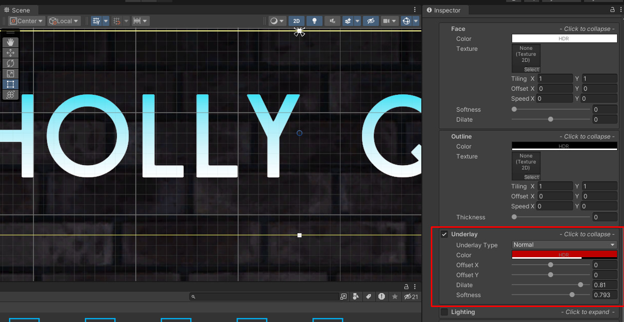
Hi,
For some reason I can’t see the effects applied for my text. I even tried to follow step by step, but I still don’t understand what am I missing here
I tried to do this with various fonts, thinking the problem might be in some font structural things, even found the one mentioned by Gary, all to no avail
I’ve tried it, sure. The problem was in inactive/invisible effects options (all of them were invisible with any options).
Thanks for the advice and your willingness to help, I appreciate it, but it was not the issue, unfortunatelly.
I’ll leave it here, just in case somebody will stumble upon the similar problem too.
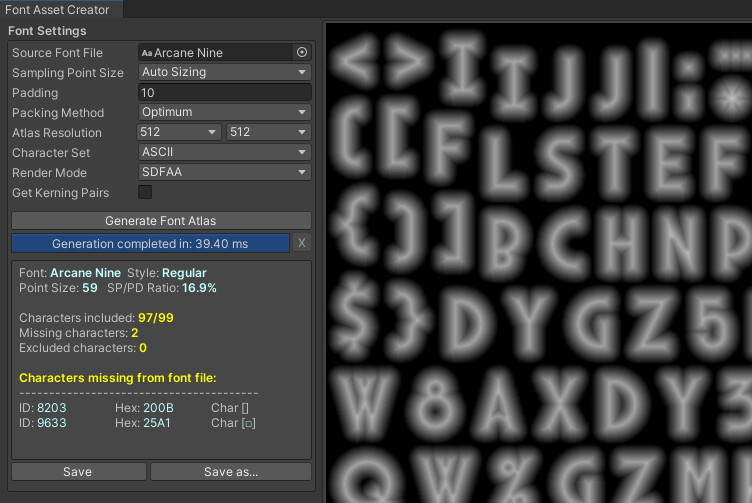
The decision was to delete the asset and generate it again, but with padding.
Whilst generating with padding, make sure it is SDFAA, not SDF.