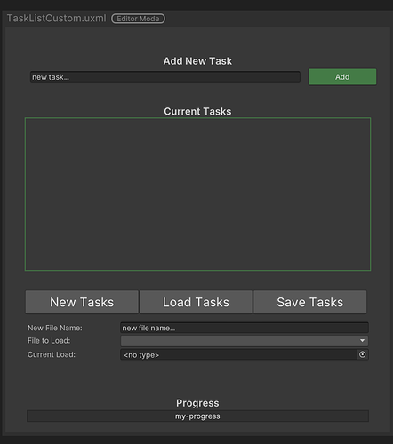
Here is my version of how I would ideally design the Task List UI:
A couple things changed is that I would like to keep all my “file” buttons in one place. Preferably side-by-side at the bottom of the task list (this just feels more natural for me). I would also like to rely on a dropdown to choose from existing scriptable object files (if that’s possible – I’m thinking retrieve a list strings for the drop down and calling based on the string selected when load tasks is shown; I think it was mentioned this was based on enums though which probably requires a bit of a workaround.)
Then I would like the current file loaded to be displayed – preferably grayed out and uninteractable if possible. I’d also like to create new scriptable objects directly from the UI.
Lastly I think it would be cool if we could replace the toggle text in the current task list with textboxes that the user can adjust in the UI directly (have to think a bit more about providing some limitations on that control – perhaps an additional Edit button shown side-by-side, transforming to a save button when selected – to limit that control).


