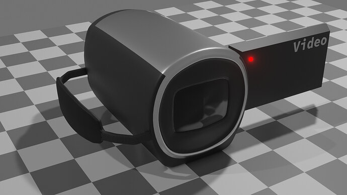
Added the record light because it was bugging me.
Nice parts.
Can see where you used them! 
Something not yet ideal about the balloons. Is it that real ones are a bit translucent? Somehow needs more rubbery than plastic effect. No idea but something is off to me.
Yeah you’re right. Something about them looks too solid. Translucency might do the trick. Should have consulted references but I was just going for quick and easy to try to finish before the deadline.
No, but when importing (Apply), you can choose to use a collection, or object or mesh.
But without extra attention, your model will stay in the same collection as the lamp and camera.
So those object will be imported also.
If you create bigger projects, with more reusable assets, place them in collections. Including empties, booleans etc …
Oh that’s a good idea! In the birthday scene, I added an area light to represent the screen shining on the dad’s face. I could put that in a collection with the camera so it imports together.
Also thanks for the feedback! On anything I post, I hope you guys will let me know if you see something I can improve.
add (burn) a tool logo on it.
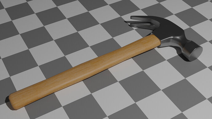
The wooden part needs more hand grip… wider at the end (use reference).
Brand new hammer. To me, the handle is too squared. As well as not shaped as FedPete refers to. Of course, it may be local variations perhaps hammers are like that where you are.
Now, look how the handle is elliptical, and how that affects the attachment of the head. Hitting end, should have pronounced bevel. (see link image)
Out of interest do you have wedges holding the head on?
You do have a good linished metal texture on it with the lines going the right directions though. Good hickory wood colour and grain.
Thanks for the feedback!
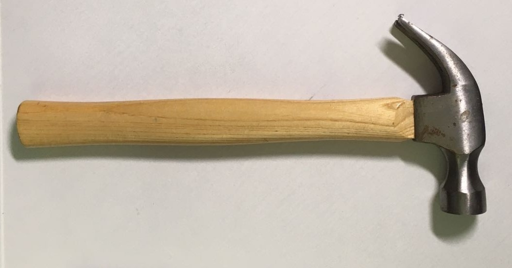
@NP5 Whoa that hammer looks almost exactly like my hammer. This is the one I used for reference:
I think I matched the profile correctly, but maybe I should make it more pronounced.
Good catch. Fixed that.
Looks a little too new, IMO. If I were going to spend more time on it, I’d try to add the rust/corrosion you can see around the edges, and just try to dirty it up a bit in general
Not sure what you mean. I think I know what you mean by the bevel, where it dips in just under the head, right? That would definitely make it look nicer. I thought about it, but decided not to since it was just a quick project.
Thanks! I was pretty happy with that. Made it with nodes and UV mapping to get it going the right directions.
Textures.com! I haven’t figured out a good way to make procedural wood yet or I’d be using that for all my wood needs.
That would look really good! Not sure if I’m going to take the time though  …
…
Here it is with the more rounded handle:
I think that’s probably where I’ll leave it for now. Maybe later I’ll get the urge to detail something. Thanks again!
Great asset !
keep it safe !
Really love the present, great texture you put on it.
Thanks! I was pretty happy with how that came out.


