This course is really speaking to me, and I’m trying to challenge myself in limiting coding and photoshop skills. In the Player Experience lecture, Rick speaks a lot of using your intended “feeling” for the player to change every aspect of the game through two or three words that you want the player to feel.
I intend to have a fantasy style RPG and the three words I had were Heroic, Needed and Mythical.
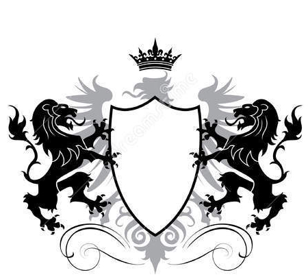
In Diablo 1 and 2, the health bars were more like spheres. I wanted something similar, and when I approached my wife for a recommendation on a “heroic” health bar, she said how about something to do with lions, so I found this image.

I took the time to learn how to turn a solid white back ground to transparent, AND how to select the inside of the shield only, to fill it with the health bar asset we were given, which took me a couple hours. I know we were told not to focus on one element too long, but I REALLY want to challenge myself to do what I envision.
I ended up with this.
As proud as I am with myself for figuring this out, it quickly dawned on me when I inserted in the scene, I’m not sure how I could make only the second layer of the photo move, to change the health status. I then assumed I need two separate images… but I’m guessing it would take extra coding to accomplish this. I don’t suppose anyone out there might be willing to supply me with the coding to make this happen?
I know it’s a lot to ask, but I’m proud of what I’ve done and I really don’t want to lose my progress. Perhaps Rick or Ben could make a new section in the course while helping? 
Any responses are helpful, even if its to tell me I’m crazy and too ambitious. Thank you.
edit: I really am proud of the second image. In photoshop, the health bar extends FAR above and below the shield, but only appears inside the shield. If only I could force that into Unity too it would all work perfect! 


