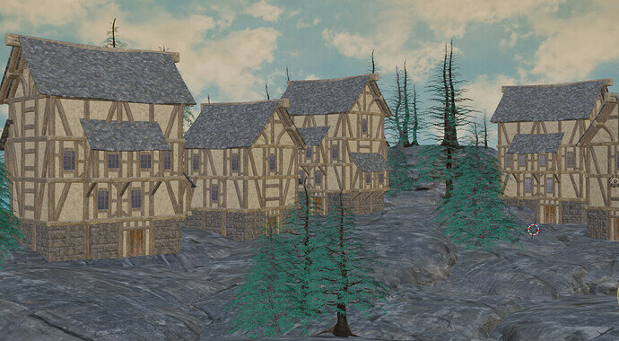
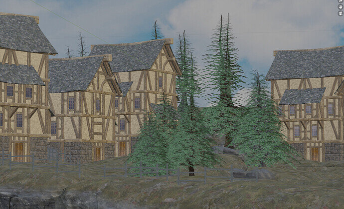
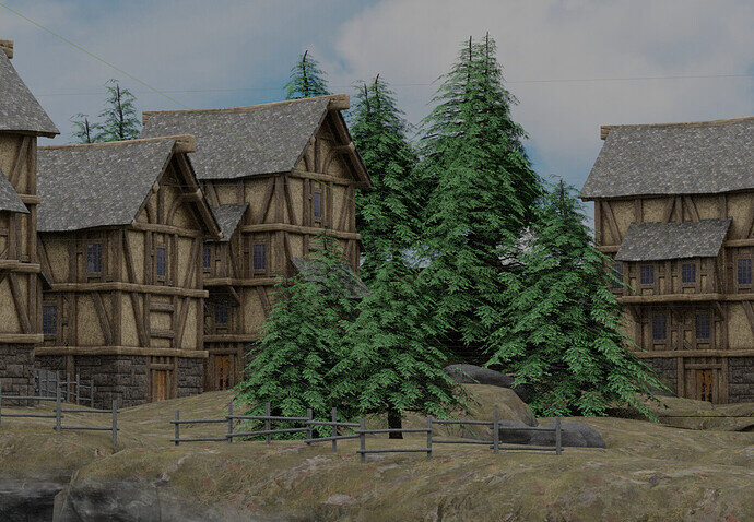
Does anyone know how to make my distant tree branches look less skimpy? I’ve tried downturning them, but the leaf images just seem too thin or something to show up.
After a bit of experimenting it seems the addition of the background is overwhelming the branches. I have no idea what to do about this.
You could turn the lighting down on the background and up on the scene. But it all looks a bit overexposed in camera language, washed out, over lit. No shadows, so no lights in the scene?
Certainly I think some experimentation with lighting would be the first step.
Thank you… yeah up to that point there were no lights per se. One thing I found that was an issue was that when I went from Material Review, to Reder Preview, they all popped back in.
I appreciate the response!
Material Review
Render Preview
The preview is just a preview with lesser information. Also, it’s using Eevee, the render is probably Cycles.
- you can also randomize the leaf’s rotation a bit. less see through


