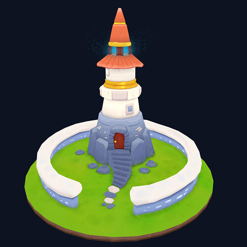
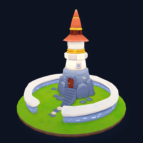
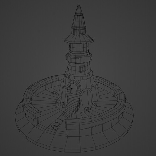
Wanted to go with sth different to learn more from this course:)
5 Likes
A wizards tower! I like the added features. I can imagine a short awkward wizard waddling around its halls.
I would suggest adding some colour variation to the white areas and the red cones at the top. They look very flat in these renderings.
Excellent work.


