
1 Like
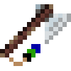
I think the placement of the shading is actually pretty good, the problem is that the two lightest colours on the blade are too similar and hard to differentiate. Fix that and you’ve got a solid piece. Maybe a bit on the string/decorations too - just a single highlight pixel could add some dimension.
2 Likes
hmm were would you suggest putting the highlight on the string??
1 Like
It’s already pretty light, so I’d maybe just do a darker shade where it meets the black, or one at both ends. The handle’s very textured, so next to it at the moment the string looks very flat. It doesn’t need much tweaking, just enough to convey some texture. That or reduce the texture elsewhere in the picture to bring it all together, but I really like the textured look you went with.
1 Like