Thor's Hammer

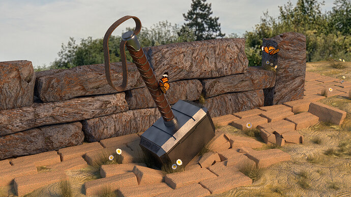
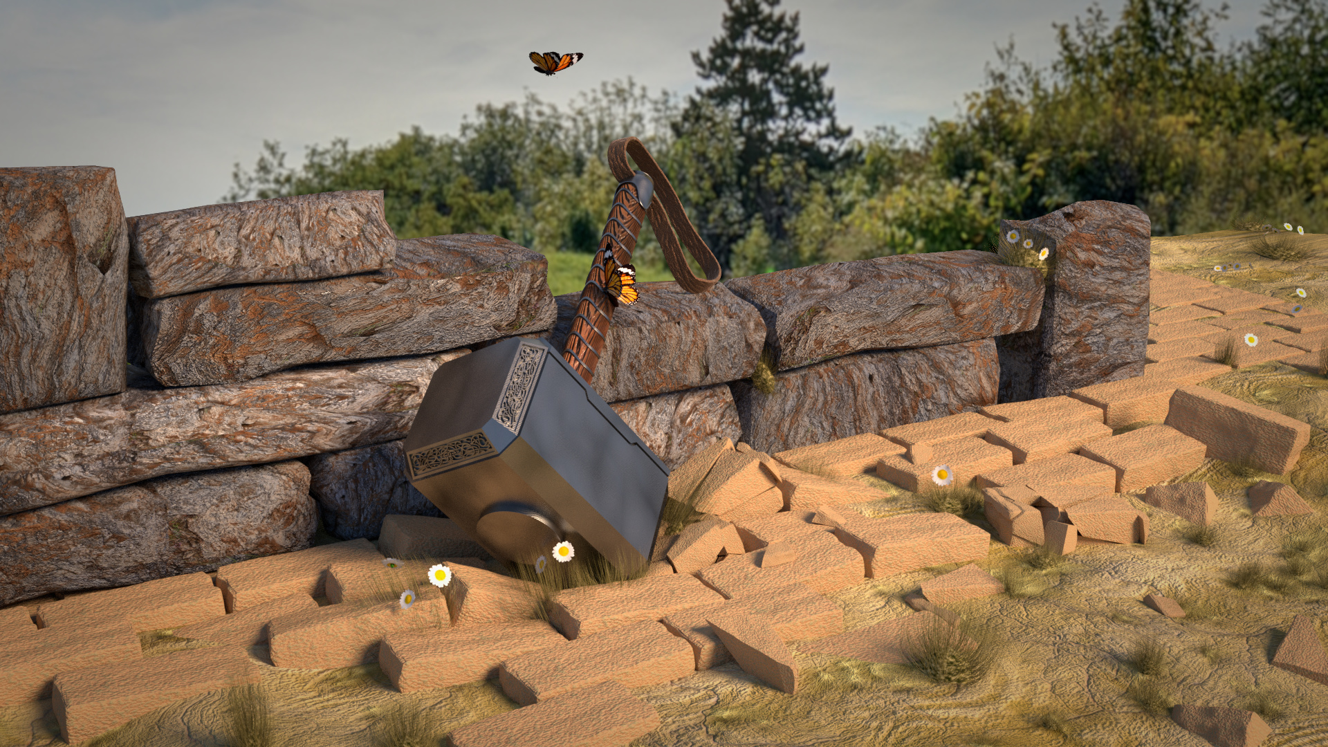
Ok, after much help on the forum. I changed the following;

  • Darker grass and increased sizes, more grass surrounding the hammer.
  • More daisies, pointing to camera
  • Added slightly more colour to the image
  • More bricks
  • Rock wall minimized shiny reflection, scaled the texture (much improvement here).
  • Added butterfly, from an other project I did (re-use :wink: ). Which bring more life into the picture, like the daisies.

Render time about 10 minutes, samples 32.

2 Likes

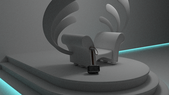
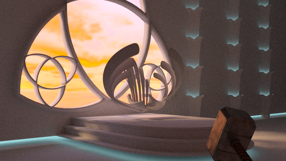
Test run with hammer near throne.

Here I experience some scaling issues. Because how big is the hammer? And how big is the throne. I think I need some sort of reference object. Like a book or a person. Just to give some reference on scale of the objects.

2 Likes

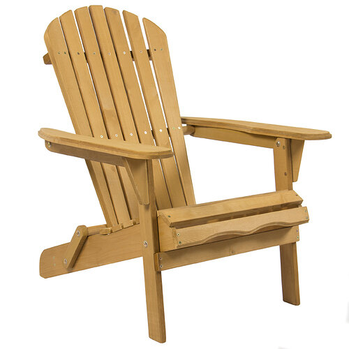
I really love that chair. :smiley:

So many legit improvements in this man. It’s looking way better and I think you had really good instincts with the butterflies especially the one on the hammer hilt.

They go super well with the little daiseys and give off this feeling of calm, the war is over, perhaps by means of this weapon, its almost like a little monument now. So in short you are giving a story by what you’ve added which is sick ;)) Also those daiseys coming out of the wall, fit in with that theme of sorta rebirth/renewal.

The color of the hammer has an interesting dynamic with wall color now, but i’d like to experiment with a few things and see if they’d work better for ya xD
New%20Hammer

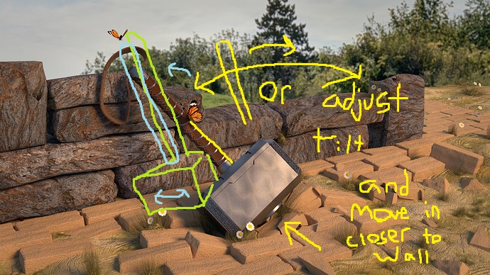
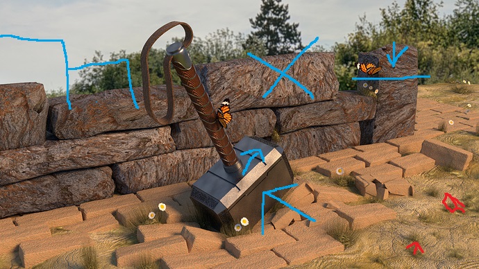
Sunken bricks just a couple somwhere down bottom right, a sloped wall by adding a few bricks and some adjustments on the other end.

I also thought it would be cool to maybe have the hammer rest against the wall, in that way it sorta says, a job well done. Adds in to that peaceful vibe you got going on there. I think it would also feel more natural to have the hammer lean against the wall somehow.

I probably should have colored the sunken brick idea blue too haha but its sorta sketched in the bottom right for ya xD dont fret about the placement of the hammer lines, those you will have to experiment with it a bit, it was difficult to grasp with Paint lol

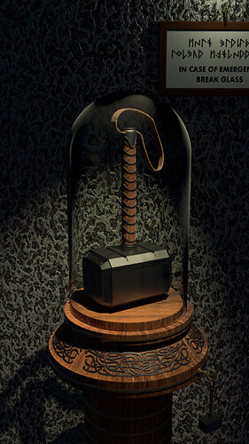
So, a change of scenery. Emergency only :wink:


(note to myself: It’s a pity that the second hammer is bit in the dark) .

5 Likes

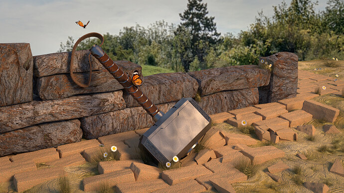
What I changed; :slight_smile:

  • Added more (hidden) bricks bottom right
  • Tilted the hammer towards the wall
  • Moved some wall stones
  • Move butterfly
  • Added vignette to the scene

4 Likes

I like to think that those two butterflies and Thor and Loki :slight_smile: Thor is the one holding the hammer, obviously :slight_smile:

I like the new location for the second butterfly, it felt like a little bit of a distraction on the wall before.

Moss for the stone wall perhaps, around the bottom? The bricks a great but look very new… I don’t know a lot about the mythology for the hammer but I assume it can’t be damaged, thus should probably be the only “new” looking thing in the scene, bar the butterflies…

2 Likes

:rofl: It’s so funny these new ideas. Never, ever thought about the symbolism of Thor and Loki as butterflies.
I like these comments. So much ideas …

When I started this channel, I said it’s not about Blender, but about composition. The story of the image.
By definition, the hammer is (nearly) indestructible. And yes indeed, the surrounding of the Hammer, should give an indication of the time, it’s lying around. But to be honest, I miss some skills to fix that.
The scene is becoming more and more complex. But that adds the fun to this project… It’s hammer time :wink:

1 Like

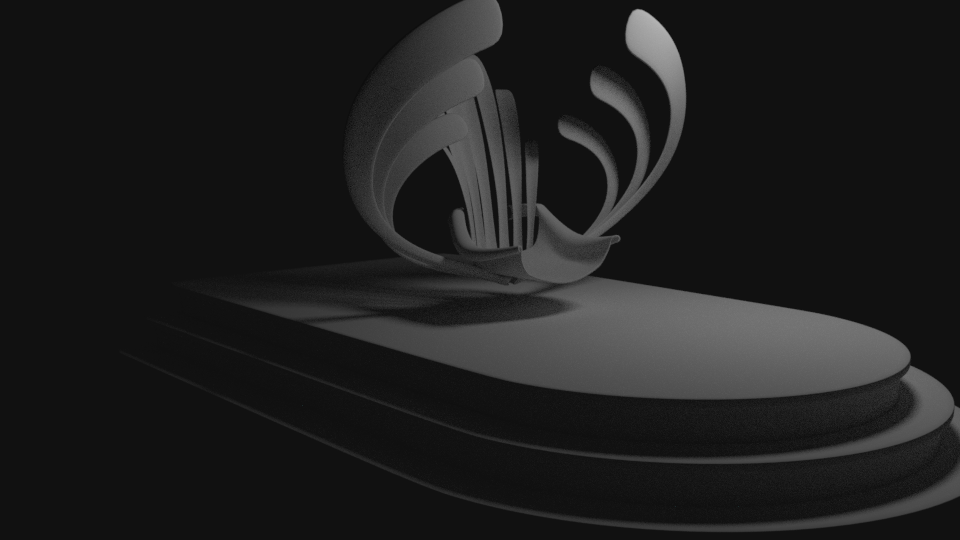
A single light source, with no background. Gives a dramatic touch to the scene.
It’s not my intention. But a design path I could take.

Throne%2007

4 Likes

Thor’s hammer look amazing, You thinking of doing more weapons in the future? love to see them!

1 Like

This is so cool man! This picture is solid all around xD Freaking nice.

1 Like

Loving the new direction with the chair man xD No more sofa vibe haha xD

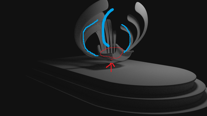
The back is off for me though, I think mostly because of where it starts and it reminds me of a lawn chair a bit lol

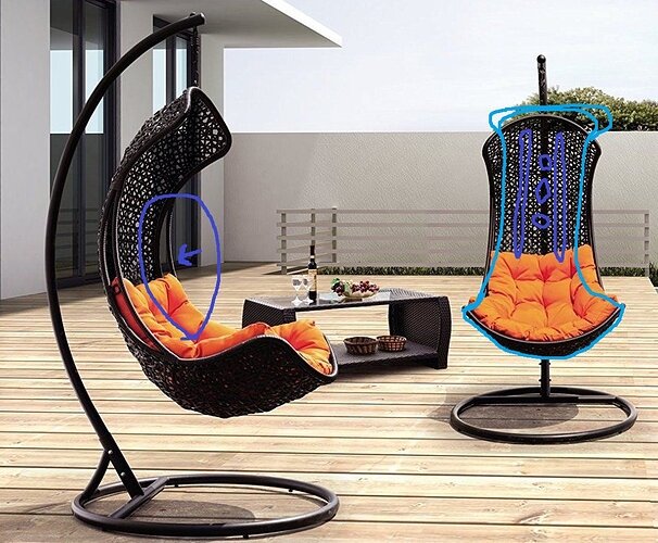
The connection is a little odd as well right where the back comes out of the seat. I also think you could maybe have the curve of the “boards” go towards the person sitting in the throne that way it sorta matches the wings on each side.
New%20chair

Here is an idea for the back that matches the base seat that you designed, I think you could maybe get something neat out of this friend,

I think the shape of this chair is neat, and the cut in the side that I circled could be used to make a cool back for the chair that says majesty, sparkle sparkle haha xD

1 Like

It’s hammer time xDxD

Those additions pull it together nicely my man! the bricks in the lower right are really well done and those three flowers on the wall fit even better with the lower end piece. I think the scene is looking super nice but the placement of the hammer is the only thing I would adjust. It might just be too center, maybe the scene is now rebirth because of hammer and not “hammer” if that makes sense, perhaps move it in to the left.

Hammmmmer

I’m not sure of how the results will be haha. Maybe the hammer is just too far from the wall that could be it too.

2 Likes

I wanted to add light rays. But due to exterior lighting, a lot of noise is introduced.
It’s just a composition try out, no textures applied yet.

While I like the throne wings, they do not fit the style of Thor. Sharp corners, strong, solid objects. Now it’s becoming more or less Elvish.

Throne%2013

4 Likes

Hammer%20and%20brick%2018

3 Likes

I do like him out of the center of the photo xD Could your try him in the green outline position? I think that will work better

You will probably have to mess around with the impact bricks to make them match as well

Great lighting

1 Like

Privacy & Terms