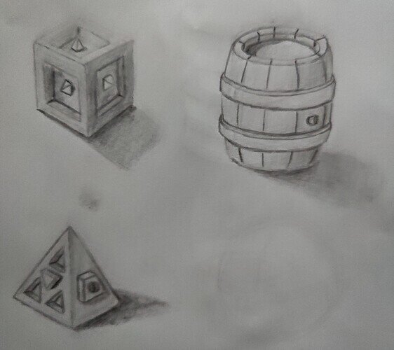
I feel like the picture doesn’t do this one justice … Some lines are indeed pretty lightly drawn, but looking at it on paper here, they at least look a little better defined than on the picture. Anyway, maybe the point of curiosity I’d have this time around: when drawing those “convex” lines, should I really draw these or should they be visible more because of “the color difference between both sides”?
As a very specific example, take the cube:
- the vertical edge right in the middle is nearly undefined, but it’s clear that there’s an edge because the color changes from a lighter shade on the left to a darker shade on the right
- I’m talking about “convex” edges because I feel like, for those, it’s not really justified to draw them darker because there’s not really any ambient occlusion on there (contrary to, for instance, those edges in the inset on the left side)
- Of course, I can always draw them sharply if that’s the style of drawing I want to go for, I guess … That would make it a bit more cartoon’ish then? I guess the style of my cube is a little inconsistent then, because in some cases (e.g., the face on the right) I did draw those “convex” edges a little more clearly
(on the barrel, I made the vertical lines dark because I figured there’s ambient occlusion between those wooden planks)


