HI All,
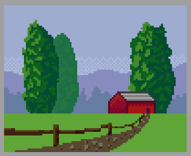
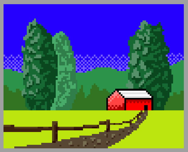
Here is my attempt at the Good and Bad colour schemes. I have tried to capture ariel perspective with this one, with the red barn being the main area of focus. With the bad colours, I went for highly saturated colours and poor contrast (It will hurt your eyes if you look at it for too long… Sorry  )
)
Feedback is always welcome 


