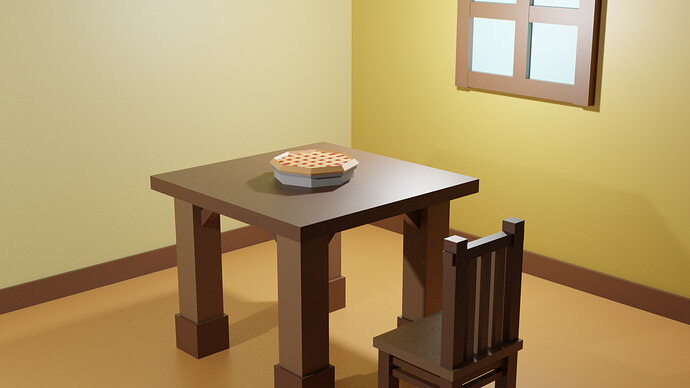
Good Afternoon, and thank you for checking this topic. Here I show this image of a rendered project of Blender which is a result of a little project I made for the challenge given by the course “Complete Blender Creator: Learn 3D Modelling for Beginners” by the instructors the GameDev.tv Team and Rick Davidson, in one of the final lessons of Section 1 which is the lesson 15 (Intro and Setup Final challenge). As you view this image, feel free to give constructive feedback if you desire.
Welcome! Very good low poly scene.
Table legs look very massive, maybe you can scale them down a bit. And it is not very comfortable to sit on a chair with a straight vertical back. If you rotate it just a little it would be much more comfortable for a low poly gentleman  If I personally would like to give this image some character I would add something to the left wall - it looks a bit empty… perhaps some “home sweet home” sign or a painting?
Maybe you would like to join our weekly challenge? The Blender Collab: Week 27 “Fish” 10K
Thank you for your review and opinion, I’ll fix this model later in the future. Stay save and have a good day.
On the other side, the weekly challenges of The Blender Collab seem to be interesting, however I still low experience with this program and I think I need more practice until I get to the shape modeling lessons, so I can gain more knowledge and skill with this program and be able to effectively assist in this weekly challenges. Thank you very much for your suggestion by the way!
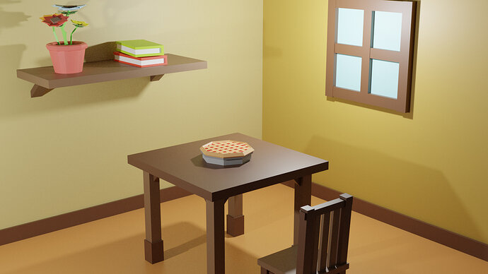
Here I have the fixed version of this project rendered in a different angle, with the same rendering engine, the legs of the table made thinner, slight angled chair back, and with more objects added to the left wall of the background room as suggested. Thank you for your feedback that helped to fix this project and feel free to give your constructive option on this one. Stay safe and have a great Friday!
I think you are unfair to yourself 
But anyway good work! Hope to see more!


