It was terrible because I’m not a woman
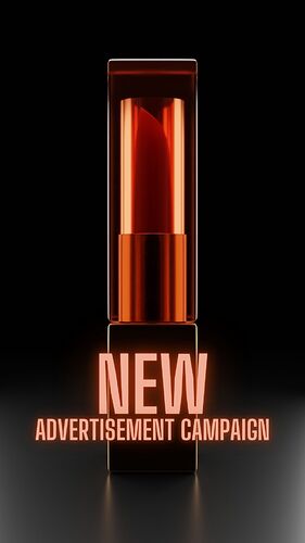
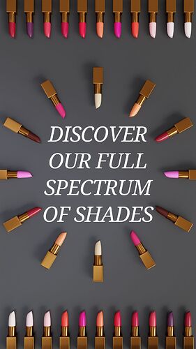
Not bad, i’d recommend it (man here). The black background looks nice in the first photo. I’d add a wood texture for that table, and in the third photo maybe stick with a darker shade of colour for the background, or something lighter to show off the shadows? Bit of contrasting colour to make it pop.
Looks a good advert image.
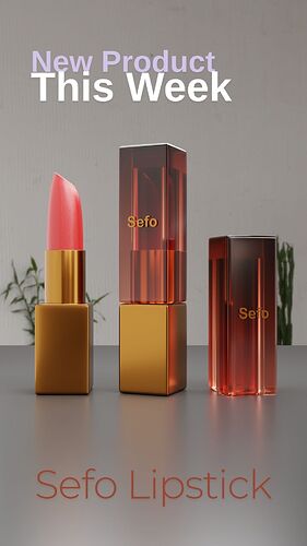
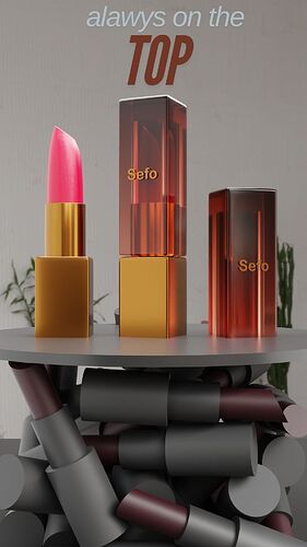
As an occasional lipstick user, I can say it looks pretty good XD the shape and gloss of the pigment itself looks right, and the gold and plastic of the casing is really effective, especially compare to the “dead” lipsticks supporting the platform of the Superior product. The last image is honestly my favorite of them, but it’s a good spread.
That’s pretty useful feedback, thank you.
So would you buy one or just visiting? 
I only wear two shades, on those rare occasions that I wear anything at all, and I use a 24 hour lip stain because I can’t be arsed to re-apply throughout the day, so I’m afraid I’m not your target customer. But the renders look very good!
A Graphic Designer can’t let their gender influence their work. You don’t need to know about lipstick but you do know to need about composition, lighting, contrast and choosing the correct colors and fonts.
What part did I get wrong?
I wouldn’t say that you got any part wrong, you did a great job if the context is just practice.
But if we are to compare this to a real life advertisement then a few things are not adding up.
The images aren’t all speaking the same branding code. The fonts, the text thickness and text colors are not following the same rules.
The lipstick container needs more flair and brand identification because the first and third image don’t have any brand identification.
There’s a little typo on the fourth image “alawys”.
Hope these suggestions are useful, don’t give up and consume a lot of reference images from real advertisements.


