The Blender Collab; Weekly Themed Gallery (Week 1)

@rszarka Thank you friend, well i did most of it in one day (most of the modelling and texturing). Then i spent more time trying to improve the render, particle system (awful fail lol) and a few more details like the flags, banner, cloth simulation.
I’ve probably spent 8-12h actually working on it, without counting rendering and idle times.
And this was a looong and heavy render, that i only realized later that i forgot to render the larger grass :confounded:

Cool, i hope we can keep this challenge running and fun =)

1 Like

Here’s mine. I actually made this a while back :slight_smile:

9 Likes

Here is my modest submission. I started by modelling this tower, which I was going to use to build out a castle, but things slowed down as I was trying to add more detail on the other pieces. If I get time I will put some of the pieces together.

5 Likes

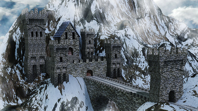
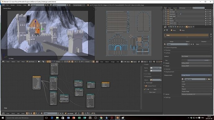
That’s a great idea! Here’s my castle

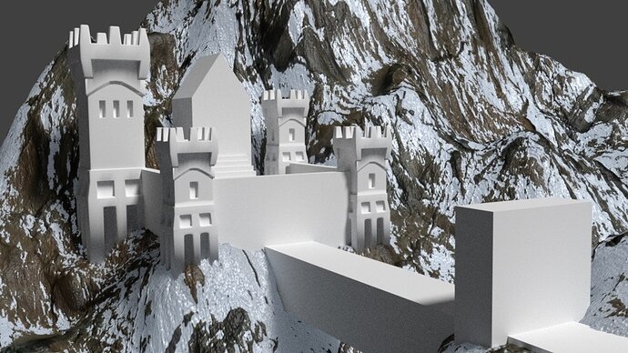
The mountains were already made from a tutorial I followed a while back, so I appended them and basically reshaped it a little and placed the castle on it.

At the start it was only rough shapes.

I modeled each of them, then duplicate linked the ones that were the same (like the three small towers and the two side walls).

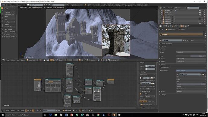
The I started to play with the materials. I prefer the Cycles render engine, once you get used to the nodes it becomes really powerful.

After that I unwrapped the more complex models to be able to texture the door.

Finally I went in Gimp to adjust the brightness / contrast, put the clouds background and tweak everything a little.

Maybe I went a little too far with this lol But I’ve been using Blender for almost a year now and can’t seem to get enough of it! There’s still a lot I could do to fine tune that scene, but there is so much to do and so little time…

You are all making great work, I want to see more!

15 Likes

Absolutely amazing! Someday, when I’m not just a week into 3D Modelling, I hope to be on that level!

2 Likes

Thanks @wesley Your castle tower’s looking great already!

1 Like

This is awesome mate! What a great great scene!

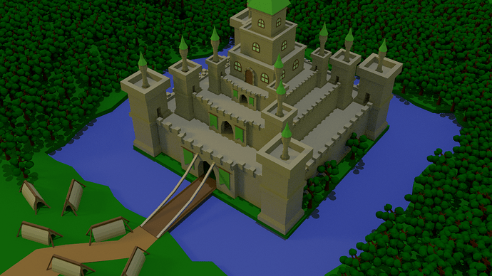
WIP update on my little castle :slight_smile:


:+1: Fail Faster - there is no instant win :+1:
Twitter: @GamedevCala - Blog: nerd-time.com - Twitch: GamedevCala

8 Likes

@GamedevCala Ahh, now that’s looking like a castle! Great low poly feel to it, and some really good colours.

So far, this thread has gone absolutely perfectly. Tomorrow morning (Monday for me, Sunday for all you non down-under folks) I’m going to collate all these into a poll (I’ll figure out how to do this, since there doesn’t appear to be a inbuilt forum poll anyway) and upload it to the Lounge in the Public section for judging from the entire site. Then, the next morning, (Tuesday for me, Monday for everyone else) I’m going to select the winner of the Poll and get them to choose the next Topic. I’ll pm the winner; there are some really standout ones here and I can’t wait to see what everyone else thinks.

Everybody did great. This has performed well above my expectations.

Haven’t read the rest of the thread but I dislike the idea of a winner in these things. Especially as people have a very varied skill sets. The challenge though I think is a good idea.

2 Likes

I agree with @Wesley_Acheson no need for competition. Still a great way to get more practice though!

1 Like

Just wanted to say that I am totally in awe of the quality of all of these models… it really is thoroughly inspiring to see all of these and what a great idea to have a theme - nice one!

I’ve not started the Blender course yet, and I honestly don’t know whether I could produce anything as cool as these but as I said, truly inspiring, really makes me want to have a go now (just got a bit too much on!)…

Definitely think it would great to publish out on to the Facebook pages too, Sketchfab is pretty cool for flying around your models, I was hoping someone may have dropped a little easter egg inside one of their models, but I haven’t found anything yet :wink:

I wasn’t able to handle Blender before starting this course. One of the first lectures is about creating your first plane out of block extrusion. Mine looked awful and I was wondering, if I can ever get some decent results like the other students. Well, look above at my castle scene :wink:


(oh boy…)

2 Likes

I am very impressed, and I really do want to start now, I just know I cant fully commit to anything else at the moment…

I suppose I am also lucky in that I only want to create some simple things for some game ideas I have at the moment, but they are just a little more complex than the simple objects in Unity…

It is very impressive seeing what everyone is creating, and I am so glad that people have shared what they’ve done.

Will look forward to starting hopefully soon. :slight_smile:

1 Like

@Wesley_Acheson Well the idea of a ‘winner’ is just to decide the topic for next week. I also don’t like the idea of “This model is BETTER!” because the whole point of this is to create a gallery of works, as we have here with all the wonderful castles.

But if it was just me deciding the topic every week, I could just cheat and make something in advance. However, it might be a good idea that the same person can’t pick the theme twice in a row, therefore allowing more people to share. However, it’s the first week running this, so we’ll work out the kinks as we go.

@Rob We’ve all been there; I even look at a few of the castles here and think the same thing. It’s just differing levels of practice. We all get there eventually :smiley:

I think I might post the currently uploaded castles on the Facebook page, for everyone to see!.. it just occurred to me that I don’t know how to find the Facebook group D: I’ll get all the pictures collated, and later today upload them in more frequented spots for everybody to see.

Maybe instead of choosing the “winner” based on how good the model looks, it could be based on how good it is for your skill level. The people entering would say what lecture they are on, or how much time they have been modeling past the course. I think that that is a fair way to judge it. Other than that, I agree with @Wesley_Acheson. This should not be a totally competitive thing, but having the winner pick the topic for the next week as @McFuzz has mentioned.

Thank you for your time!
-M.47

Just randomly pick one of the participating people to choose a new theme. We are all in for the practice not the competition!

1 Like

These are all really good points. The intention is not for people to not submit a castle because it “Won’t win” or “Isn’t good enough”. It’s for everybody to share what they can do when given a nice, fun challenge like this.

Ultimately, I think GamedevCala is right! We will just pick at random. I’ll put all the entries into a random generator I find on the internet and get back with the results. (Edit: Obviously I won’t count me if that’s what comes out lol)

Meanwhile, I’m about to upload a gallery with all our castles in one thread over in the Lounge. I will provide a link once it goes live. (DOUBLE EDIT) Here it is 3D Gallery: Week 1

(TRIPLE EDIT SUPREME COMBO) After generator a random number from one to 8 (for 8 submissions, in order of submission), RNG has favoured @AltDemon for picking next week’s theme with a randomly generated 8. Congratulations :smiley: Please either PM me the theme you would like and I’ll set up a thread for our next gallery, or you may set it up yourself.

Thankyou to everybody who submitted this time, and I can’t wait for your next submissions :smiley:

4 Likes

Everyone did a great job! @McFuzz I’ll choose a theme and create a new thread in a few minutes.

I think that this kind of challenge is a good way to practice new skills and get feedback from the community, so keep up the good work!

EDIT:

The second theme is up! Head over there : https://community.gamedev.tv/t/the-blender-collab-weekly-themed-gallery-week-2/2094

1 Like

Nice I like the style on this one!

Privacy & Terms