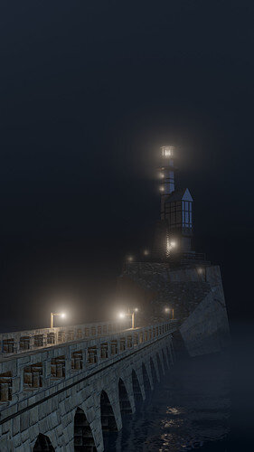
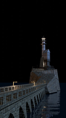
I changed the angle for viewing my lighthouse to get a more dramatic effect leading up to it, and played around with the rocky cliff path to make it feel more precarious.
I didn’t spend a lot of time finding the exact right textures, so the rocky ground is a little shoddy, but it works. If I were gonna do more, I’d fancy up most of the lanterns / light posts about the island, and actually add stairs to the rickety platforms leading up to the lighthouse itself. The only generated texture I used is for the walls of the wooden structure/lighthouse tower, I tried to make it feel sort of like stucco with pitted bits and spiky bits, but it’s pretty far from the camera so it was more practice for myself than anything else :stuck_out_tongue  And finally, I was never actually able to get the water to reflect the light in a way that I liked, but luckily fog is here to save the day.
Anyway, I hope you like it. 
- I’ve included the fogless version for reference.


