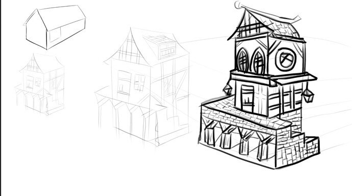
rock plus wood to a same house.
Hey man, Looking good!
Your perspective is slightly out but not by much. So good job on that. The main problem for this piece is the line thickness- it’s too thick. A good tip I remember hearing when it comes to knowing which lines should be thicker/thinner is imagine it as a 3D object and place a crawling spider  on each of the planes. If you can still see the spider after it goes over a corner/edge then line doesn’t need to be thick. If you can’t see the spider anymore then it needs to be thick e.g. if the spider went over the far edge and went on to the back of the house, you wouldn’t see it anymore. Therefore that line needs to be thicker.
This makes sense in my head so hopefully it will with you to. I wish I could remember the video so I could link it.
Regardless, keep up with the drawing and eventually it will become second nature.
Thanks for your advice!
Looking food 
