
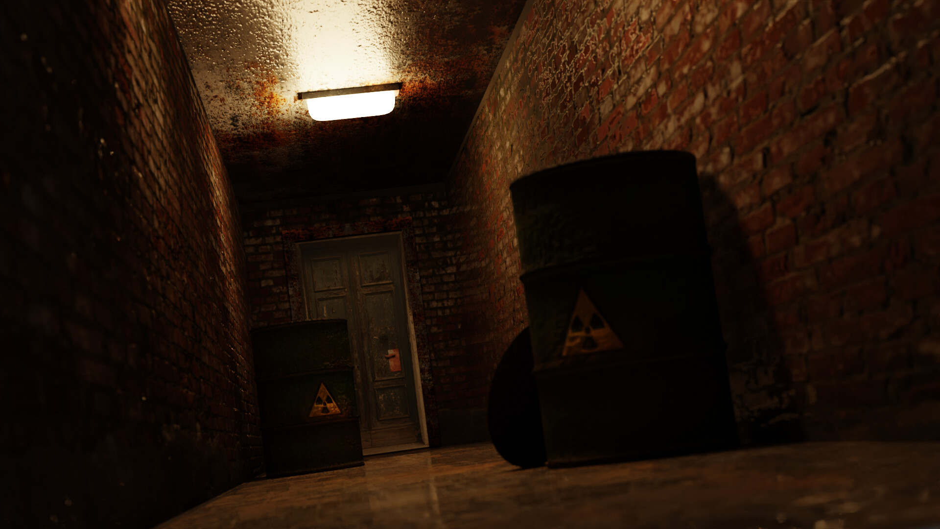
I added some normal maps to the textures as well as some roughness maps to make some parts appear wet.
9 Likes
Cool.
3 Likes
Wow amazing. I am still learning …
4 Likes
My personal opinion is that the ceiling looks too wet. The white spot is too prominent. It overrules the entire scene.
dit you see … you can still be participating …
3 Likes
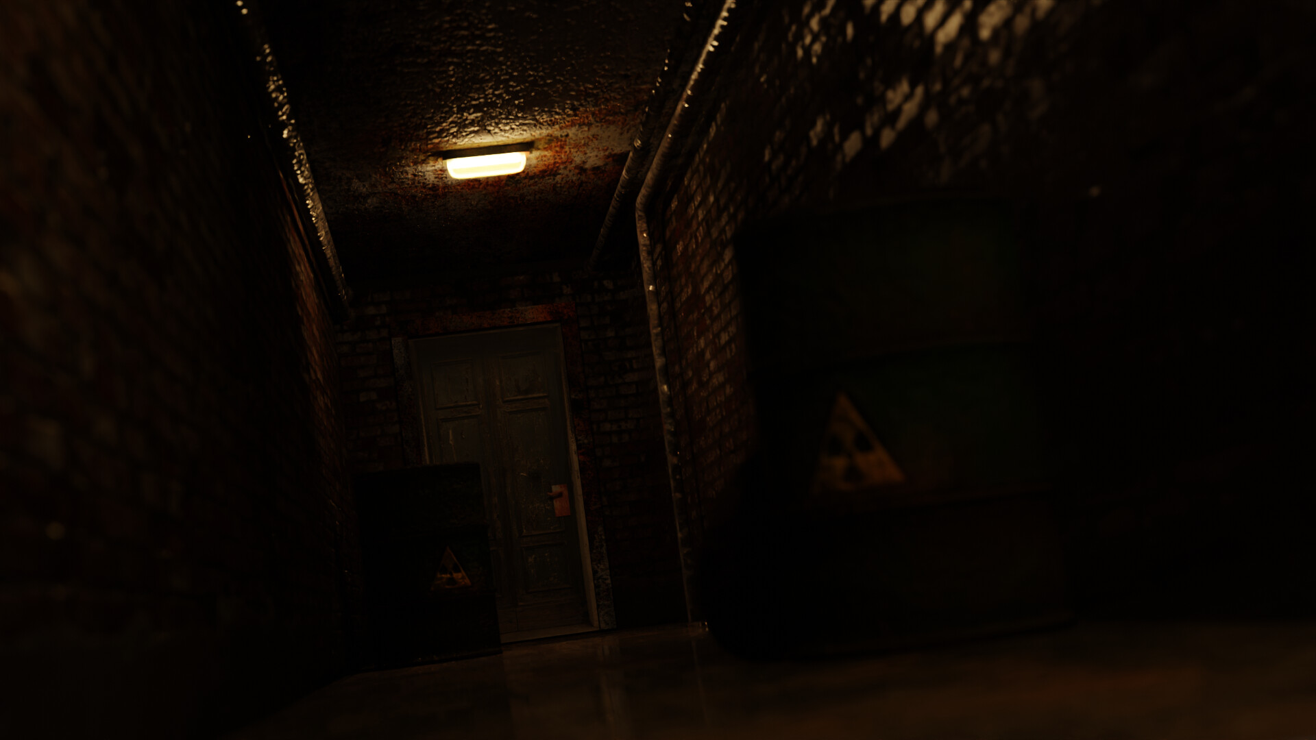
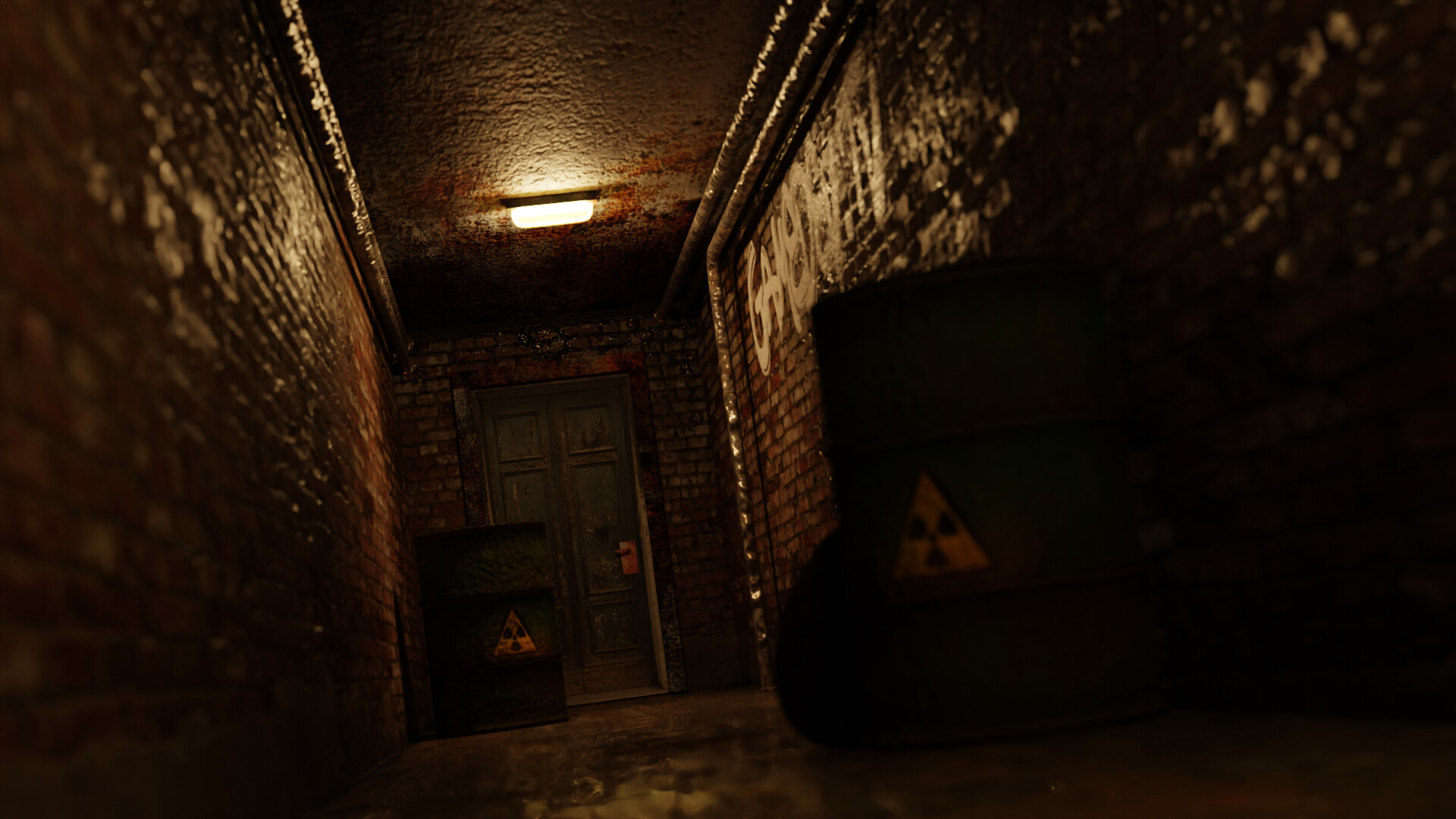
Excellent, I appreciate the feedback. I have since added a few more items, edited the texture of the ceiling, and the walls. One other thing that bothered me about the original image was that it was too bright. I have turned the intensity of the light down a bit.
4 Likes
I have been trying to get the lighting just right. I return to it hours later and noticed all of my normal maps were not set to “non-color” data.
It pays to take some time off.
4 Likes
Great scene!, love the way you’ve implemented these textures.
3 Likes
Love it, where did you source the wall textures?
1 Like
The brick wall texture I’ve had for a while, but I always make sure that they are from sites that are “free use.” A great place to get textures like this is Free PBRs, here is a link:
Some of the other textures like the ceiling I only had the color image, so I had to make the roughness and the normal maps myself. If you are interested in making normal maps, there is a great photo-editing program called “Krita.” It’s free and it’s a great alternative to Photoshop. In Krita there is a function to simply convert your color image into a normal map. I’ll provide a link to that if you’re interested:
Krita | Digital Painting. Creative Freedom.
Lastly, if you’re interested in adding graffiti art to your walls or characters, there is also a free use website that allows you to download free fonts that you can add to blender or any other typing program (including krita). However the website also lets you download an image of the typed font, including an alpha version. Simply type the word you want and it will show you that same word in different fonts. If you are interested in that, here is a link:
Sorry for the long read, but I like to help as much as I can by providing awareness for free tools. Learning art shouldn’t be expensive.
3 Likes
Thanks for the info and links. Might be worth you adding them the the forum wiki pages if they are not there already.
Materialise is the free program I use that makes other maps from a starting colour photo or image.
2 Likes
Thanks for the links. I usually only use a ambientcg(formerly CC0 textures) textures as they are free to use and are actually really good quality. The links you specified may help me get more of the ones i want. Much appreciated.
3 Likes
Awesome work! Looks extremely realistic.
1 Like