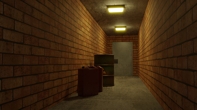
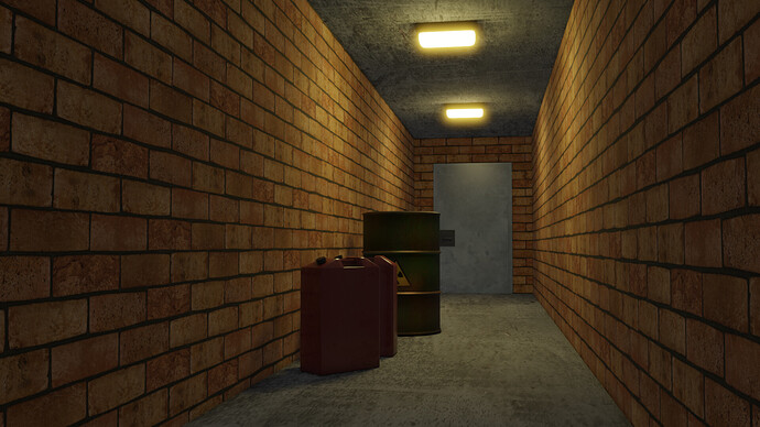
Spooky Corridor Render Comparison

Hi, more course work. Clear imperfections in this despite looks okay. Need too resize the bricks in UV maps or generated UVs. Look more like blocks. Did the quick knock up Gerry cans. Realized half way should have mirrored along length. Maybe displacement [or bump] maps suited to this model. Need to revise that. Ah well live and learn.

The Evee render uses 3.0 built in bloom setting. The cycles is done with compositor glare setting. Evee has two area lights and two point lights to get the back shadows on the ceiling. Looks pretty close but cycles is still better. Evee is nearly timeless however and more like game engine I understand.

Comments welcome.


8 Likes

Latest Blender 4.2 has had more development of Eevee. Now bloom is not a tick box but uses the same node route that Cycles does.

Good looking corridors!

3 Likes

Looking good! Of the two, I think I prefer the first one. On their own, I don’t think I would notice this, but because I can compare, the second render’s light colour is closer to white and looks slightly desaturated. Not a bad thing in the least, depending on what you’re going for; this is just what caught my eye =)

4 Likes

Thank you for the comparison with this nice corridor! I think that Cycles is still more accurate and results are more proportionate to the amount of light emitted from the lamps, but as @CoreyKnecht said, if you only look at one of the images, it’s difficult to tell (well, Evee still works a bit weird with shadows on angled items, as if there were an extra light pointing at all surfaces through obstacles).

4 Likes

Yes if I wanted to do an animation and use Evee I could make a comparison like this and try to tweak the materials for Evee to make darker. I had tried to get rid of saturation. Perhaps I would get better with practice? Thanks for all comments.

PS. Shadows are hard to get a match on as well. I actually tried to improve the shadows around the cans by increasing the fall off distance on the area lights which helped quite a bit but you can still notice.
Cheers

1 Like

Oh definitely. Among other things, lighting can be very tricky to master; that’s why I like to point out what I can when I see it. Glad it’s of use =)

1 Like

This is a beautiful comparison shot! The eevee render still looks very good and imitates the lighting very well for the effect. The subtle differences in color temperature do affect the tone of the scene, but I imagine a subtle tweek of the area light’s colors, or the brick texture itself since you were mentioning adjusting that, would make them even closer. Really skillfully done!

I would expect to find a monster or npc hiding behind those cans xD

2 Likes

Privacy & Terms