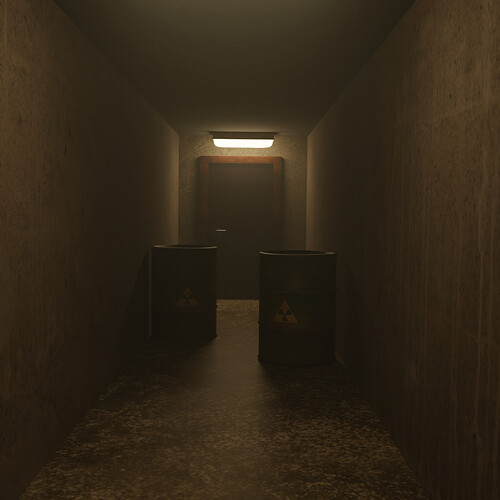
Here are my final renders for the Spooky Corridor section. Tell me which one you prefer.
4 Likes
I like the first one better. It is more atmospheric while also hiding the sharpness of the seems in the scene.
If you want clean lighting like in the second render, it would look a lot better with beveled edges and ideally something to break up the textures a bit.
2 Likes
Nice, thanks for sharing! In order to be immediately “spooky” I would go for the first one. Otherwise, I would check the following in the second one:
- Less powerful ligthing for this particular scene (two lights are good, just make them dimmer or yellowish - or reddish; or be radical and go for a totally “aseptic” environment on walls and floor with that white, powerful light
 )
) - As a quick fix, increase the roughness of the floor, since the texture gives the impression of somehow irregular but lighting tells otherwise.
- Look for a rougher texture on the walls if you have one or know a way to do it.
By the way, I seem to have used the same door material for this lesson  !
!
2 Likes


