Some more futuristic icons

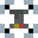
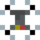
My attempt to create some icons for the lesson’s challenge ended in the following:

Icons1
Some sort of “Act!”-icon, maybe, represented by a hand in a glove

Icons2
I really tried making this one look like a drone of some sorts, but I suppose that a lot of imagination is necessary to see such. The hand is neat though.

1 Like

Yes, hard to see.
A drone, for me, has four rotors.
It’s all about, how to identify things in their basics.
Less a design issue, and more about expectancy.
What does the viewer expect to see!

1 Like

That’s true, indeed.
Funny enough, my design idea whilst pixelating this icon was not about a flying drone, but rather a triangle-shaped one with three wheels driving on the ground (which are supposed to be the black areas).
I appreciate the feedback!

1 Like

That is what I tried to express.
Creating icons, is talking in a language that everybody needs to understand.
If you say “human” to expect two legs and arms.
Answering the question, what makes the object unique in shape.

1 Like

I haven’t approached the icon-creating with this way of thinking, but I’m glad I have been enlightened. It makes quite a lot of sense actually.
By thinking about the unique shape of this object, the conclusion of it having four rotors is the most obvious. So I sat down and changed its appearance:

drohne2

drohne3

drohne4

I’ve created three different types of rotor blades for the drone, of which I am not sure which fits the best yet. However, they cerainly do look more like a drone now, in my opinion

1 Like

I know, it’s hard to do if, you have a small canvas.
I get a lot of inspiration, in the icon definitions made for the web. Or even road signs, which are standardized. So this sign language can be interpreted by anyone (if you got your drivers license ofcourse)

See:

Have fun.

1 Like

Privacy & Terms