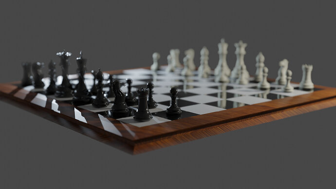
Pretty satisfied with the realism on this one
6 Likes
Yes, an exiting view.
Maybe too much depth of field?
And welcome back.
1 Like
Only thing in focus is one tiny section of the board. As FedPete says too much blurring depth of field.
Welcome back, refreshing on the new 2.8 interface?
Yeah I was going for a more toyish look so I tried turning the depth of field up high, but now I realize it’s a bit too blurry. Thanks for the feedback! Currently trying to make some game assets so I decided to revisit blender and brush up on the 2.8 interface updates.
1 Like

