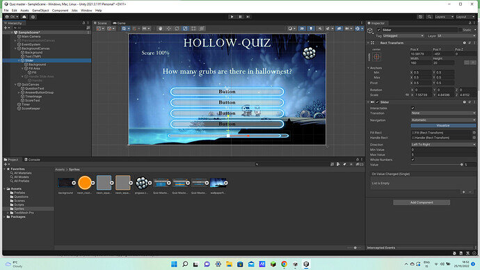
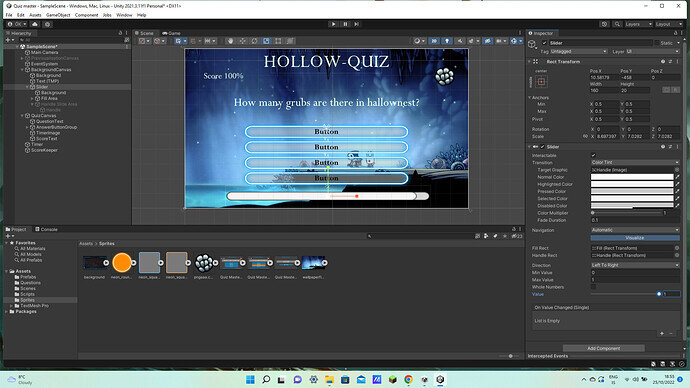
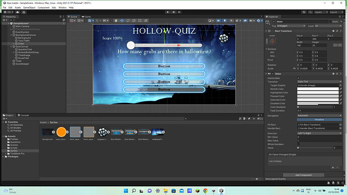
For some reason my slider looks much different its not square, it doesn’t fill all the way and it looks much much worse what can I do to change this?
Hi odinn,
How is the slider supposed to look? To me, it looks perfectly fine in your first screenshot. Please share a screenshot of what you would like to achieve. The second screenshot shows the default sprites.
I would like it to look like this where the bar is square and fills up all the way
Ps the screen shot doesn’t work I’m talking about a slider that looks like Garys in the sliders lesson
In all your screenshots you have changed the scale of the sliders. If you look at Gary’s slider, the scale is not changed, it’s always (1, 1, 1).
Yours


Gary’s

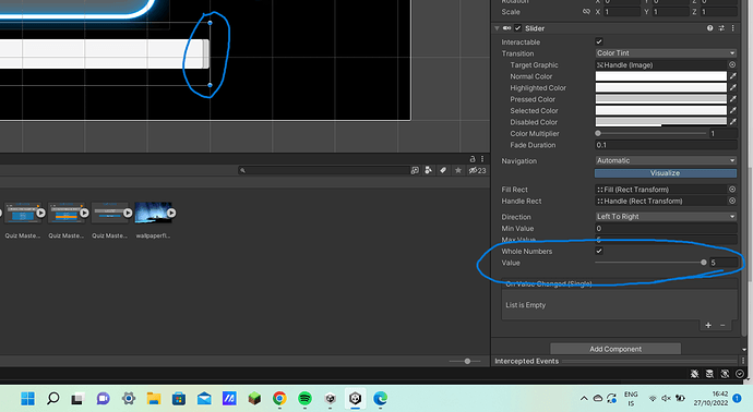
Yeah, that’s how it is. Sliders make space for the ‘handle’ that you drag around. Look at ‘Fill Area’ and ‘Fill’ inside the slider. The ‘Left’ and ‘Right’ properties should help you out
This topic was automatically closed 24 hours after the last reply. New replies are no longer allowed.

