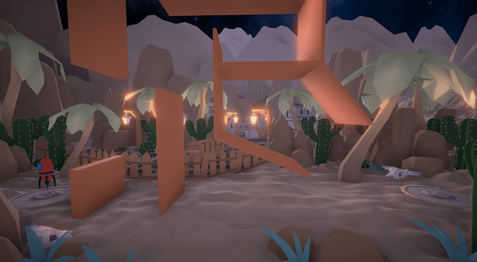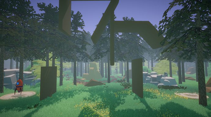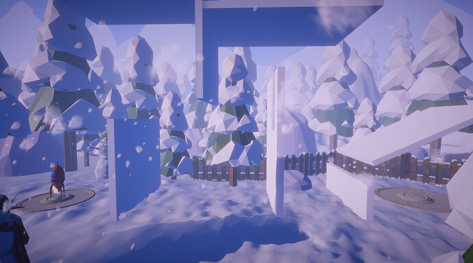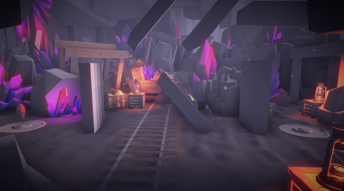
Wow great job! I like the music and the environments. Very polished!
I will say the difficulty on the first forest level was too high for me. Maybe consider removing the first or second moving block, or otherwise lowering the difficulty? I tried probably about 30 times or so and never made it to the landing zone. I’d say for the level 1 of a game maybe the difficulty there needs a bit of a tweak.
Again you really put a lot of effort into this and it shows! Can’t wait to see more!
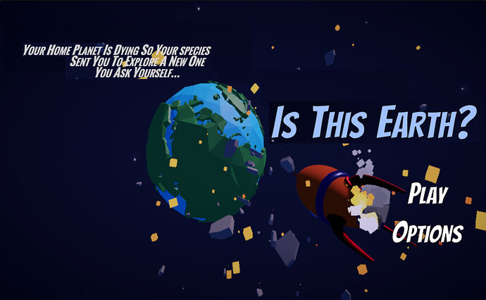
Went back into the game to see if maybe I missed a Difficulty selection in the options, then I was wondering how the Main Menu would look with some elements switched around.
I took the liberty of rearranging some of the text. Maybe you think it has a nice feel to the flow of the text on the screen too? I really hope you don’t mind and I hope you accept that this is constructive criticism. Keep up the great work!
Thanks for the suggestion. The new menu does actually look better than my old one. Did you do that in photoshop? And for the level thing I guess I didn’t realize how hard it was, I just got so used to it that I became really easy to me. I’ll be sure to change it.
I did the photo editing in GIMP. If you’re not familiar, it’s very similar to Photoshop.
Thank you for being so receptive to feedback. It’s really nice when someone can take a critique as how it’s meant to be taken…suggestions for improving a product. Definitely @ mention me if you update your stuff. I’d love to see the progress!

