Show Your Blockout – WIPs & Feedback Welcome!

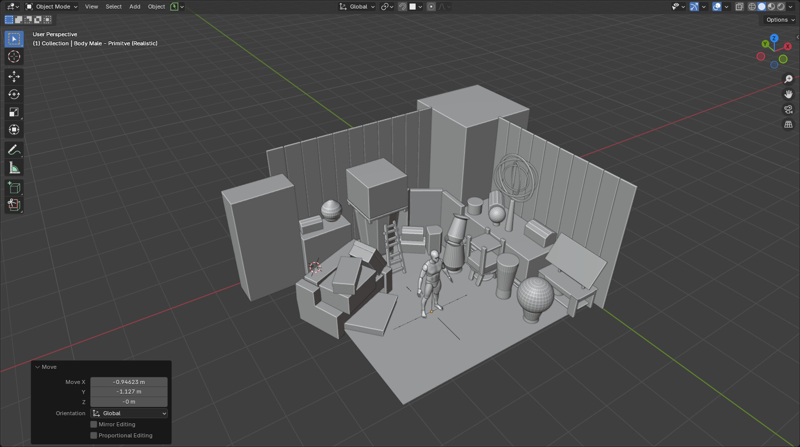
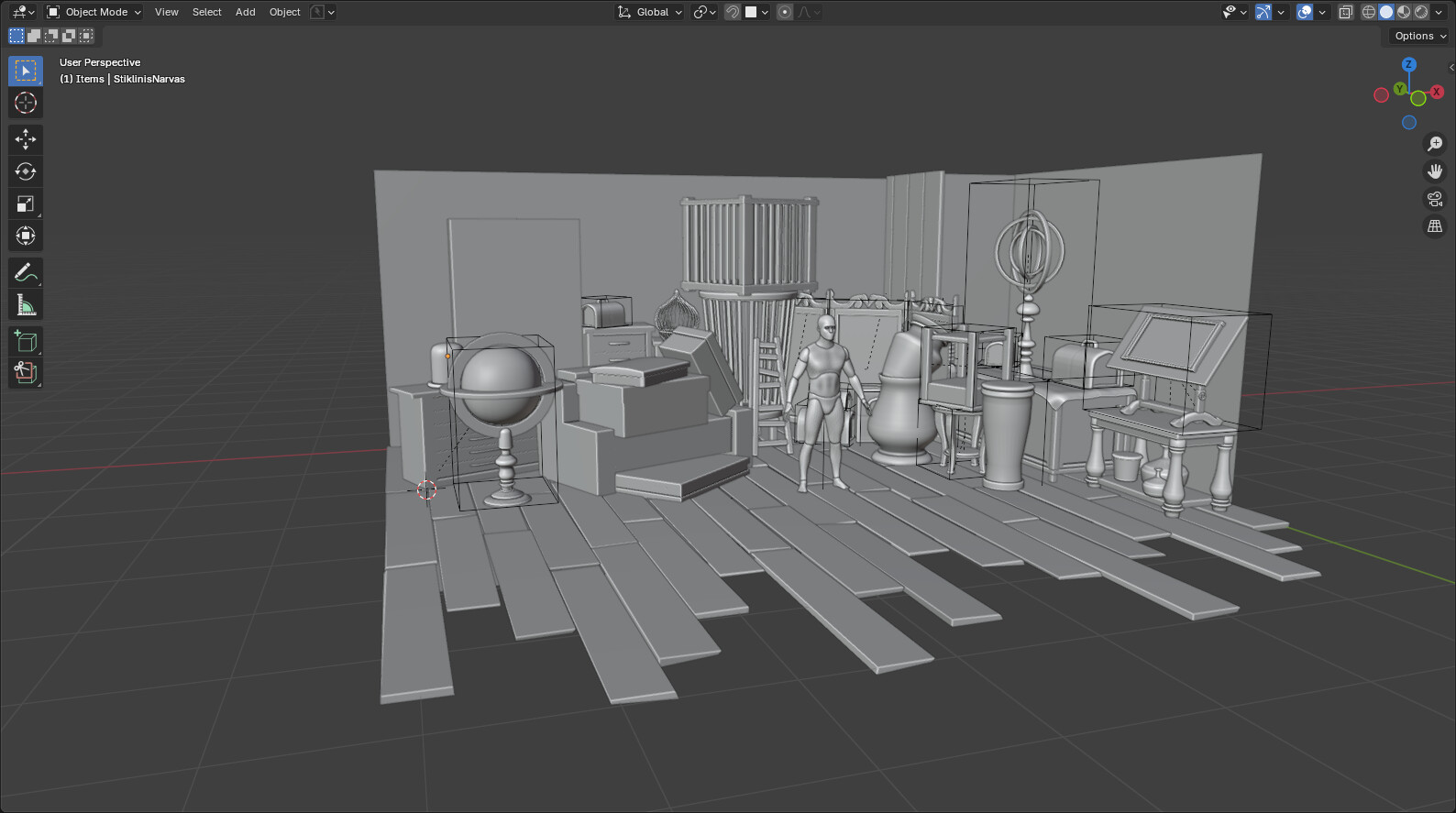
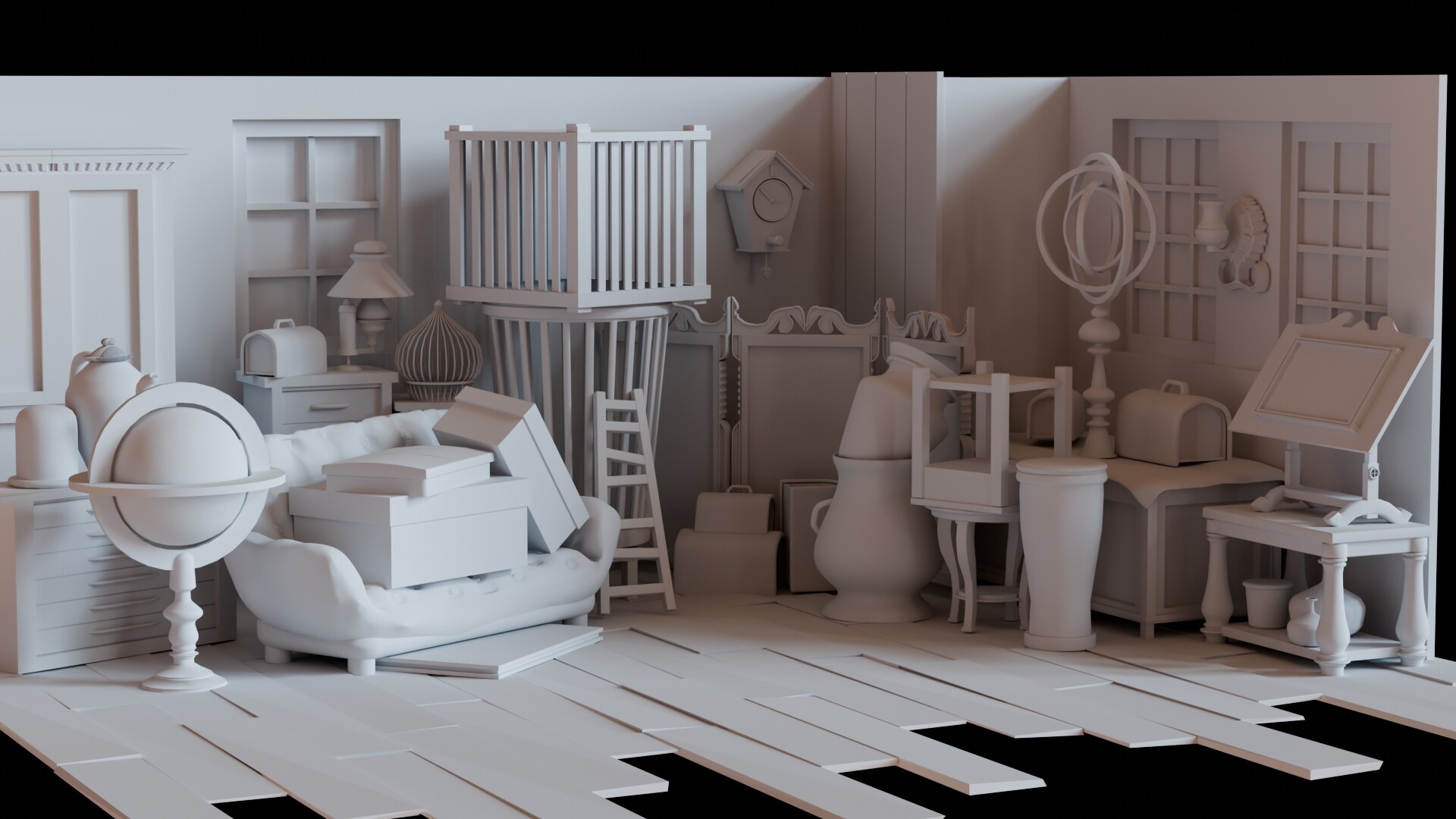
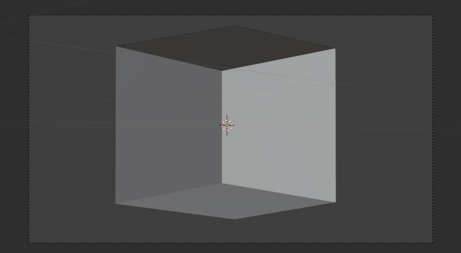
I’d love to see how you tackle this stage of modeling! When I first started using Blender, blockout felt like a strange and tricky step for me (funny, right?). I’ve also seen others mention similar experiences in different forums.

It’s not talked about much—probably because experienced artists see it as a natural and easy process. But maybe sharing our blockout stages could help someone who’s still figuring it out.

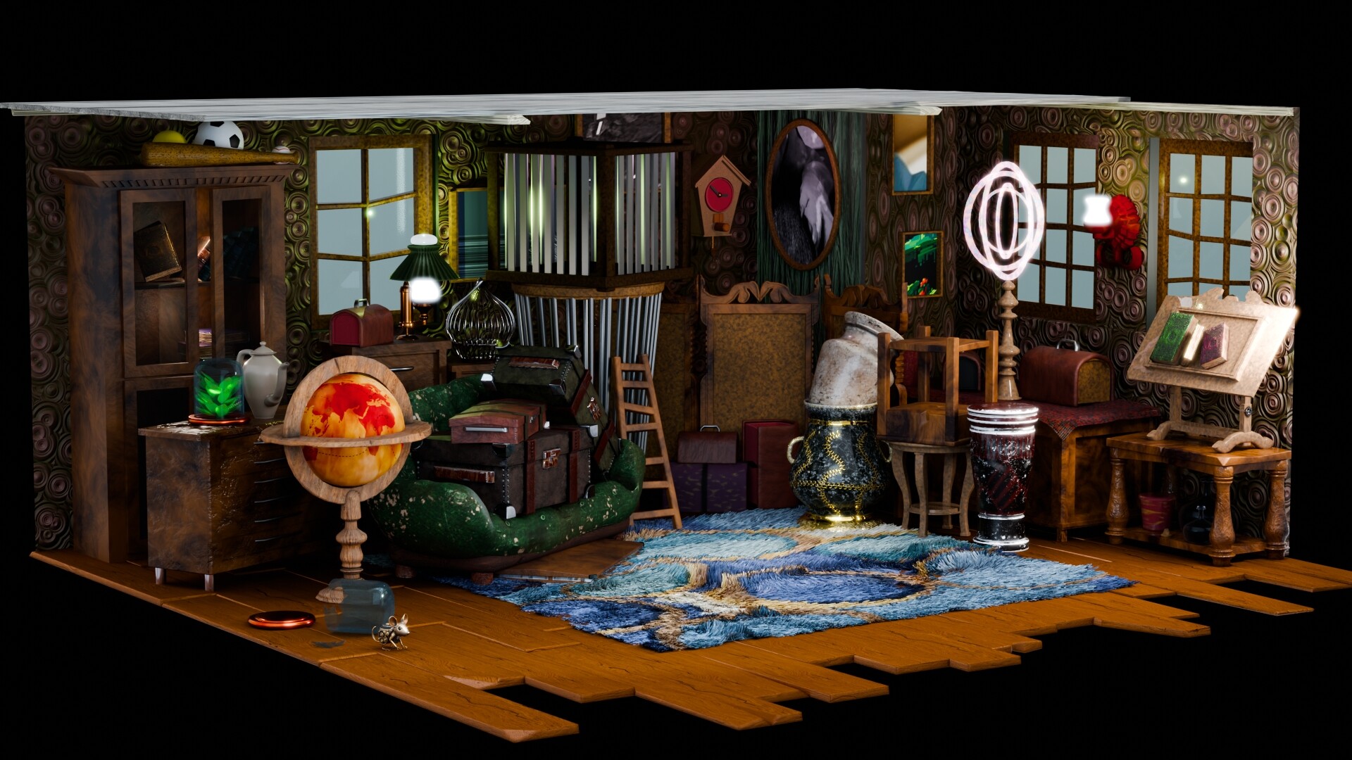
I’ll start by posting my own blockout render. Feel free to share yours! Let’s compare approaches and learn from each other. :rocket:

5 Likes

Must admit I rarely do it. Probably should!

2 Likes

You mean a view of your block models with only a flat grey material?

1 Like

I think it’s because it’s part of the first contact with Blender 3D modeling.
In that initial phase, a student wants to use all the tricks and tools in Blender and experiment with them. Like shiny, reflective things. Very detailed models because it’s possible. Making things like you see them on the web. Without worrying about topology, reuse, time investment, etc.
Then you do it because it’s fun and possible, without thinking about it and knowing the long process for “triple-A” quality. And just have fun.

After a lot of experiences with Blender, you know the process and you start thinking ahead. Like block modeling, reuse, topology, …

I myself try to convert my tinkering work as an asset. Which involves more work. Because the moment you start using an asset, you see what’s wrong with it. And for larger scenes I always apply block modeling. And replace the data of the simple object with that of a more high poly model. This is normal Blender process.

3 Likes

In your example I see the configuration. And not the camera view.
Which could tell you where to put the details in and where not to.
And it will give you a guideline on how your lighting (floor plan?) need to be.

To give feedback on your scene, we need to see the camera view which exposes the composition, mocked out in blocks.

1 Like

Hm… lightning… need to think about it more. I moved a little bit forward with it, but I think the original post idea still holds. That is the camera position. If that’s what u talking about.

2 Likes

Yes I do!

For scene design is handy to know where the viewers focus lies (mostly in the center).
But lies this focus also on the figure?
Now you see also more detailed object at the right side, and not so much on the left side.
You could encounter that using lights. Or add more to the left.

But that said, the more details the more cluttering of the scene (losing focus of the subject (person?). The trick is when to add details and where not. Like the floor, which is empty looking …

2 Likes

I like your thoughts flow. It makes me think more deeply about the scene.

2 Likes

Made a bit more progress today! Still thinking about adding some small details here and there—maybe moving the tall box from right to left. I’ll also add a rug to the floor. Overall, the process has been fun! Planning to finish next week, and I also want to do something for this week’s challenge—the theme is really interesting.

5 Likes

adding a little mouse …
Just a tiny detail for the floor

1 Like

I had more time to finish this. Any suggestions for changes?

5 Likes

More depth (camera zoom in) , because the ceiling is one white ‘bar/line’. And you want to see the
ceiling from below.

1 Like

I could try. What about colors? Is it me or does something look off? (or maybe my eyes are too tired)

3 Likes

Colors look good but maybe blue with green tends to clash artistically. “Blue with green should never be seen” say the clothing designers.
Also the random textures on the rug might be a bit overwhelming when you have so much going down on the walls. Others might think differently. It’s just a feel thing I believe.
You might pick up something from garden design where the textures of plants are just as important as colors?

2 Likes

I was unsure about the rug colors, and when I made the walls pop, something instantly felt off. I wanted to keep the walls that way, but it felt like something wasn’t fitting. After making a short animation, I also noticed there were too many reflections across the scene. Thank you for your insights.

3 Likes

The modeling is excellent, first of all. When I saw the scene without textures, I thought, this is so lovely - such wonderful models!
The difficulty with the textures is that everything in your scene has TEXTURE and most of the colors are dark. There is nowhere for the viewer’s eye to rest. This may be a case of using too many patterns and textures. It’s also possible that you can lift sections of the scene adding specific lighting to help direct the viewer’s eye. I understand that this is an antique shop and they are always crammed with so much stuff of varying colors/textures that it can be quite a disparate collection. But 3D designers have the luxury of being able to direct the viewer and really show the story. Perhaps there are specific items you wish the viewer to really focus on? Or, perhaps you want them to take in the whole scene - if so, is there a way it could be lit so that there is a more natural order of progression on what the viewer should focus on? Think about the story of this particular scene.
Really fantastic job - I’m just trying to help elevate your work :smiley:

4 Likes

That’s a lot of good thoughts, thank you.

1 Like


I took all of your suggestions and made some improvements to the scene (I think). I’m still struggling to find the right balance with colors and lighting. I might have made things harder for myself by scattering too many objects and overcomplicating the scene. This isn’t final, I’ll probably come back to it later when I have more experience. But for now, this is the best I could do.

What do you think? Did it get better or worse?

5 Likes

Much better!

1 Like

Works better for me. Well done.

1 Like

Privacy & Terms