
I thought it was a bit annoying having the blocks that the player could place on the same colour as those they could not place on. It felt like bad UX so I switched mine to have the track as being blue. This tells the player at a glance that there is a difference between the blocks. Even without any tutorial, they would work this out in a few seconds fo clicking.
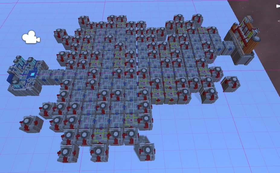
Also, I thought it looked a bit confusing having all those bases on Ricks track!
Cheers!
Jack