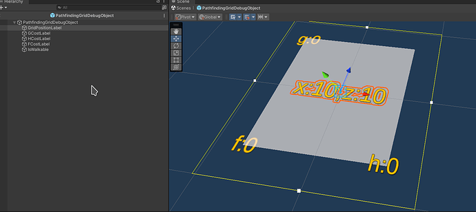
I found it actually much simpler to have the TMP_Text with a size of (2, 2) so it just fills a grid cells’ area. To make it look a bit nicer, I used the “Liberation Sans SDF - Drop Shadow” variant of the TMPro default font…
1 Like
Well done! Feel free to make your UI the way you like it best.
I would think it makes the layout for the grid objects much easier to handle:
Each of the A-star values is neatly placed into its corner.
This topic was automatically closed 24 hours after the last reply. New replies are no longer allowed.
