I’m fairly happy with this. The mountains are simply rotated plains, and the sky is also fake. I forget to check how it looked in cycles before I did the cycles render, and when it was finished I realized that the ground is reflective. Oh well, I’ll call it a stylistic choice.
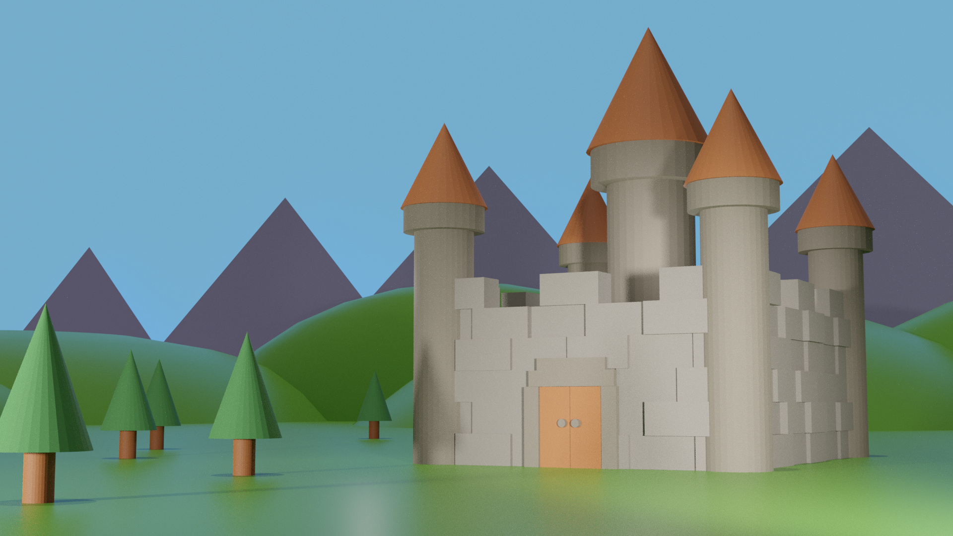
Evee:
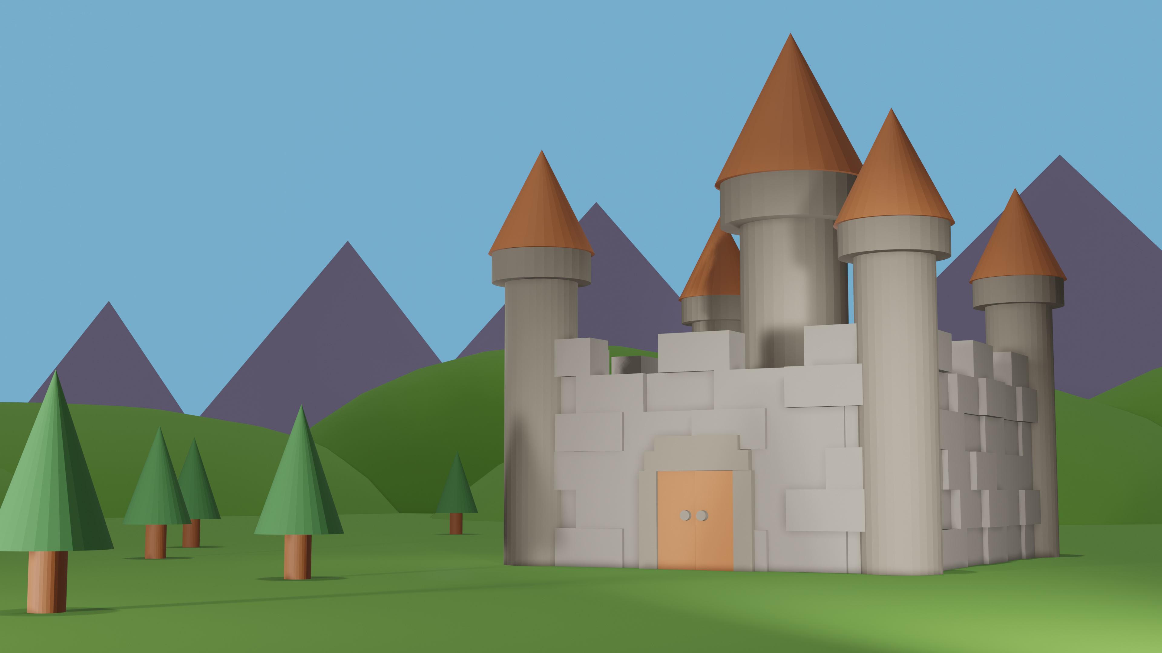
Cycles: