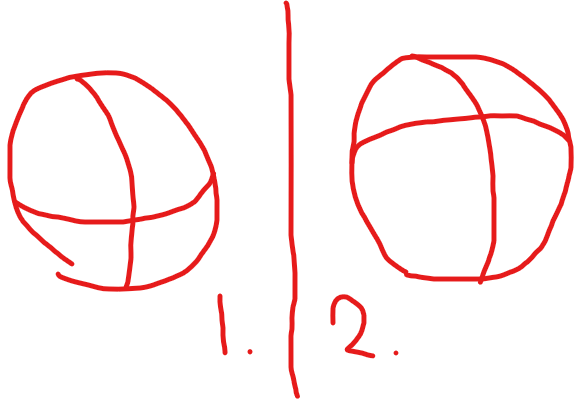
When you’re drawing the horizontal and vertical guidelines onto the header shape, am I suppose to use a downwards arc for the eye line, or an upwards arc for the eye line, or does it even matter?
My theory is that if they’re looking in an upwards direction, it should be a downwards facing arc or vice versa for looking downwards. And if they’re looking straight ahead, it should be a straight line.
Any advice?


