Question about color palettes

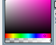
Hello so there’s some things I just want to clarify about creating color palettes.

  1. Whether we’re creating a darker color, or a lighter color, increasing the saturation will cause more contrast and vice versa. Correct?
  2. If I’m using color (such as pink) which is on the right side of blue, do I want to shift the hue to the left instead of the right if I’m creating a darker color (and vice versa for a lighter color) ?
    image

Hi,

Thanks for the great question.

  1. Yes thats my understanding of it as well
  2. Probably a combination of the two moving the hue to the left towards the blue and the colour picker down towards the bottom left rather than top left.

I would experiment with both until you get the color you are looking for

Hope this helps

1 Like

This topic was automatically closed 24 hours after the last reply. New replies are no longer allowed.

Privacy & Terms