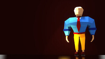
Why not in the middle and bigger …?
such a nice model!
Thanks.  Glad you like it. Just think it gives the model some room that way. First i had it centered but it seemed static to me.
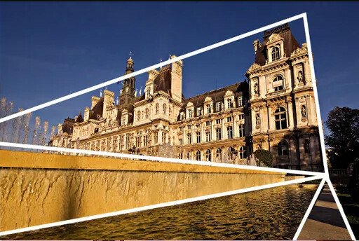
If you take a picture (photo) of a family member (friend), where does he/she stand in the frame?
Somewhere around the centre i guess. But if i think about presenting something i always try to put it in a more interesting position more to the side, so it comes across a little less neutral. And here i didn´t try to just show the model in itself but to come up with a pleasing composition. In my eyes the almost empty but darker left side of this picture also brings more depth and contrast in the whole thing. For me it works fine, i find it definetely more pleasing on the side - but maybe i´m wrong.
In this case I also think he would stand better in the centre because it’s a showcase of what you made. But I get what you’re going for. Maybe some object on the other side of the image would balance is out.

Nevertheless, very nice low poly character!
For me I would put a table with a telephone on it. Idk why, that’s what first came to mind when I think about it. 
Great idea, i´ll borrow it for my next render 


