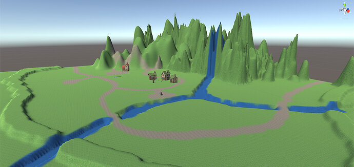
Back again with my latest updates. I spent a lot of time this evening on camera perspective so the map looks a bit bare, but a lot of it is relying on getting assets produced and want to make sure I do that bit at the right time. I’m learning my limitations, fast, when it comes to design. Theory & Code comes relatively easy, but designing is difficult and not something I am particularly good at, but it’s important to get a working prototype 
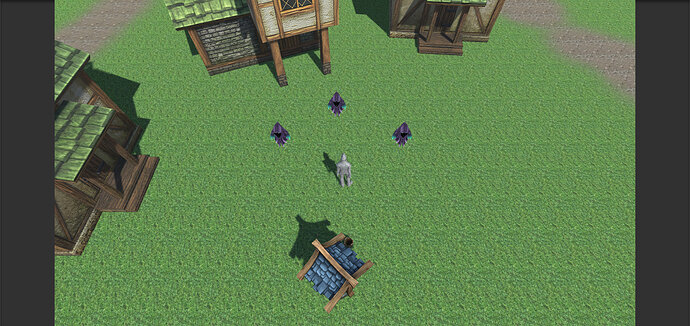
Anyway, I have 2 screenshots for you guys to view. They are pretty bare, but hopefully the level’s blocked out enough to convey what I’m going for. It’s also worth mentioning that the game has a somewhat open world feel and, right now, seems sparse. I’ll be working on getting the right depth over the coming days.
I wanted to include a perspective of the character, too, as it is relevant to understanding the feeling that I am going for:
Please go easy on me 


