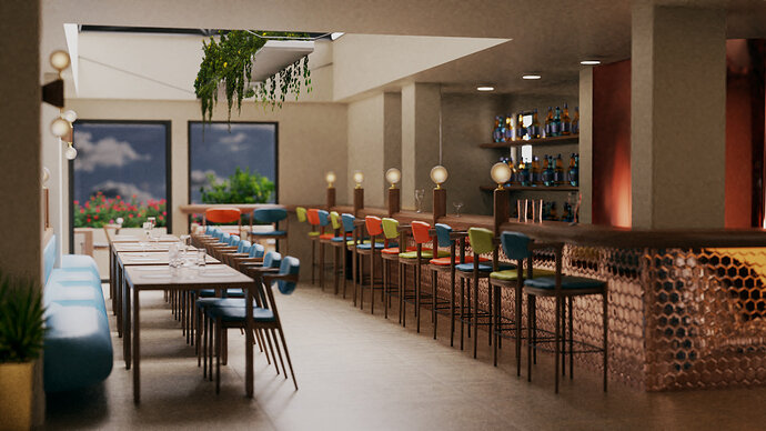
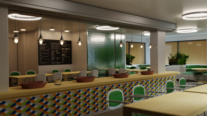
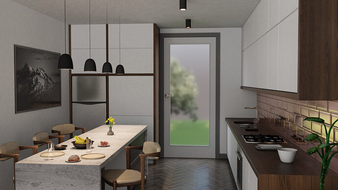
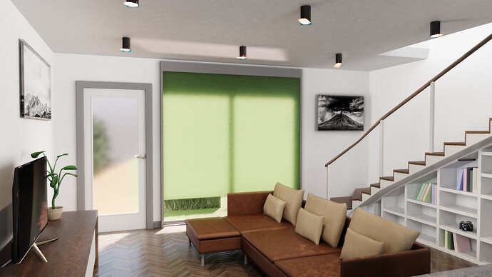
So I’ve taken a detour from the course and have been using blender to do some architectural renders. Opinions and comments/advice welcome 
Those look great! Did you model everything in those scenes? They look very well done.
Can’t say why but it feels like it is not a real scale room but rather a scaled model of a room. Other than that - a wonderful work.
That looks very nice! Also, the reason it may look small is because it looks like there is some sort of tilt-shift going on, where close to the camera is blurry.
Objects too far away are blurry too. I think it has more todo with lighting and shadows. Shadows are very soft and blurry, more like those of small objects.
Looking good, but that tiled wall is too shiny, it takes attention away from the rest of the room. A lot of the malls here have walls like that and they don’t look nearly that shiny.
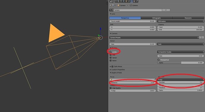
Love the DoF going on, but most architecture photography of rooms like this have the room in full focus unless the room goes far back, then the farthest part of the shot may have a slight DoF blur. Setting the limits and distance on the camera can help along with the F-stop number if you want to go for a slight DoF, it may take some playing with it to get it right though.
I modeled everything apart from the plants which are just images put in facing the camera.
Thanks for the comments, I think I may have gone OTT with the DOF, trying to be dramatic as well as draw attention away from some parts of the scene
Very nicely done. I don’t usually create such large projects, but I’m sure this must’ve taken you quite a while to complete.
@id211 Very good job indeed! I like what you have done with the models.
Upper:
Positive: Kitchen cabinets, items on the counter, stove and things looks they belong to the scene. I really like the fish bone wooden floor too. Things on the dining table add to the whole. Small details matter here in my opinion.
Room for improvement:
Plant in the bottom right corner looks like it’s floating? Shades of the ceiling spot lights can be seen, maybe add a little more geometry (and /or is the smooth shading on?). Frige material could use some work to look more real.
Lower:
Positive: Atmosphere is nice here. I like the daylight you have managed to put in. I like the book cabinet idea under the stairs. Solid models and a lot of effort in the items.
Room for improvement: There’s strange blue artifacts on the lights, intentional? Picture frame UV mapping, picture “bleeds” to the frame. Couch cushions look really hard  and thin. For me it spoils a bit the realism. Otherwise you have realistic colors but the books in the shelf are all selected from pastel colors. IMO, books do not look like that. Maybe recolor and add some more, in addition to some other objects? Also there’s weird reflection or shading artifact in the ceiling, looks a bit out of place.
All in all very good job. You can be proud of yourself and the scenes you’ve done!
