I’m hoping I’ll just be able to make one topic and collate everything I do here, for now I’m just going to post my work for the challenge in Lesson 9. Highlighting. I have done the challenges up until this point but was feeling lazy about making an account in the community hub. Will see how we get on 
6 Likes
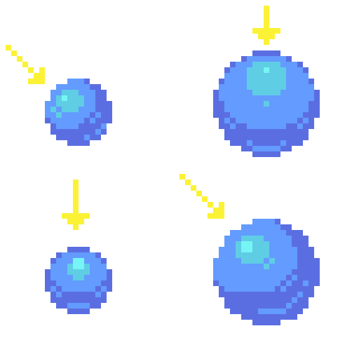
Doing dithering today. Tried to be a bit extra by dithering the sun in the lecture’s challenge exercise.
2 Likes
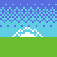
I see a snowy mountain … may adjustments of the colors used.
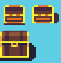
Bit late in posting! Here’s the Treasure Chest challenge from the next video in the series on shading and placing shadows.
4 Likes
The last one, has more depth (3D).
While the first two, is hard to say what it can be exactly. maybe, due to the orange horizontal line, or scaling …
Have fun.
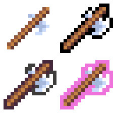
Lesson 12! Outlines. I made an axe and outlined it 4 ways - simple black, darker colours but not black, and a highlight “selection” or “power up” colour while also using the double-outline technique covered in the lesson.
1 Like
Here’s Lesson 13 - Colour Palettes. Forgive my Bri’ish spelling lol. I’m from New Zealand btw. Hello!
Anyway, for the first one, we have my mountain lake scene in a muddy brown/yellow palette derived from a colour found in the default Aseprite colour palette: #524b24.
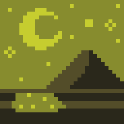
I modified it slightly to #545d29 which gave a base midtone from which two highlights were derived by shifting towards yellow, lightening the value, and increasing saturation. The shadow was made by de-saturating and decreasing value. In other words, if you sample each colour from darkest to lightest, the colour picker moves up and to the right while leaning towards yellow on the colour wheel.
Next, I did the opposite. I used the same base colour, #544d29, and shifted towards red and desaturated, while still increasing value. To create the shadow, I saturated, and moved value lower.
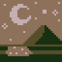
This still looks coherent as a colour palette to me, despite not moving the highlights towards yellow. Strangely I think it actually works better, though this could be because it’s a night time scene and moonlight has that haunting, desaturated, pale feel to it. Keeping the movement of hue and saturation in opposite directions (darker = more saturated, more yellow; lighter = more desaturated, more red) keeps this palette choice consistent.
So to deliberately do it wrong, I pushed the colour wheel too far in the respective directions. 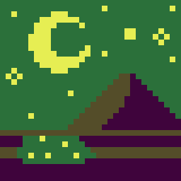
I kept the same base tone again, but this time, pushed my mid-tone way past yellow into green. For the highlight, I decided to buck consistency in moving the colour wheel to the right (more green and into cyan) and chose to backtrack into yellow. Saturation was all over the place. For the shadow, I kept saturation high and moved into a gaudy purple tone. This one feels actually more wrong, and lacks the coherence and harmony of the previous two. However it still “works” as a night scene!
Reviewing the lecture, I see now that even though I went around the colour wheel or did the “opposite” of saturating/desaturating, the real practices to avoid are 1) simply value shifting, without looking at hue, and 2) throwing together complementary colours right next to each other without any value or saturation difference to make them stand out or contrast one another. Plus, complementary colours can really hurt your eyes!
3 Likes
Did the rotating object challenge today! Not much to say here except that I’m SUPER PROUD of myself!! Animation has always been a daunting topic for me and the first sprite I made for the flame here looked so bad, I ended up getting discouraged and taking a break. It took roughly an hour or two, in fact I lost time, but I love the outcome. Enjoy!

3 Likes
Today’s Monday where I live and that means a new challenge and lecture. Today’s lesson - camera angles and perspectives. It’s a bit of a cruddy attempt here but I made an isometric GameGuy. Totally not based on or inspired in any way by BMO, I promise. lol.
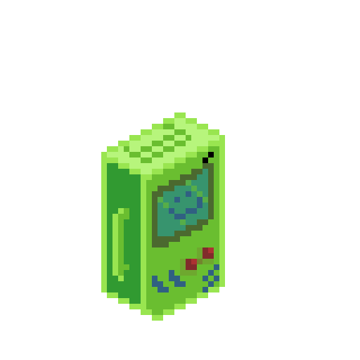
2 Likes
It’s been over a week since I posted. Life just got busy. Getting warmed up today with a quick sketch and the daily challenge, along with the time and effort to upload. I know it’s not much, but admin like this, even if it takes me five minutes, is always a slight pain in my butt. Anyway, here’s a simple shield that reminds me of the sprites in Zelda, and a slightly more detailed buckler. Thanks everyone for the likes and support (I saved these as jpegs, the transparent layers are coming through as black).


1 Like
Aaand here’s the next challenge. Two in one day! Whoop!
Behold: A ROCK
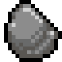
1 Like
Another day, another pixel challenge. Here’s the lumber challenge. I chose birch. I know it has lots of interesting black nubs and gnarls all over it, so it was interesting to break conventional lighting when making the twig.
Log:
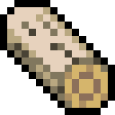
Twig:
Enjoy
2 Likes
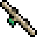
Two lessons in one day! For the weapons design challenge, I present: a kunai (Japanese throwing knife used by ninja). Getting the geometry for it at this angle was tricky, but a satisfying challenge!
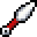
1 Like
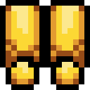
Here’s my attempt at the armour leggings and boots assignment. I tried to include a knee pad for the leggings.
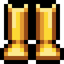
The boots didn’t quite work out like I’d hoped. Something’s off about them, but I can’t quite tell what.
1 Like
Another post for today I’m on a roll!
Here’s the icons I made - a mana crystal and a poison icon:


You may not see it but I did add the “cast shadow” line at the bottom, it’s just fading in with the colour of the forum’s background.
1 Like
It’s been 2 whole weeks since I last posted! Good grief. I’ve been really busy with real life things. To kick things off today, a relatively simple exercise from the course: making the letters H-N and 5-9.
1 Like
And here’s the next exercise. These are a bit easier than the previous chapter.
An animated triangular shaped button.
1 Like